PC Plus HelpDesk - issue 274
 |
This month, Paul Grosse gives you more
insight into some of the topics dealt with in HelpDesk.
|
 |
HelpDesk
Concentrate your log data with 'grep'
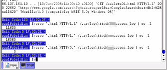
We all know that you can use 'wc' (word count) from the command line to see how many lines there are in the file and even hovering the mouse over the file icon in Konqueror will tell you how many lines there are. However, these lines include png files, jpegs and other files so how do we tell how many pages have been downloaded? The 'grep' command will look at each line in a file and attempt to match a pattern with it. If that match is successful, it outputs that line. All you have to do is find some pattern for it to match. In the log file, each record starts off with an IP address, then some more fields followed by the file that the client has asked for, in the form of 'GET /some/directories/yourfile.html HTTP/1.1' (or /1.0). The string that they all have in common is '.html HTTP1.' so if you use that as your matching string, you will get page after page of lines from your log file. Next, we just stick the 'wc' to 'grep' using a pipe. If you were already in your /var/log/httpd/ directory, your command would like like this ... grep '.html HTTP/1.' access_log | wc -l ... and all you would get in return was the number of lines from your log file. You can redirect the output to a file like so ... grep '.html HTTP/1.' access_log > Desktop/extract.txt ... and use that for further examination. In this way, you can extract data that allows you to trace a visitor through your website, seeing how long they took between loading each web page and so on. |
 If you run
your own web server, your log will soon fill up with
literally thousands of hits, each taking one line of the
log file.
If you run
your own web server, your log will soon fill up with
literally thousands of hits, each taking one line of the
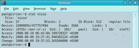
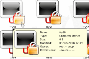
log file.File creation time/date on UNIX-like systemsLike many other OSes, date and time information is stored on Linux and UNIX file systems for each file, directory, pipe, link and so on. However, the three dates on a UNIX-like system don't include the created date. You can see the dates along with other information if you type 'stat' followed by the file/directory name like so... stat myfile.txt
These are:
No creation time though. But then, if you really
needed that information, you would have it somewhere
else, wouldn't you? |
 The images: The images:
You can try this out for yourself... Assuming that you don't have a file called 'myfile', type touch myfile stat myfile cat myfile stat myfile chmod myfile stat myfile You will be able to see that:
Still assuming that you didn't originally have a file called 'myfile', type rm myfile to get rid of it. |
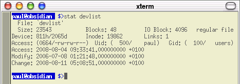 The
information you get back tells you about the file itself
(type, where it is and how big it is, along with who owns
it and how it is controlled) and then you get the three
date/times.
The
information you get back tells you about the file itself
(type, where it is and how big it is, along with who owns
it and how it is controlled) and then you get the three
date/times.
|
 Different
OSes have different representations of the hardware they
are connected to.
Different
OSes have different representations of the hardware they
are connected to.Different pages for different browsersNot all browsers render your pages in the same way so it is helpful to be able to differentiate between browser types. Things were pretty bad in the browser wars of the late 20th century but even now, with browsers moving towards common standards, you still need to know that browser 'A' will display a table the way you want it to whereas browser 'B' will mess it up completely.
In your web page, simply include the following lines of code, substituting whatever you need. If, say, you want to supply an image as a gif because png transparency isn't rendered properly then this structure is what you would use. <!--#if expr="${HTTP_USER_AGENT} = /MSIE/" -->
something that works for MSIE users
<!--#else -->
something different for everybody else
<!--#endif -->
If you are using SSI web parts to define pages then this can be placed in any of the files making everything from background colours to copyright notices configurable. Of course, you don't have to look for MSIE, or even at the user agent, there are plenty of variables that tell you something you need to know. |
 You can
use the browser's user agent string to set a variable in
Apache's httpd.conf file or as here, you can do the same
thing in the web pages themselves. One advantage of doing
it this way is that the code is transferable so you can
take it from one server to another without having to edit
configuration files.
You can
use the browser's user agent string to set a variable in
Apache's httpd.conf file or as here, you can do the same
thing in the web pages themselves. One advantage of doing
it this way is that the code is transferable so you can
take it from one server to another without having to edit
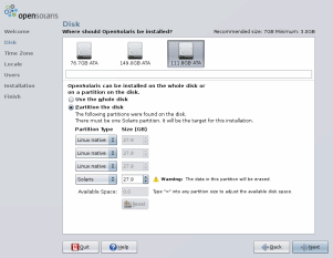
configuration files.Installing Solaris just got less nerve racking
This, inevitably means multiple partitions,
potentially on multiple drives. |
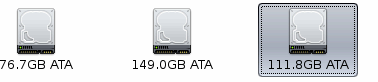 For somebody not used to the different ways
that OSes report partitions and drives, installing
OpenSolaris was something of a nightmare because the next
to last thing you want to do is overwrite an existing OS
installation - the last thing being reading the
instructions. For somebody not used to the different ways
that OSes report partitions and drives, installing
OpenSolaris was something of a nightmare because the next
to last thing you want to do is overwrite an existing OS
installation - the last thing being reading the
instructions.However, instead of being presented with a list of partitions with frightening descriptions like 'c2t0d0', you get a friendly dialogue box showing you the drives you have and the options that you want to see instead when you install an OS. After that, it all goes smoothly. |
 All
operating systems like to be the only one on a particular
machine but most OS manufacturers are realising that the
PC that has their OS on it should be able to use others
as well.
All
operating systems like to be the only one on a particular
machine but most OS manufacturers are realising that the
PC that has their OS on it should be able to use others
as well.
|
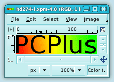
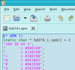 The start of the file contains information
regarding the dimensions (160 pixels wide by 38 pixels
high), number of colours used (64) and the number of
characters used to describe each pixel (1). The start of the file contains information
regarding the dimensions (160 pixels wide by 38 pixels
high), number of colours used (64) and the number of
characters used to describe each pixel (1).Following
that, each string that is to be used in the palette is
matched with hex RGB values and then... |
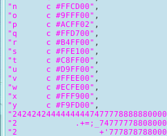 ...each line is printed out within double
quotes... ...each line is printed out within double
quotes... |
 ...like so. This is displayed in an ordinary
text editor and as the file is ASCII-only, you can edit
the text in the XPM file and then save it without having
to use a special plug-in or risk losing any of your data. ...like so. This is displayed in an ordinary
text editor and as the file is ASCII-only, you can edit
the text in the XPM file and then save it without having
to use a special plug-in or risk losing any of your data. |
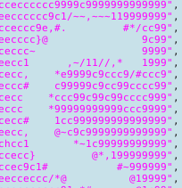 You can see here that the top of the 's'
looks like the output from ASCII-art except that here,
the characters that have been chosen only represent
logical value for the image rendering program to
evaluate. If you wanted to change it into ASCII-art, you
would need to use 'tr///' in Perl. You can see here that the top of the 's'
looks like the output from ASCII-art except that here,
the characters that have been chosen only represent
logical value for the image rendering program to
evaluate. If you wanted to change it into ASCII-art, you
would need to use 'tr///' in Perl. |
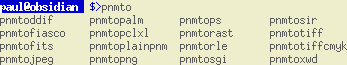 Similar file formats include PNM and if you
want to convert the image to something that an older web
browser might know what to do with, there are a myriad of
conversion programs that are part of the system so if you
open up a Bash prompt and type 'pnmto' and press [Tab]
twice, you will see the utilities such as 'pnmtojpeg' and
so on. Similar file formats include PNM and if you
want to convert the image to something that an older web
browser might know what to do with, there are a myriad of
conversion programs that are part of the system so if you
open up a Bash prompt and type 'pnmto' and press [Tab]
twice, you will see the utilities such as 'pnmtojpeg' and
so on. |
 Many image
file formats are inaccessible from the programs you write
without having to rely upon a special module that
somebody else has written. This opens up questions about
cross-platform compatibility for your program.
Many image
file formats are inaccessible from the programs you write
without having to rely upon a special module that
somebody else has written. This opens up questions about
cross-platform compatibility for your program.
|
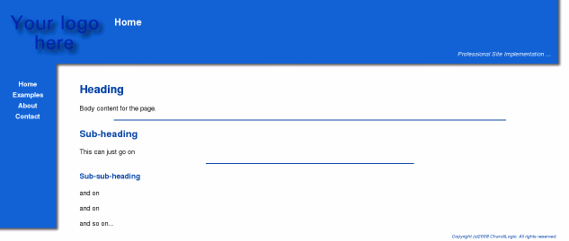
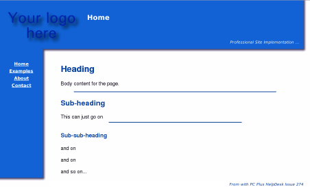
 Above-right, you can see it in a
reasonably-sized window with a reasonably-sized font -
all of these screenshots are half their original size. Above-right, you can see it in a
reasonably-sized window with a reasonably-sized font -
all of these screenshots are half their original size.On
the right, you can see that if you make the window
narrower, it doesn't break the page |
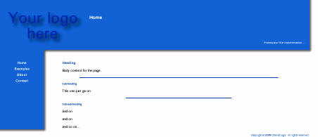
| Making the page ridiculously wide
doesn't break it either (as long as if
you are running IE, you have enough text on at least one
line of the page). |
 |
 Making the text so small that you can only
just read it doesn't break the page... Making the text so small that you can only
just read it doesn't break the page... |
 ...nor does making it ridiculously large. ...nor does making it ridiculously large.So, how do we make a website that has pages that are easy to edit and will resist almost everything we do to them? |
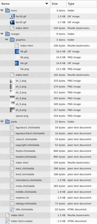 You can see in the listing on the right that
the site has a certain amount of structure to it. You can see in the listing on the right that
the site has a certain amount of structure to it.There are three main subdirectories:
Note that each directory has its own 'index.html' file which contains little more than the name of the directory that it is in - this stops browsers and spiders sending requests that produce lists of files that spiders can use. At the bottom of the listing, you can see that there is one explicit html file (index.html) - this calling the other resources that it needs by using SSIs. The top of the page looks like this... <html>
<head>
<!--#include file="parts/meta.chich" -->
<!--#include file="parts/title.chich" -->
Home
</title>
</head>
...with the meta information and the identities and locations of the favourite icon files in the file 'parts/meta.chich' and the title tag and the page-common title (ie 'Bill's Site :: ' or 'space blog :: ') in it. After that line, we have 'Home' which is the title of this particular page and you would change that for other pages. In that way, when the directive for the title part was processed, it would produce the following... <title>Bill's Site ::
Home
</title>
which would look like 'Bill's Site :: Home on the title bar. Note that you can use directives within other html markup tags so, if you have... color="#dfdf00" ...in your bgcolour1text.chich file, then the following line <p><font <!--#include file="parts/bgcolour1text.chich" --> >Home</font></p> ... will render like this ... <p><font color="#dfdf00" >Home</font></p> In this way, you can insert the text and images - and
any other structures you want - into the home page and
save it. To create another page, copy the
index.html.master file to weddings.html or whatever you
want, edit the menuitems file in 'parts' so that you have
a link to it in all of the pages and then add its
content. The menuitems web-part is called by all of the
pages so updating it will update all of the pages. This
is the same with all of the parts and if you find that
you are using a structure repeatedly, you can extract it
to parts and call them so that they are globally
editable. |
 The basic configuration involves deciding on
a logo and the colours of your title background and
coloured text. The basic configuration involves deciding on
a logo and the colours of your title background and
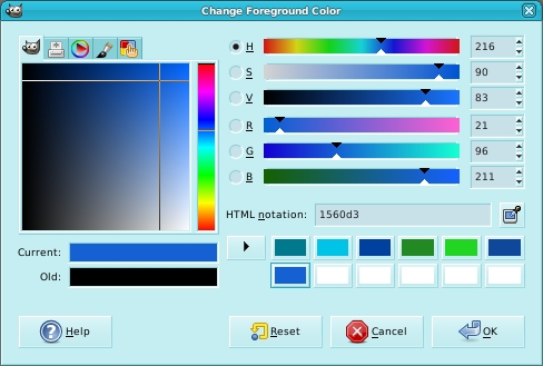
coloured text.One way to find the right colours for your site is to look at some sites that you like the colour schemes for and takes samples of some colours. In The GIMP, you can click on the foreground/background colour in the toolbox and the dialogue box on the right pops up. You can either select a colour using the colour space
on the left (you can see five tabs across the top which
give you five ways of selecting colours) or the sliders
on the right. |
 Alternatively, you can click on the
eyedropper which will let you select any colour on any
part of the screen (not just an image already loaded -
this is on The GIMP 2.4.1, you might have to take a
screenshot and sample that using the eyedropper tool on
some older versions of The GIMP). Alternatively, you can click on the
eyedropper which will let you select any colour on any
part of the screen (not just an image already loaded -
this is on The GIMP 2.4.1, you might have to take a
screenshot and sample that using the eyedropper tool on
some older versions of The GIMP).Once you have finished, you will see that you have a six-digit hexadecimal representation of the colour ('HTML notation:' in the screenshot above) and you can copy and paste that into your colour tag files. Next, save a 16x16 and 32x32 version of your favicon in the icons directory (you can use any browser-friendly format you like so .PNG files are all right) and the logo in the images/graphics directory and then, in the parts directory, you can edit the other files that define colours, text and so on. To add a new page, copy the master file in the document root directory then give it a new name and add the page content. To add it to the menu, edit the 'menuitems' file in the parts directory. The readme.txt file contains a list of web parts and what they do. Making pages now just consists of copying and pasting text, producing links for images and updating the menuitems file. The interesting thing about this approach is that each
page in the document root refers to the web parts in the
parts directory so when you update the menuitems file,
the menu is automatically update on all of the pages. The
same goes for the colours, logo, site tag and so on. |
In your Apache configuration file, you
might need to add (or modify the existing version) of the
following...<IfModule mime_module> AddType text/html .whateveryouwant AddOutputFilter INCLUDES .html .whateveryouwant </IfModule> |
| This allows your server to look at the .html files without you having to use the X-Bit hack (such as on version of Apache that don't use that hack or on OSes that don't support an executable attribute in the metadata such as on Windows. |
| Have fun. |
 People
always want to have a website built for them which, of
course, means that you end up doing the hard work.
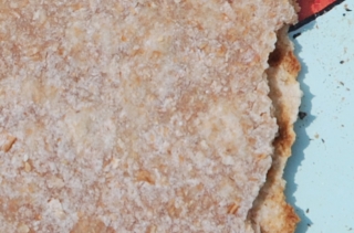
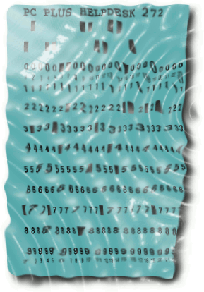
People
always want to have a website built for them which, of
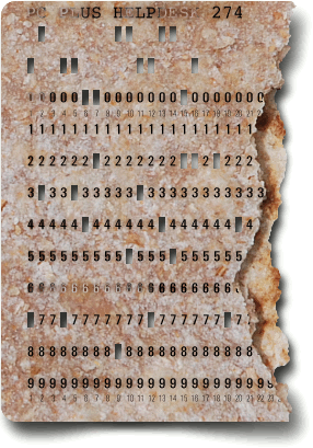
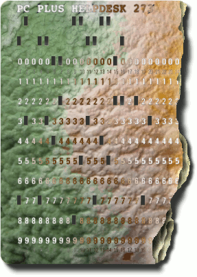
course, means that you end up doing the hard work.Real textures in imagesBack Image processors are getting fairly advanced and can produce their own textures for you to use either as a visible surface or for a bump map to be rendered. However, no matter how good these are, if they take up a dominant role in the image, they tend to look artificial. An alternative to this is to use real textures such as that used in the image on the right. Armed with a camera with a reasonable macro provision (many compact cameras have better macro capabilities than the standard lens in the macro position on SLRs costing ten times as much), you can take whatever textures you like. Once you have them, you don't have to use all of the qualities of the image, you can use just its hue, value, saturation, edges ... any part of it The image on the right is from a chapatti (roti) that I made and then thought that it would be interesting to have as the substrate for this month's SuperDisc punched card. As an example of what you can do on your own, as
opposed to buying images that someone else has taken and
then has inevitably created licensing issues about, here
is how it was done. |
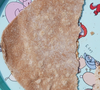 First of all, you need to make/obtain
whatever it is that you are going to use. First of all, you need to make/obtain
whatever it is that you are going to use.To make roti, make a stiff dough from just water and wholemeal flour then roll it into balls around 1.5" (4cm) in diameter. On a lightly-floured surface, one at a time, roll them flat until they are around 8 to 10" (20 - 25cm) in diameter. Then, on a skillet that is hot enough to make a pinch of dry flour start to brown within 10 seconds, place the freshly rolled roti and let it cook for what seems like around 20 seconds. This cooks a thin layer. Turn it and let it cook on the other side until it
starts to go a bit bubbly (like in the picture on the
top-right). |
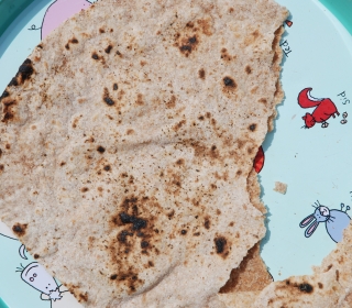 Turn it back onto its original side and
then, holding it still with a pair of long tongues, pull
the skillet from under it so that it is now sitting on
the prongs of the cooker, in direct contact with the gas
flame. Turn it back onto its original side and
then, holding it still with a pair of long tongues, pull
the skillet from under it so that it is now sitting on
the prongs of the cooker, in direct contact with the gas
flame.Move it around so that it gets browned evenly (like in the picture on the right). At this point, the water inside it boils and the whole thing blows up like a breathalyser bag (unless you have any holes in it). This steam cooks the roti from the inside. When the surface of the underside looks like the image on the right, it is done and you put it to one side to cool down whilst you get on with the next one. So now, we have a food product (that is never bad in computing circles), that has two interesting textures on it, has two layers that can be separated completely quite easily. For my requirement of having something that has been torn in half, that makes for an interesting shot. On the top-right, we have the second cooked face
upwards and on the right, we have the side that was
exposed to the flames - both torn in half. |
 The requirement for the shot is that it is
lit from the upper-left so I got the roti and put it on a
tray in the sun with the light coming in from the upper
left. On the right, you can see a half-scale (shrunk down
to 50%) image of one side with the tear ... The requirement for the shot is that it is
lit from the upper-left so I got the roti and put it on a
tray in the sun with the light coming in from the upper
left. On the right, you can see a half-scale (shrunk down
to 50%) image of one side with the tear ... |
 ... and here (right), the other side. It is
then, just a matter of matching them up with the
requirement for the image - in this case, the holes in
the punched card should not fall over an edge - the
column with the '4' of '274' has an upper-surface tear in
it that goes below it in the same column but the hole
misses it. This image was scaled so that it fitted
properly. ... and here (right), the other side. It is
then, just a matter of matching them up with the
requirement for the image - in this case, the holes in
the punched card should not fall over an edge - the
column with the '4' of '274' has an upper-surface tear in
it that goes below it in the same column but the hole
misses it. This image was scaled so that it fitted
properly.One thing to notice in the image on the right
and the one above it (which was used in the final image
on the left) is that where the upper layer of the roti
casts a shadow, it has a larger displacement than the
shadow cast by the lower layer. The images were taken in
direct sunlight (to enhance the texture) so the shadows
of both of them are sharp to the point where any extra
blurring of the shadow is in the sub-pixel range but in
the image on the left, the drop-shadows had different
blur radii as well as displacements (in fact, they were
done by hand). |
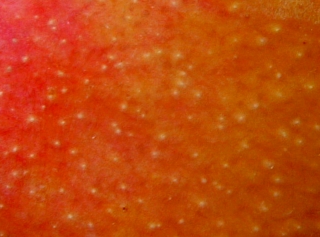
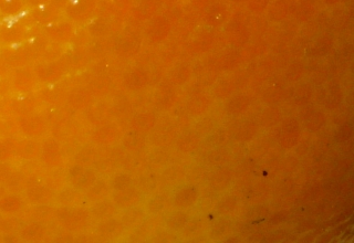 You are not limited to things that you can
make yourself. You are not limited to things that you can
make yourself.On the right is the surface of a small
orange although many citrus fruits have a surface similar
to this. |
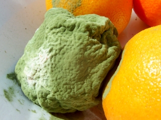 Here is a mouldy orange which has an
interesting surface. Here is a mouldy orange which has an
interesting surface.Note that the mould starts to
bloom where it has been growing the longest. |
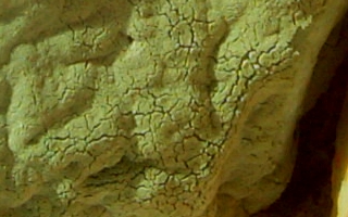 This is the texture of a part of the same
image from above, showing the way the surface cracks. This is the texture of a part of the same
image from above, showing the way the surface cracks.You
can use this natural, surface-cracking in your images
without having to reveal that it was actually mould that
it came from. |
 Last month's card came from a mouldy orange
(yes, we eat oranges; yes we don't always get around to
eating all of them). Last month's card came from a mouldy orange
(yes, we eat oranges; yes we don't always get around to
eating all of them).In this image, a bump map was derived from the image, rendered and then the highlights and shadows extracted (render it to a grey surface and then use the colour-to-alpha function to remove the grey). These were then added to the underlying layer so that it gave the right effect. The layer with the numbers on it had its alpha fixed and then colours from the mouldy layer were used to paint the numbers different colours according to the local background. The layered effect on the right, were the tear is, is
completely fictitious. |
 This one is of a mango. This one is of a mango.Fruit provide a very useful library of real-life textures - you can get what you want from most local supermarkets nowadays. Often, they provide translucent-looking surfaces and
you can always mess around with the colours. |
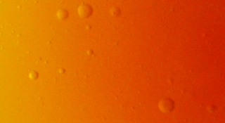 You don't have to use raw fruit either. This
is, of course, mango jam (a cup and a bit of sugar to a
cup of mango pulp and then boil). You don't have to use raw fruit either. This
is, of course, mango jam (a cup and a bit of sugar to a
cup of mango pulp and then boil).The bubbles add an
interesting texture to it. |
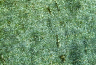 You are not limited to using fruit from
trees either. This is ash tree bark and has a wonderful
surface. You are not limited to using fruit from
trees either. This is ash tree bark and has a wonderful
surface.Hopefully, this will give you some ideas and armed with a fairly cheap camera (a 4 Mega Pixel camera is adequate and doesn't cost too much), you can furnish your own texture library opportunistically. Carry the camera with you and when you see something interesting, take some pictures of it. Who knows when you will find them useful? |
|
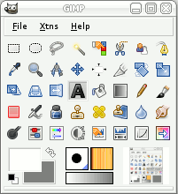
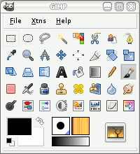 Here, we will be using The GIMP 2.4.1
(happens to be on OpenSolaris so it is running on UNIX,
not BSD, Linux, OS X or Windows but the interface is the
same whichever OS you use) although what you will do here
can be transferred to other images processors that use
layers so it is not GIMP-only. Here, we will be using The GIMP 2.4.1
(happens to be on OpenSolaris so it is running on UNIX,
not BSD, Linux, OS X or Windows but the interface is the
same whichever OS you use) although what you will do here
can be transferred to other images processors that use
layers so it is not GIMP-only.The menu layout is the default so you should be able to reproduce this for any image you want to make. The theme used ('File'/ 'Preferences'/ 'Theme') is the small theme and for the toolbox in the same dialogue, make sure that Appearance has all three options ticked. If you click on 'File'/ Dialogues'/ 'Tools' (near to
the bottom) you can add everything except 'Colourise' to
get the same tool set as used here and just adjust the
size of the window to get it looking the same. That way,
it won't take up much room and you have most things you
need for any job. |
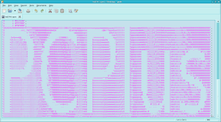
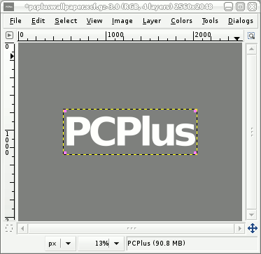
 So, what do we want here? So, what do we want here?We want to create a 'PC Plus' wallpaper that looks like a sand-cast block that has had the letters 'PC Plus' cast out of it (they stand out) which have then been honed down with a diamond tool to a flat surface. However, casting into sand is never a perfect job and you end up with bits of grit embedded in the surface which is also quite uneven. Thinking of this, we need to produce some proper noise
that reflects the unevenness of a cast, flat surface, we
need to be able to produce cast inclusions (bits of grit)
and we need to be able to make letters stand out and then
be ground flat. |
| With what you will learn here, you can
make a wallpaper any size you like but my screen is
1280x1024 so we'll start off by creating a blank canvas
that is twice that size. Click on 'File'/ 'New' and in the image size, type in your screen size dimensions times two (this will give us a bit of extra space to play around with and the ability to reduce the image by a factor of up to two so that any unevenness can be ironed out). So, 2560x2048 it is. This gives us an image of 46.9MB and we'll use this to hold our bump maps and other parts of the image. Save it as myfile.xcf.gz and then, as you work, you can save it just by pressing [Ctrl][S]. Now, we need to create some noise so that we can have our cast background. There are a number of noise generators but rather than use a pre-set noise, we'll do this manually. We are going to create five binary scales of noise with the final scale being blown up by a linear (size rather than method) factor of four. So, we want to create a new image that is only 40x32. Click on the foreground colour in the toolbox and in the 'HTML notation:' field, type '7f7f7f' and press [Enter]. Click on 'OK'.
Now, right-click, 'Filters'/ 'noise'/ 'RGB Noise'. Uncheck the 'Independent RGB' checkbox and adjust the sliders so that they say 0.50. Click on 'OK' and this will create an image with noise with values ranging from 0 to 255. Next, resize the image by right-clicking on the image and selecting 'Image'/ 'Scale image'. If, for the units, you click on 'percent', then change one of the image size values to 200.00 and when you go to the next field in the dialogue (say by pressing [Tab]), it will change the other as well (they are linked with the chain icon). The interpolation method should be set to 'Cubic' and then click on 'scale'. You can now see that the noise is a bit 'blurry'. Now, create a new layer in our 80x64 image by clicking on the new layer icon in the layers dialogue. For the 'Layer Fill Type', choose the 'Foreground Colour' (which is the mid-grey) and then click on 'OK'. We now have a new, mid-grey layer. Next, right-click on the image (the new layer is automatically selected) and select 'Filters'. At the top of the list is 'Repeat "RGB Noise"' and below that is 'Re-Show "RGB Noise"'. Re-showing it brings up the dialogue box again but we already have that set the way we want it so we can just use the Repeat menu item or, [Ctrl][F] (for Filter) without calling the menu. In the dialogue box, change the opacity of the layer
we have just created to 50%. |
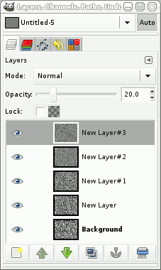 Resize again (so now it is 160x128). Resize again (so now it is 160x128).Now, you can create a new layer from the Layers dialogue box by holding down [Shift] and clicking on the new layer button. This gives you the last options used (foreground colour which happens, at the moment to be grey). Click on the image window and press [Ctrl][F] to generate the noise, in the layers dialogue, change the layers Opacity to 33.3%, resize the image window by 200% to 320x256. Create a new layer (Layers dialogue) [Shift]-click on New layer button, focus on image, press [Ctrl][F] for noise, in Layers dialogue, change opacity to 25%, focus on image, resize to 200% to 640x512. Create a new layer (Layers dialogue) [Shift]-click on
New layer button, focus on image, press [Ctrl][F] for
noise, in Layers dialogue, change opacity to 20%. |
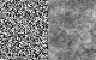 Now, we have five layers, each contributing
20 percent to the final image. Now, we have five layers, each contributing
20 percent to the final image.On the right, blown up
by four in each case, the left half is normal noise and
the right half is the noise we have just generated. |
 Just in case you noticed that the density
range is smaller on our generated noise and that might
affect it, here it is (lower-right) with the density
range stretched to the same extent, with a single layer
of noise in the background for comparison. Just in case you noticed that the density
range is smaller on our generated noise and that might
affect it, here it is (lower-right) with the density
range stretched to the same extent, with a single layer
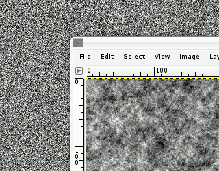
of noise in the background for comparison.You can see that there are macro structures there, generated on various scales as you would get in reality, giving it a sort of clotted or flocculent look about it. Now, right-click on one of the layers in the Layers dialogue box and then choose 'Flatten Image'. Then scale it up by a factor of four to 2560x2048 pixels. Now, we need to blur it a bit so right-click on the image and select 'Filters'/ 'Blur'/ 'Gaussian Blur...' and adjust the blur so that it looks like there are no squarish corners to the noise - a blur radius of around 5 pixels will do this nicely. Next, drag our noise layer from the Layers dialogue box and drop it in our wallpaper image. This will make it have two layers, one of which is our noise. We are going to use this layer for a number of
different tasks so it is quite valuable |
 Next, we are going to create our text.
Create a new layer in our wallpaper image by holding
[Shift] and clicking on the new layer icon. Next, we are going to create our text.
Create a new layer in our wallpaper image by holding
[Shift] and clicking on the new layer icon. Next, click on the white arrows to swap the foreground and background arrows over and then click on the text tool. Click on the image and type your text - we'll use 'PC
Plus'. |
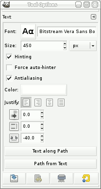 Next, in the 'Tool Options' dialogue box: Next, in the 'Tool Options' dialogue box:
until you have what you want. This is what I used. |
 Now, we want to make sure that it is centred
in our wallpaper. The text layer is smaller than the
background image so click on the 'Alignment' tool. Now, we want to make sure that it is centred
in our wallpaper. The text layer is smaller than the
background image so click on the 'Alignment' tool. |
 Next, drag the mouse from top-left to
bottom-right over the text layer (it could be any
direction, just imagine that you are using the selection
tool) and small pink blocks will appear in each corner of
the layer. Next, drag the mouse from top-left to
bottom-right over the text layer (it could be any
direction, just imagine that you are using the selection
tool) and small pink blocks will appear in each corner of
the layer. |
 Now, make sure that 'Image' is selected in
'Relative to:' and then click on whatever alignment you
want. Now, make sure that 'Image' is selected in
'Relative to:' and then click on whatever alignment you
want.If you want to move the layer just up or down or left or right, you can click on the move tool (the blue NSEW arrow icon next to it) and move the layer using the arrow keys instead of the mouse. Now that it is in the right place, drag it down to the bottom of the layer list - we can use it as an outline reference for many different tasks - just don't change it's x-y co-ordinates once it is in the right place. NOTE: Doing this is all right if you just want one
block of text that you can type in in one go. If you want
several pieces of text and perhaps a logo (on a
transparent background), get them all in the right place
and then merge them into one layer and move that to the
bottom - here, we are just going to use this layer to
create masks so its alpha values are the only important
part of it. Make sure you end up with a transparent
background with what you want as opaque. |
 First of all, we're going to make a raised
portion on our casting bump map that corresponds to the
characters we've just typed in. First of all, we're going to make a raised
portion on our casting bump map that corresponds to the
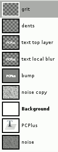
characters we've just typed in.Right-click on the text layer in the Layers dialogue box and then 'Alpha to Selection'. Next, click on our 'New Layer' (the grey one at the top). Now, grow the selection - say by 15 pixels - right-click, 'Select'/ 'Grow' and then change the value to 15 and click on 'OK'. This extends the sharp edge beyond the letters. Next, feather the selection - by twice the value we used above - right-click, 'Select'/ 'Feather' and then change the value to 30 and click on 'OK'. Then, drag the white colour from the toolbox and drop it onto the image to flood-fill the selected area. Next, press [Ctrl][Shift][A] to remove the mask. Then, in the Layer's dialogue box, double-click on the
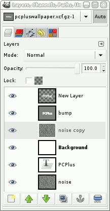
label for that layer and type in 'bump'. Whilst you are
at it, change our noise layer's name to 'noise'. You
don't have to do this because it won't change the way any
of it works, it's just that it can get a bit confusing if
you have seven layers called 'New Layer'. |
| Next, create a new transparent layer by
just clicking on the new layer button and selecting
transparency as the layer fill type.
Click on our 'New Layer' (the transparent one at the top). If you drag the white into that layer and drop it, you can see that our letters stand out from the gradient a bit (such as at the top of the 'P' - right) which is pretty much what we want, but, at the bottom of the top of the 'C' where it is close to the 'P', the white letter juts out too much. In a real casting, it wouldn't be like that so we'll
repeat what we did above but with a smaller grow and
feather. |
 First of all, let's back-track to where we
had the alpha on the transparent layer. First of all, let's back-track to where we
had the alpha on the transparent layer.You can either press [Ctrl][Z] to step back or, you can click on the 'History' dialogue which is in the layers dialogue box. This shows you what you have done and if you go back too far, it will let you go forward again (as will using the key method, it's just that this is easier to see). We need to go back to where we had just selected 'Alpha to Selection' so click on that. Next, click on the layers tab. Now, grow the selection - say by 5 pixels - in the image window, right-click, 'Select'/ 'Grow' and then change the value to 5 and click on 'OK'. This extends the sharp edge beyond the letters. Next, feather the selection - by twice the value we
used above - right-click, 'Select'/ 'Feather' and then
change the value to 10 and click on 'OK'. |
 Then, drag the white colour from the toolbox
and drop it onto the image to flood-fill the selected
area. Then, drag the white colour from the toolbox
and drop it onto the image to flood-fill the selected
area.Next, press [Ctrl][Shift][A] to remove the mask and change it's opacity (in the layers dialogue box) to around 20 percent. Finally, create a layer that will be our honed surface. Create a new, transparent layer, get the alpha from the text layer, select the new layer and then drag white from the toolbox into the image, finally getting rid of the mask using [Ctrl][A]. Now change our 'bump' layer's opacity to around 80
percent. This will let the noise through to give us our
mottled bump map. However, if you look at it, it has a
fairly even distribution but castings into sand aren't
quite like that. We need to change the noise's density
distribution to reflect what we want from our bump map. |
 The first rule is don't destroy what you
have so, in the layers dialogue, with the noise layer
selected, press the duplicate layer button and move our
original to the bottom. The first rule is don't destroy what you
have so, in the layers dialogue, with the noise layer
selected, press the duplicate layer button and move our
original to the bottom.This way we can re-do any work that we might mess up later on. Now, we can work on the copy safely.
|
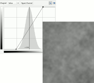 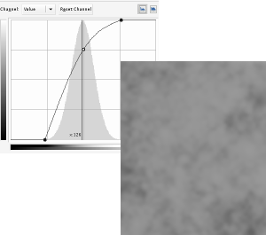 We can now change the density and tweak its
profile. We can now change the density and tweak its
profile. With this set, click on OK. |
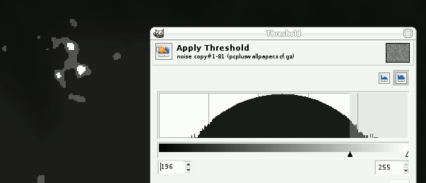
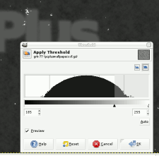 Now, we want to create the casting
inclusions (bits of grit and so on that ruin the surface
- a bit like those little black bits of old chips you get
in the chip pan that stick to your chips). Now, we want to create the casting
inclusions (bits of grit and so on that ruin the surface
- a bit like those little black bits of old chips you get
in the chip pan that stick to your chips).
Click on the new layer and then adjust the lower value
until we have the right amount of inclusion - here it was
185. Click on OK. |
 Repeat the exercise (fresh copy of the noise
layer on top, make partially transparent and then hit the
threshold) but this time, leaving a smaller sized mark.
Imagine a piece of grit, sitting in its own indentation. Repeat the exercise (fresh copy of the noise
layer on top, make partially transparent and then hit the
threshold) but this time, leaving a smaller sized mark.
Imagine a piece of grit, sitting in its own indentation.Click
on OK and we now have our two new masks. |
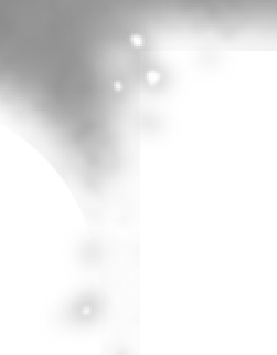
 First of all, let's deal with the
indentation mask. Make that the current layer. Then, blur
it by right-clicking, 'Filters'/ 'Blur'/ 'Gaussian
Blur...' and then choosing a value that gives a
reasonable slope - I used 15 pixels radius. Select RLE to
speed things up and then click on 'OK'. First of all, let's deal with the
indentation mask. Make that the current layer. Then, blur
it by right-clicking, 'Filters'/ 'Blur'/ 'Gaussian
Blur...' and then choosing a value that gives a
reasonable slope - I used 15 pixels radius. Select RLE to
speed things up and then click on 'OK'.Next, we want to remove the background so we right-click on the image and then 'Colours'/ 'Colour to Alpha'. Click on the 'From:' colour button, then on the dropper and then on the black part of the image. Click on OK in the colour selector and then on 'OK' in the colour to alpha dialogue box. We now have our mask but the colour is wrong. Click on the 'Lock Alpha Channel' checkbox in the
layers dialogue box then click on the little black and
white reset on the foreground/background selector in the
toolbox. Drag the black onto the layer in the layers
dialogue box or into the image itself. to flood-fill that
layer whilst preserving the alpha. Adjust the layer's
opacity to around 30% to give the indentations in the
surface, including the letters that have been cast. |
  Now: Now:
You can now see what we have on the right and on the left, you can see what our layer structure looks like.. We are almost done. ... Well, sort of. |
 Next, we need to create the mask for our
honed letters. This is fairly easy. Next, we need to create the mask for our
honed letters. This is fairly easy.Make a copy of the text top layer - this has the crisp letters with a transparent background. Make a copy of the dents layer - this has the modified densities in it. Bring them both to the top (with the dents copy layer on the top) and make them both 100% opaque. You can, beneath them - in the layer hierarchy - create a black layer so that you can see what you are doing easier but you don't have to (we'll only delete that extra layer later if we do make it). Next, make our copied text layer the current layer and right-click on it in the Layers dialogue box, choosing 'Alpha to Selection'. Press [Ctrl][I] to invert the mask, make the dents copy the current layer and then press [Ctrl][X] to cut away the dents that are not part of the honed text. Now, right-click on the clipped dents copy layer in the Layers dialogue box and select 'Merge Down'. Rename the layer something like 'honed text'. |
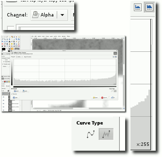
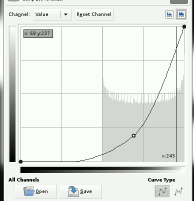
 Then, right-click on the image and select
'Colours'/ Colour to Alpha' and make sure that you have
black selected as the colour. Click on 'OK'. Then, right-click on the image and select
'Colours'/ Colour to Alpha' and make sure that you have
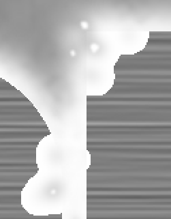
black selected as the colour. Click on 'OK'.Next, select the curves tool from the toolbox and click on the image. Select 'Alpha' as the channel (top-left) and 'Freehand' as the curve type (bottom-right). Next, click on the graph and drag all but the 255 value (horizontally) to 0 (vertically). To make this easier, you can make the window wider and the scale will stretch for you, allowing you to use more precision. You now end up with the mask on the right when viewed
against the black background layer you might have added
(if you did, you can delete that black layer now) |
| Next, we want to make our honed layer.
This is essentially a surface that has been machined with
a very sharp tool so that it shines. Make the foreground colour '7f7f7f'. Create a new image that is just over a 10th of the width of the final image and a little bit taller so as ours is 1280x1024, well make one that is 130x1030 pixels and make it the foreground colour ('Advanced Options', Fill with:' 'Foreground colour').
Click on new layer, select foreground, set opacity to
50%, press [Ctrl][F] for noise, scale to 200/100 percent,
click on new layer, select foreground, set opacity to
33.3%, press [Ctrl][F] for noise, scale to 200/100
percent. |
| Now, we have noise that is stretched
horizontally. Flatten the image and then scale it so that it is just a bit bigger than our working required height (ie, by 200% so it is now 4160x2060). Next, right-click on the image and select 'Filters'/ 'Blur'/ 'Motion Blur...'. Make the blur type 'linear', the angle '0' and the length 200 or so. Click on 'OK' and go and make yourself something to eat or drink. Next, click on the curves tool and then on the image to make the density range full range (40-210 ish) and click on 'OK'. Then, click on the Duplicate layer button in the layers dialogue and set the opacity of the new layer to 50.0%. Next, on the image, right-click and select 'Colours'/ 'Invert' - it should all go grey. Next, click on the Move tool (the blue NSEW arrows) and then on the image window (but not on the image - try the title bar). Now, move the image upwards by pressing the up key on the keyboard two or three times. Flatten the image and then drag it into our wallpaper image (which should be zoomed out completely so that all of the image can be seen so that the dropped image covers all of the wallpaper image).
Right-click on the 'honed text' layer and select 'Alpha to Selection'. In the layers dialogue, make the honing copy the current layer and then click on the border of the wallpaper image so that it has the focus. Press [Ctrl][I] to invert the selection and then [Ctrl][X] to remove the unwanted honing. Finally, drag the '7f7f7f' colour from the toolbox and drop it into the layer called 'Background'. Save it, if you haven't already done so. One thing that is worth taking note of here is that all of the layers (apart from our text layer) are the full size which means that we can create new layers and drag and drop them. When we drop them back into this image, they will be aligned. |
 So, running at 826MB of RAM (or so), press
[Ctrl][D] to duplicate the image (the new image will be
smaller because there is no history to remember - this
one came in at 250MB but this depends on the detail you
have in your layers). So, running at 826MB of RAM (or so), press
[Ctrl][D] to duplicate the image (the new image will be
smaller because there is no history to remember - this
one came in at 250MB but this depends on the detail you
have in your layers).In the new copy, turn off the 'honing copy', 'honed text' and 'grit' layers. Change the opacity of the bump layer and merge down the 'text local blur' layer (the one with the small blur radius and the opacity of around 20 percent) with the bump layer and then apply curves to the alpha so that the appearance is more spherical (in a Turin Shroud sort of way - this is essentially what a bump map is). Next, adjust any opacity levels (such as the bump
layer opacity) you want and flatten the image. |
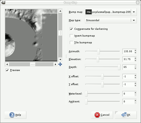 Then, drag and drop it into the wallpaper
image and rename it 'bumpmap'. Drag the background layer
to the top. Then, drag and drop it into the wallpaper
image and rename it 'bumpmap'. Drag the background layer
to the top. Next, right-click on the image and select 'Filters'/ 'Map'/ 'Bump Map...'. Make sure that you have the right layer as the bumpmap and then mess around with the controls until you have something that you like. The ones to play around with are:
Once you are satisfied, click on 'OK' and let it render (it is fairly fast). Then blur it (right-click on the image, 'Filters'/
'Blur'/ 'Gaussian Blur...') by around 5 pixels radius so
that there is nothing that is too fine and any contours
that might have been have been smudged out. |
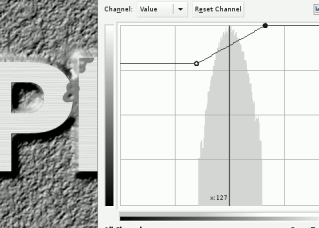 Next, in the Layers dialogue box, drag the
honing copy layer (the cut-out text) to the top. Next, in the Layers dialogue box, drag the
honing copy layer (the cut-out text) to the top.Select the curves tool and push the density range up so that it looks like machined metal. Now, move the grit layer to the top. This is still white so in the layers dialogue, lock the opacity, in the tools dialogue, make the colours black and white and then drag the black down to the grit layer (either in the layers dialogue or on the image). Finally, you can select the background layer and click on that to adjust its density so that you might have highlights clipped and the midrange squashed to give it a more matt appearance - whatever you want. You can adjust the densities of the RGB layers independently to give the metal a slight colour. You can also, take the honed copy and duplicate that. Preserve the opacity and then drag a gradient (such as the horizon gradient) over it then adjust its opacity to whatever you feel it needs to be. You can also give your grit a 3D appearance and give it a drop-shadow if you want. Finally (yes, really), flatten the image (or a copy of it) and then size it down to your screensize (or scale it as appropriate and then crop it). When you scale it down, you are effecting an oversampling. This is what we've just made and having preserved the
layers that take the time to make (the noise and the
brushing) we can modify it or make completely new ones
fairly easily. |
 |
 Artificial textures
in images
Artificial textures
in images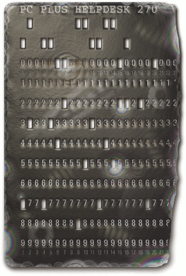 card from HelpDesk
272 which is produced entirely artificially, using pretty
much the same set of procedures you are going to use
below, except for the wave generated displacement (using
the GIMP 2.4.1 and many before that, 'Filter'/ 'Map'/
'Displace...' using a wave bump map to produce the
refraction distortions and then just a normal
'Filter'/'Map'/'Bump Map...' to produce the reflections
(colour to alpha) - you'll see how it works below).
card from HelpDesk
272 which is produced entirely artificially, using pretty
much the same set of procedures you are going to use
below, except for the wave generated displacement (using
the GIMP 2.4.1 and many before that, 'Filter'/ 'Map'/
'Displace...' using a wave bump map to produce the
refraction distortions and then just a normal
'Filter'/'Map'/'Bump Map...' to produce the reflections
(colour to alpha) - you'll see how it works below).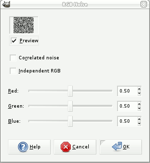 Next, drag
the foreground colour from the toolbox to the background
image in the Layers dialogue box and drop it on it. This
will flood-fill the image with mid-grey.
Next, drag
the foreground colour from the toolbox to the background
image in the Layers dialogue box and drop it on it. This
will flood-fill the image with mid-grey. Then, right-click on
the text layer in the Layers dialogue box and then 'Alpha
to Selection' as you did in the previous step.
Then, right-click on
the text layer in the Layers dialogue box and then 'Alpha
to Selection' as you did in the previous step. Click on
the curves tool icon in the toolbox and then with the
'noise copy' layer selected, click on the image.
Click on
the curves tool icon in the toolbox and then with the
'noise copy' layer selected, click on the image. Make a copy of the
noise layer and drag it to the top. We effectively want
to make a mask of where these inclusions have indented
the surface so let's use the threshold tool. Make the new
(top) noise layer have a opacity of around 50% or so, so
that we can see what is underneath and select the
threshold tool.
Make a copy of the
noise layer and drag it to the top. We effectively want
to make a mask of where these inclusions have indented
the surface so let's use the threshold tool. Make the new
(top) noise layer have a opacity of around 50% or so, so
that we can see what is underneath and select the
threshold tool.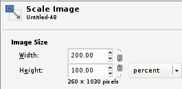 Click on
'OK'. Right-click on the image and select 'Filters'/
'Noise'/ 'RGB noise...'. Make sure that the sliders are
not independent and the value is 0.50 then click on 'OK'.
Right-click on the image and select 'Image'/ 'Scale
Image...'. Break the chain and make sure that the width
is 200 percent and the height is 100 percent. Click on
'OK'.
Click on
'OK'. Right-click on the image and select 'Filters'/
'Noise'/ 'RGB noise...'. Make sure that the sliders are
not independent and the value is 0.50 then click on 'OK'.
Right-click on the image and select 'Image'/ 'Scale
Image...'. Break the chain and make sure that the width
is 200 percent and the height is 100 percent. Click on
'OK'.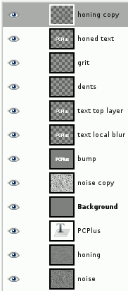
 Right-click on the
new layer in the Layers dialogue and select 'Layer to
Image Size'. Rename the layer 'honing' or similar, make a
copy of it and drag the honing layer down to the bottom
where the noise and the PC Plus text layer (or your other
image layers) are.
Right-click on the
new layer in the Layers dialogue and select 'Layer to
Image Size'. Rename the layer 'honing' or similar, make a
copy of it and drag the honing layer down to the bottom
where the noise and the PC Plus text layer (or your other
image layers) are.
|
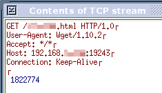 In the
screenshot on the right, there are a number of lines
including one specifying the file, eventually followed by
a blank line. After that, we send the file that has been
requested. Here, it is not even a HTML file, just a
number (to keep a web counter display up-to-date).
In the
screenshot on the right, there are a number of lines
including one specifying the file, eventually followed by
a blank line. After that, we send the file that has been
requested. Here, it is not even a HTML file, just a
number (to keep a web counter display up-to-date).
|
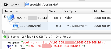
Now that we can do this, let's look at
producing a program that will read this value (using the
server code and configuration in the above article - Make
your own Microserver) and here is what we get...#!/usr/bin/perl -w $ttyst = "stty sane 9600 parenb cs8 -crtscts cstopb --file=/dev/ttyS0"; Substitute your own serial location for your system - see Opening a serial port above. $oc = "w";
$ctr = 0;
while (1) {
readpipe "wget -q -r http://1.2.3.4:19243/ginty.html";
open (HTML, "<1.2.3.4:19243/ginty.html");
$c = <HTML>;
close HTML;
chomp $c;
if ($oc eq $c) {
$ctr += 2;
if ($ctr == 20) {
open (TUBE, "+</dev/ttyS0") or die $!;
print TUBE " t";
close TUBE;
} elsif ($ctr == 40) {
$ctr = 0;
$c =~ s/ /0/g;
open (TUBE, "+</dev/ttyS0") or die $!;
print TUBE $c;
close TUBE;
}
} else {
$oc = $c;
$ctr = 0;
readpipe ($ttyst);
open (TUBE, "+</dev/ttyS0") or die $!;
print TUBE $c;
close TUBE;
};
sleep 2;
}
So, you can see that it polls the server every two seconds. If the value it receives is different, it posts that to the serial port. If it is the same, it does not. After 20 seconds, if there has been no change, it posts a 't' to the serial port which makes the display show the current time. If the value - which is still polled every two seconds - has still not changed then it goes back to showing the last counter value that it was given although this time, it also displays leading zeros. If, at any time, the polled value changes, it displays that and the 20 seconds starts again. |
 When you
are writing a program, the last thing you want to do is
to re-invent the wheel. If you can call a program that
already does the job for you, then you can save on making
errors, introducing security flaws and so on.
When you
are writing a program, the last thing you want to do is
to re-invent the wheel. If you can call a program that
already does the job for you, then you can save on making
errors, introducing security flaws and so on.
|
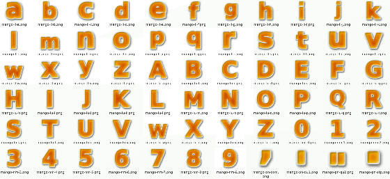 |
 To use them, copy the directory to your hard
drive and then drag them and drop them into your image -
correcting the size once you have done any transforms.
like so... To use them, copy the directory to your hard
drive and then drag them and drop them into your image -
correcting the size once you have done any transforms.
like so... |