PC Plus HelpDesk - issue 249
This month, Paul Grosse gives you more insight into
some of the topics dealt with in HelpDesk
|
 |
HelpDesk
|
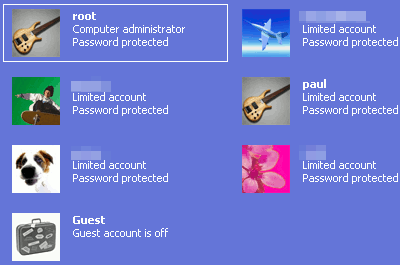 Account
types in Windows
Account
types in WindowsInfra Red - 'Super Black and White' |
|
 Taking colour pictures has become very easy
with digital photography - our eyes see in colour and the
instant results we get from our cameras reflect
reasonably well, the picture we saw although the dynamic
range leaves something to be desired. Taking colour pictures has become very easy
with digital photography - our eyes see in colour and the
instant results we get from our cameras reflect
reasonably well, the picture we saw although the dynamic
range leaves something to be desired.As long as we don't want to start taking pictures of anything too out of the ordinary, or expecting too much from our cameras, that is. The skill of taking good black and white photographs has apparently been superseded by the ability to force an image to lose all of its colour saturation information and we can therefore create a perfect black and white image just with the click of a mouse. Like so... |
|
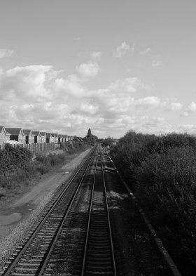 ... Okay, so I did that deliberately. ... Okay, so I did that deliberately.There is little contrast between the sky and the clouds and the whole thing looks very grey. You can modify the weighting of each layer so that you might end up with a bit more of, say the red layer to make your blue sky darker or, say, the green layer to make your leaves a bit lighter but here, like so many pictures, the image was taken with colour reproduction in mind and therefore the skill of taking a good black and white image was never written in. You cannot write it in afterwards - no matter how much you paid for you image processing program. Garbage in, garbage out. The best you can do when mixing layers is to get just
one of them - mixing in others will only reduce any
effect (which is all right if your image will permit it). |
|
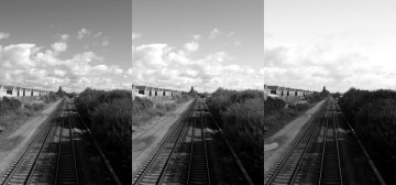 This is a decomposition (RGB) of the above
colour image and as you can see, the red layer gives the
best sky but the rest just looks a bit grey. This is a decomposition (RGB) of the above
colour image and as you can see, the red layer gives the
best sky but the rest just looks a bit grey.Clearly, taking a colour image and trying to make a black and white image from it is not guaranteed to work by any means. So, just what is a black and white image and, for that
matter, what is a colour image? |
|
| Essentially, a colour image that looks
good tends to be one that has all of the primary colours
(remember that these are red, green and blue, not,
red (magenta), yellow and blue (cyan)) and also reaches
out to the limits of darkness and highlight (ie, black
and white). Therefore it has good colour contrast and
good luminosity contrast. We naturally look for these images when we take photographs because these are what we have been looking at since we were born. This, however, also represents a problem when we take black and white photographs because we need to visualise a scene differently when we take such photographs. |
|
 This is where digital cameras can actually
help. If you set your camera so that it is in black and
white mode, you can see what your scene will end up
looking like and can work out, through trial and error,
what makes up a good black and white photograph. This is where digital cameras can actually
help. If you set your camera so that it is in black and
white mode, you can see what your scene will end up
looking like and can work out, through trial and error,
what makes up a good black and white photograph.Of
course, without any colour information to have any
contrast with, a good black and white photograph has good
luminosity contrast although that does not mean that you
can zap the contrast up on any old image to make it look
good. |
|
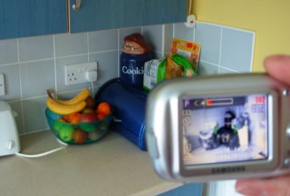
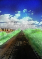
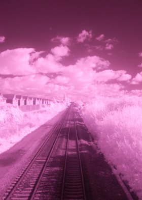 It is, of course, better to start off with a
good looking image and if you want that landscape to have
something that the competition doesn't have, an infra red
image will provide that. It is, of course, better to start off with a
good looking image and if you want that landscape to have
something that the competition doesn't have, an infra red
image will provide that.The image on the right is the same scene as the colour one above but with a Wratten 87 filter (although it was necessarily taken a few seconds later so that I could hold the filter in place). The camera is nothing special - it is a Samsung Digimax A400. With images like these, the light that is allowed through the filter (which looks black in normal light levels) lands on the sensor in the camera. At those long wavelengths, from around 750nm down to the sensor's lower limit of around 900nm, the red, green and blue filters have little meaning and the light reacts fairly evenly with them all (although we always end up with the magenta tint because one of the dyes in green layer isn't quite the same at these wavelengths. Note that for a dye to be green, either it has to be a single molecule that has two electronically separate sections so that one can absorb red and the other absorb blue; or, you use a mixture of two dyes, one that absorbs red and the other that absorbs blue. With the latter, you have more control over the absorption). Unfortunately, so the story goes, some people in Japan discovered that if you use an IR filter that tends to pass towards the 900nm part of the usable IR spectrum, thin layers of clothes disappear (or at least partly). And therefore the camera manufacturers use sensors that have the IR below around 700nm filtered out. So, we have our useful 700nm to 900nm band filtered by
an IR layer so that naughty people cannot remove layers
of clothing and the residual absorption of any colours
from visible light filtration (such as the red absorbing
dye in the green cells) and the image on the right is
what we get. |
|
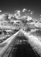
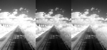 You can see that in the green layer
(remember that a Bayer mask has twice as many green cells
as red or blue cells), you get better contrast with the
clouds and sky. At 700-900nm, the blue sky is almost
black. You can see that in the green layer
(remember that a Bayer mask has twice as many green cells
as red or blue cells), you get better contrast with the
clouds and sky. At 700-900nm, the blue sky is almost
black.Also, you might note that leaves reflect a lot
of infra red light. This is because they absorb red and
blue for the photosynthesis process but don't need to
absorb IR or green. This is why they look green to us and
if you use colour IR film, they look magenta (IR and G
shifted up one colour so they become R and B). |
|
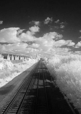 This is the IR shot taken from the green
layer. This is the IR shot taken from the green
layer.Shots like these cannot be derived from colour
images that haven't, at some stage, started off with IR. |
|
  One
other thing to think of is the fact that images like this
are so far from normal experience that they automatically
lend themselves to being messed around with. On the left,
you can see a pseudo-solarised version and on the right,
I've quickly added some false colour just to demonstrate. One
other thing to think of is the fact that images like this
are so far from normal experience that they automatically
lend themselves to being messed around with. On the left,
you can see a pseudo-solarised version and on the right,
I've quickly added some false colour just to demonstrate. |
Digital-Image Equivalent to Retinal Contrast Effect
However, you can get these extremes in an image where, instead of just trying to see more of the detail at each of the extremes, you actually want to preserve the impression of density change where the border between the two exists. This type of effect is usually seen where you have a shadow and want to see what is in the shadow as well as elsewhere but preserve the fact (although implicitly) that the difference in light levels between the highlight and the shadow is still quite high. In order to do this, we will need to expand the extremes as before but give the impression that we are extending them beyond the density range of the image, not within it. Just like in the image on the right. Of course, we cannot do this so let's look at the
image and also look at how the eye does it... |
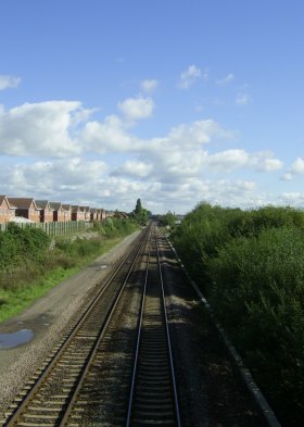
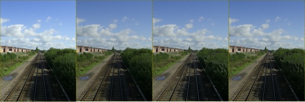
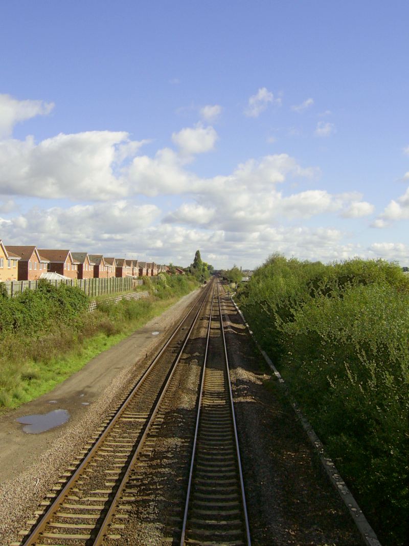
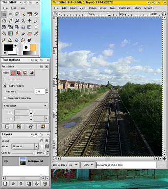 This is
the image - the main Derby to Birmingham Intercity line.
You can see that the sun is casting a definite shadow on
the railway line (looking north, this makes it a.m. so
there, we have proof that computer journalists get up
before noon). This is
the image - the main Derby to Birmingham Intercity line.
You can see that the sun is casting a definite shadow on
the railway line (looking north, this makes it a.m. so
there, we have proof that computer journalists get up
before noon).All of this will be done on the Gimp so you can do it for free on any operating system from Windows, BSDs and Linux to the Mac. Also, being the Gimp, you should be able to do this on Photoshop if you have gone and bought yourself a copy. For those not familiar with the Gimp, the main toolbox
is in the top left, the layers dialogue box is in the
bottom left and if you double-click on any of the tools,
you will get a context sensitive toolbox options dialogue
box open up for you. |
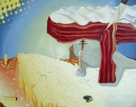 This is
how the effect we want is done in oil paintings. This is
how the effect we want is done in oil paintings.You
can see in this painting (if you look
closely, the lower layer - made from potato chips - is in
the shape of the north of Scotland with north pointing to
the left so that the east coast is at the top - you can
work out where the rocks and the pole in the middle is
and go and find out what it is if you want - this was
painted in 1983) that on the inside of the
shadows the surface is darker towards the edge. This
gives the impression that the shadow is a lot darker than
it really is. |
 You can see
it more clearly in this blow-up. The original painting is
a 30"x20" oil on canvas. You can see
it more clearly in this blow-up. The original painting is
a 30"x20" oil on canvas.So, how do we get our image to do this? Let's build a mask and take it from there. |
 First of
all, we need to know which bits are in highlight and
which are in shadow. First of
all, we need to know which bits are in highlight and
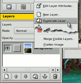
which are in shadow.So, duplicate the existing image so that we can mess around with it and still have something at the end of the process. To do this, right-click on the image in the Layers
dialogue and click on 'Duplicate Layer' in the menu. |
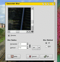 Next,
let's blur it. This might sound a little irrational but
this will make sense when you see what we are going to do
after that. So, right-click on the image and select
'Filters', 'Blur', 'Gaussian Blur...'. The default 5x5
blur will do - we just want to de-emphasise any small
highlights - this is an effect we want to see on larger
areas. Next,
let's blur it. This might sound a little irrational but
this will make sense when you see what we are going to do
after that. So, right-click on the image and select
'Filters', 'Blur', 'Gaussian Blur...'. The default 5x5
blur will do - we just want to de-emphasise any small
highlights - this is an effect we want to see on larger
areas. |
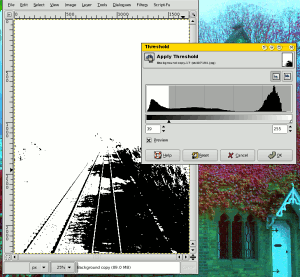 Next,
right-click on the image and select 'Layer', 'Colours',
'Threshold'. Next,
right-click on the image and select 'Layer', 'Colours',
'Threshold'.You can now select a level at which the image undergoes a transition from black to white and you can do this either by dragging the marker around or by scrolling the number at the left. You can also do this at the right if you want (or
instead of - which would make more sense but who is to
judge about uses you will have for this tool in the
future?) |
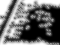
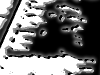
 As you can
see, you now have a fairly good outline of the shadows
but without loads of single-pixel areas that you will
necessarily get from noise if you don't blur it to start
with. As you can
see, you now have a fairly good outline of the shadows
but without loads of single-pixel areas that you will
necessarily get from noise if you don't blur it to start
with. |
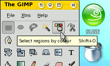 Next, you
need to select the 'Select regions by colour' tool. Next, you
need to select the 'Select regions by colour' tool.Click
on a black area of the image and all of that colour will
be selected. |
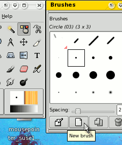 Following
that, click on the active brush in the tool box and click
on the 'New brush' button. Following
that, click on the active brush in the tool box and click
on the 'New brush' button. |
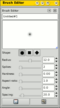 Now, you
want a brush that is very soft (ie, the density increases
all of the way to the centre) and is around the
right radius. Now, you
want a brush that is very soft (ie, the density increases
all of the way to the centre) and is around the
right radius.The radius to choose depends upon how big your image is, how big it is going to end up. Ideally, this value will be no bigger than the smallest 'blob' of darkness (or light) on your image. Next, click on the foreground colour and change it to a value of '7f7f7f' (or 127 for each of the RGB values - you might want to change this or experiment with it depending on your photograph), then clicking on 'OK'. Finally, right-click on the upper image in the Layers dialogue box and select 'New Layer...' and then make sure the 'layer Fill Type' is set to 'Transparency' before clicking on 'OK'. In the 'Layers' dialogue box, the new, transparent
layer should be selected. |
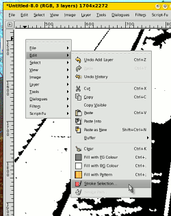 Now,
right-click on your image and then select 'Edit', 'Stroke
Selection'. Now,
right-click on your image and then select 'Edit', 'Stroke
Selection'.This function will draw a line around the selected parts of the image using the border of the selection as the vector. Selecting the area, changing the brush and changing
the colour have all been for this function. |
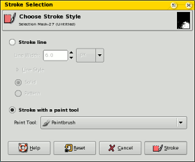 In the
dialogue box, you have a number of options about the
stroke line width and style but we want a line that uses
our brush, not one that is even and has hard edges. So,
select the 'Stroke with a paint tool' option and make
sure that 'Paintbrush' is selected. In the
dialogue box, you have a number of options about the
stroke line width and style but we want a line that uses
our brush, not one that is even and has hard edges. So,
select the 'Stroke with a paint tool' option and make
sure that 'Paintbrush' is selected.Note that instead of this, you could use any of: 'Pencil'; 'Paintbrush'; 'Eraser'; 'Airbrush'; 'Ink'; 'Clone'; 'Convolve'; 'Smudge'; or, 'Dodge/Burn' so this is quite a versatile and powerful tool. Click on 'Stroke'. |
 This draws
our fuzzy-edged, grey line around the selection boundary
like so... This draws
our fuzzy-edged, grey line around the selection boundary
like so...This is half of what we want with this new
mask. |
 Next, we
need to cut the selection (a slice half way through the
fuzzy line we have just drawn) to the clip board and then
paste it into a new layer. So, press [Ctrl][X] and then
press [Ctrl][V]. Next, we
need to cut the selection (a slice half way through the
fuzzy line we have just drawn) to the clip board and then
paste it into a new layer. So, press [Ctrl][X] and then
press [Ctrl][V].Instead of just pasting it into the current layer (it might well be in the wrong position any way), we right-click on the pasted layer in the 'Layers' dialogue and then select 'New Layer...'. Instead of giving us the new layer dialogue box, the
pasted layer gets its own layer which we can now position
using the move tool. |
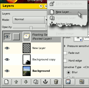
 To do
that, select the move tool and click on the eye icon for
the second layer down so that it disappears (this one is
already in the correct position because we haven't moved
it). To do
that, select the move tool and click on the eye icon for
the second layer down so that it disappears (this one is
already in the correct position because we haven't moved
it).Click on the other layer (clicking once on the text will select it without doing anything to it) and then, with the image zoomed in (maybe 200%), move that layer around (to select that layer, move the mouse over the image until the cursor changes from the normal mouse to one with an arrow and the 'NSEW' arrow cross) until its sharp edge matches the black and white mask below it. Next, click on the eye icon that you previously hid in the layers dialogue box - this will bring back the other layer. We now have all of the bits in place to change the
image. |
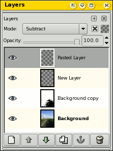 First of
all, click on the eye icon on the top two layers so that
they disappear. This leaves us with the black and white
image obscuring the original image. Click on the black
and white image in the Layers dialogue box to make it the
current layer. First of
all, click on the eye icon on the top two layers so that
they disappear. This leaves us with the black and white
image obscuring the original image. Click on the black
and white image in the Layers dialogue box to make it the
current layer.Next, change the mode to 'Subtract'. This will subtract the darkness from the shadow and subtract the lightness from the lit areas. Note that the resulting image will display some of the detail in the shadow but not the highlights - this is because when we made the black and white image using the 'Threshold' tool, we selected a threshold that was in the shadow part of the image density range. In order to make this image usable, we need to reduce this layer's effect. This is done by changing the opacity. For this type of effect, something between 10% and 25% will do - much more than this and the final image density range will be squashed up too much. Next, click on the eye icon to turn on the next layer up (the second one down - this is the highlight-side blurred border). We want to add this to our image so select 'Addition' as the mode and an appropriate level of opacity (remember that we used a 50% ink to start with) would be around 25% to 50% (ish) - this depends on your image. Finally, bring in the top layer (the layer that blurs
the border just inside the shadow). We need this to
darken the border so that the local contrast is
increased. So, select 'Subtract' as the mode and, as we
are already in shadows and close to the limit of density,
virtually any value will do 0% to 100%. |
 |
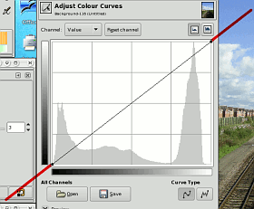
 Note that
at the moment, we haven't committed to any value of
anything. As this image processor works with layers, we
can adjust them in any order and tweak our image to the
way we want it. So, if you see anything that is not quite
right, you can change it. Note that
at the moment, we haven't committed to any value of
anything. As this image processor works with layers, we
can adjust them in any order and tweak our image to the
way we want it. So, if you see anything that is not quite
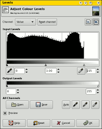
right, you can change it.When you have finished it, save the layered file as an .xcf.gz file (you do not have to be on a UNIX-like system to do this as the Gimp has .gz compression built into it). Next, press [Ctrl][D] to duplicate the image and then flatten it by right-clicking on one of the layers in the 'Layers' dialogue box and then clicking 'Flatten'. Now, right-click on the image and select 'Layers',
'Colours', 'Levels' and drag the image density markers to
the ends of the image density or click on 'Auto'. You can
treat the image like any other image by tweaking its
saturation, curves and so on. |
| This is the final result... |
 |
| One thing that is worth noting is that
you can actually use two different-sized paintbrushes for
your mask - discarding the half that you don't need in
each case. Another point is that you can also use the mask to divide up your original image so that you can process each part differently - density range, colour correction ... Note that the area in the shadow is lit by the diffuse blue light from the blue part of the sky whereas the areas in the sunlight are lit with a light that has had that blue taken out of it (it goes to make up the blue of the rest of the sky for other observers). |
 In issue
247, I showed you how to make an image with extremes of
density with a void in the range could be modified so
that you can see more of each of the two extremes - in
that case, a bright sky and a dark corn field.
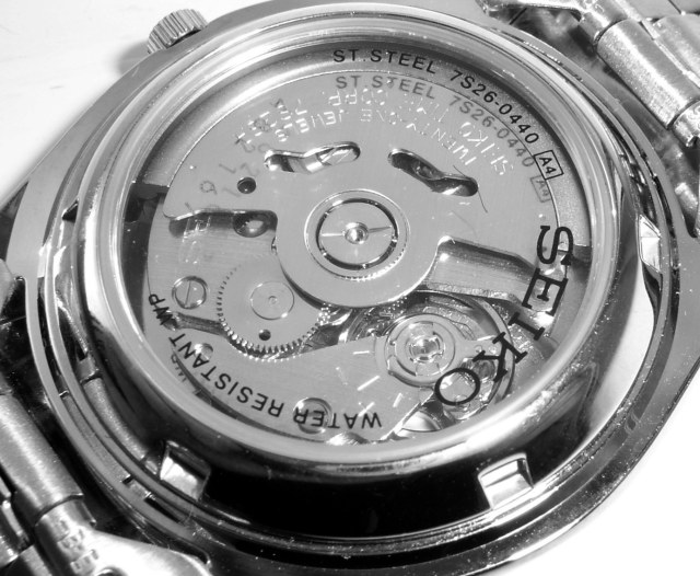
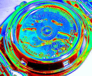
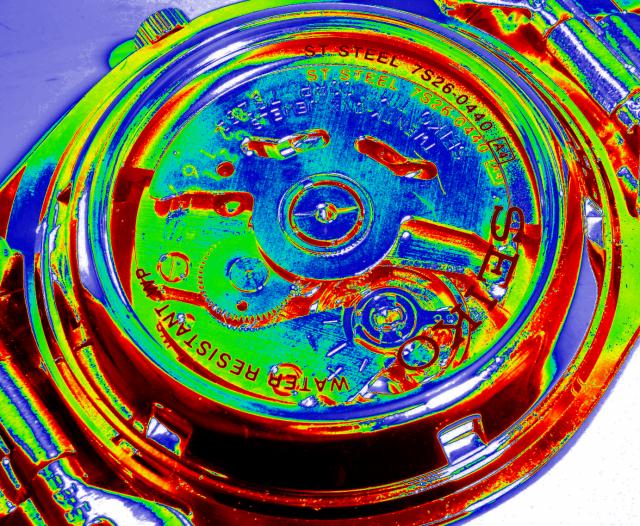
In issue
247, I showed you how to make an image with extremes of
density with a void in the range could be modified so
that you can see more of each of the two extremes - in
that case, a bright sky and a dark corn field.False colours from the GIMPImages with hidden detailGood black and white images, such as the glass-backed
watch below, have a good range of densities and are nice
and clear. However, in some imaging applications, you
need to be able to see some of the details in what would
otherwise be interpreted as areas of fairly uniform grey. |
 |
So, how do you get to see these areas
expanded? Your eyes are a lot more sensitive to changes
in hue than to changes in density.Importance of hue sensitivity:You can see this already with analogue colour TV signals. The colour information is transmitted as two signals on a single carrier using a technique called Double Sideband Suppressed Carrier Modulation (or DSB) - if it was transmitted on two different carriers, you would get interference patterns in the output colour signal. This all sounds a bit complicated but essentially, if you modulate a carrier with a signal, you get the carrier along with an upper sideband and a frequency-inverted lower sideband. This is normal AM (Amplitude Modulation) and you can decode it with a non-linear circuit such as a diode in a crystal set. However, you are transmitting a lot more power than you need to with AM. You can get rid of the carrier by filtering it out and this leaves the upper and lower sidebands (known as 'DSB'). You can remove half of this again by filtering out the lower sideband thus leaving a single sideband (SSB). To decode a suppressed carrier modulated signal, you need to inject the carrier back into the signal again and threat it like a normal AM signal - just like a crystal set with carrier injection. An SSB signal and DSB signal will reproduce the original signals quite well. However, it is when things start to go wrong that it gets interesting. With an SSB signal, if your decoding carrier drifts off-frequency, the decoded signal either has its frequencies added to or subtracted from (depending on whether the shift was higher or lower than the original) with negative frequencies wrapped around 0Hz if it was lower than. Note that the frequencies are added to/subtracted from and not multiplied, so music (where a key shift is a multiplication of frequencies) will sound increasingly horrendous but voices just sound increasingly odd. With a small shift (say 4Hz) a sound system can be prevented from feeding back and when this technology was first implemented, some groups used it with feedback as an effect - Pink Floyd at the end of 'Echoes' for example. With a DSB signal, if the decoding carrier merely goes out of phase, the signal is cancelled (completely at 90 degrees). Therefore it is important for a DSB signal to be decoded with the correct phase - not just the correct frequency. However, this can be used in an interesting way. If you send one signal down a carrier, you can send another signal down a carrier of the same frequency but phase-shifted by 90 degrees. Once you have removed your carriers, you have a composite signal that you can broadcast. At the other end, you pick up the signal but have to know the phase of the signal to decode it properly. This is done at the beginning of every scan line with a 'colour burst signal'. This lets the decoder know the phase of the signal and it is able to decode it properly - using the normal decode-carrier for one signal and a decode-carrier that is phase-shifted by 90 degrees for the other signal (the carrier being 90 degrees out for one signal ensures that it is cancelled out. That's what I call clever - especially as this was all designed so that black and white receivers could still pick up the signal and process it correctly for a black and white set.). So, what can go wrong now? The signal can have an effective path length change usually caused by things moving and reflecting the signal before it gets to the television set. This can cause a phase shift that will change the hue.
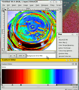
One thing you can do - should you ever get the chance - is to look at the colour of the beam in a UV-Vis spectrophotometer. Put a mirror (or something shiny like a spatula) in the beam so that it is reflected upwards. Next, make sure that the dial is somewhere between 700nm and 420nm. The light levels are low (they have to be for it to work linearly) so you should not damage your eyes unless you have some obscure and previously unknown medical condition because your eyes will already have seen light at well above these intensities during normal, everyday living. Now, look into the beam and turn the dial until you see the same hue as sodium light (the yellow streetlights that make any colour just a shade of yellow). You see these lights all of the time so you will surprise yourself as to how accurately you can remember their colour. When you look at the dial, you will see that it is on (or very close to) 589.3mn (5892.9 angstrom units). If your memory of hue is that good then your immediate perception of it when next to something to compare it with is even more important. So, hue is important as our eyes are very sensitive to changes in it. The next question is how do we add it to a monochrome image such as the one above? Creating a false-colour gradientIn the Gimp, you could HSV-decompose an image and put the V layer into the H layer then flood-fill the S layer with white and when you recompose, you get a false-colour image. However, although this works, it is not particularly flexible or dynamic - there is no way of optimising it in real time (you can mess around with the gamma and so on for the H layer but you have to do several steps to see the result). As always (or at least most times), there is more than one way to do it and with the Gimp, this is fairly easy. |
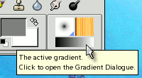 Click on the gradient in the toolbox (bottom
right) and... Click on the gradient in the toolbox (bottom
right) and... |
 ...the 'Gradients' dialogue box will open
up. ...the 'Gradients' dialogue box will open
up.You can use an existing gradient (skip to 'Using and adjusting the gradient') but you can make it more interesting. Click on 'New gradient' and... |
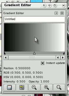 ...the gradient editor opens up ...the gradient editor opens upThere are several important areas to this dialogue box:
Make sure that the checkbox is checked. Next, give it a title - I'm just going to call it 'temp' - then hit the 'save' button. You will see the gradient appear in the Gradients list
box in the Gradients dialogue box. Now, - as that is the
current gradient - you can click on it in the list box if
it isn't already for some reason - any changes you make
to the gradient will appear automatically in the gradient
in the Gimp toolbox. |
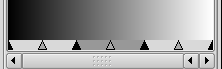
| So, let's create a fairly basic gradient
that goes from black, through the rainbow, to white.
On the next dialogue box, you select the number of
segments to split it into - here, we need three - so move
the slider to 3 and click on 'Split'. |
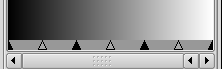 Our gradient now looks like this. You can see
that the black arrows separate the sections and the grey
arrows divide the sections. Our gradient now looks like this. You can see
that the black arrows separate the sections and the grey
arrows divide the sections.Let's click on the middle
section. |
 This is what it looks like and you can see
that the other two sections are not selected. This is what it looks like and you can see
that the other two sections are not selected. |
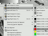 Now, we can edit the colours so, let's start
off with the left hand colour. Now, we can edit the colours so, let's start
off with the left hand colour.Right-click on the
highlighted segment of the gradient. Select 'Load Left
Colour From' and then a colour. Here, we are going to use
the red so just click on that. There are a number of
other options but we'll come to them later. |
 Our gradient now looks like this... Our gradient now looks like this...Let's
repeat the process with the other side. So, right-click
on the highlighted segment of the gradient and select
'Load Right Colour From' and then blue. |
 Our gradient now looks like this... Our gradient now looks like this...We've
got the end colours the same but remember that we wanted
the colours of the rainbow between. We could do this by
dividing up the red-blue segment and then assigning
left/right colours to them all but there is an easier
way. |
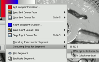 Right-click on the gradient and select
'Colouring Type for Segment'. You now have a choice: Right-click on the gradient and select
'Colouring Type for Segment'. You now have a choice:
Select HSV (anti-clockwise hue). |
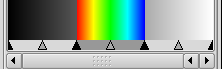 The gradient now looks like this... The gradient now looks like this...Now, we
can concentrate on the areas to the left and right of our
central rainbow. |
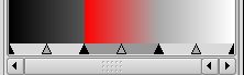
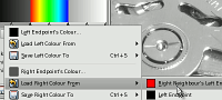 So, click on the left segment to highlight
it. The left segment's left endpoint is already the
correct colour so right-click on the segment and then
click on 'Load Right Colour From', 'Right Neighbour's
Left Endpoint. So, click on the left segment to highlight
it. The left segment's left endpoint is already the
correct colour so right-click on the segment and then
click on 'Load Right Colour From', 'Right Neighbour's
Left Endpoint. |
| The opposites are true of the right
segment so click on the right segment to highlight it.
The right segment's right endpoint is already the correct
colour so right-click on the segment and then click on
'Load Left Colour From', 'Left Neighbour's Right
Endpoint'.
|
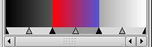
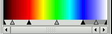 You can move the segment dividers so that it
is spread out more evenly like so... You can move the segment dividers so that it
is spread out more evenly like so...Now, we are ready to use the gradient. |
|
 If you are going to do a lot of tweaking,
you can click on the tear-off (as you can on any menu
stage) or create your own shortcut key sequence if you
want to. If you are going to do a lot of tweaking,
you can click on the tear-off (as you can on any menu
stage) or create your own shortcut key sequence if you
want to. |
 Our gradient now gives us this... Our gradient now gives us this... |
 If you decide that there is some transition
in the scale that you want to tweak - say change a colour
or where in the scale a feature of your gradient should
be, this is what you need to do: If you decide that there is some transition
in the scale that you want to tweak - say change a colour
or where in the scale a feature of your gradient should
be, this is what you need to do:
|
| Once you have finished, you can end up with something like this. |
 |
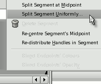 Right-click on the
bar at the bottom and select 'Split Segment
Uniformly...'.
Right-click on the
bar at the bottom and select 'Split Segment
Uniformly...'.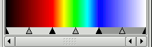 Your gradient should now look like this...
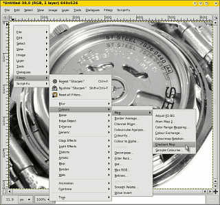 Using and adjusting the gradient
|
 Online
Drawing
Online
DrawingLithium Ion Batteries
In order to prevent a memory, charge the battery fully and then use it until it has run down fully before you recharge it - using it only ever in a full charge/discharge cycle. However, it doesn't take an experienced laptop user to notice that this type of use is more like mobile phone use that laptop use. One thing that is worth remembering though is that Lithium
Ion (or 'LioN') batteries don't suffer from memories
so partial charge-cycling is not an issue. |
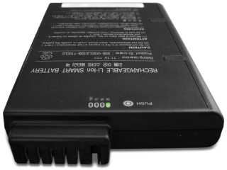 However,
it is not all rosy for LioN batteries. One of the
problems is that the chemicals inside degrade and they do
so independently of use. This is in effect the clock
ticking for the one way trip to the recycle bin that
starts as soon as the battery is manufactured - never buy
a second hand LioN battery. However,
it is not all rosy for LioN batteries. One of the
problems is that the chemicals inside degrade and they do
so independently of use. This is in effect the clock
ticking for the one way trip to the recycle bin that
starts as soon as the battery is manufactured - never buy
a second hand LioN battery.Fortunately, the rate at which they degrade is to some extent dependent upon temperature. So, whilst your current, dead battery is no longer fit for use, this is what you need to do with your next battery: At 25C, a laptop battery will lose around 20% of its charge per annum with this rising to around 35% at 40C - a normal operating temperature for a Windows machine (try BSD or Linux for a cooler machine). If you are going to have your laptop switched off, or run it off the mains for a protracted period of time, take the battery out and store it somewhere cool. Ideally, you should have it at around 40% charge and keep it in the refrigerator (sealed in a plastic bag so that moisture cannot get to it) although you must not let it freeze. At around 0C, it loses only two per cent per annum at a 40 per cent charge. However, when you take it out of the refrigerator, let it get back to room temperature before you take it out of the bag so that you don't get moisture condensing on it. So, to make it last a long time, keep it in the refrigerator in a plastic bag at 40% a charge and only use it for as short a time as possible. That way, it will last as long as it can. The next question is why don't the manufacturers make it clear that that is what you need to do and tell you how long your battery will last under various sets of conditions you are likely to encounter? |
 With many
types of rechargeable batteries, only partially
discharging a battery, recharging it fully, then
repeating this behaviour will create a 'memory' - the
battery will only discharge to that level after a while.
With many
types of rechargeable batteries, only partially
discharging a battery, recharging it fully, then
repeating this behaviour will create a 'memory' - the
battery will only discharge to that level after a while.