PC Plus HelpDesk - issue 243
This month, Paul Grosse gives you more insight into
some of the topics dealt with in HelpDesk
|
 |
HelpDesk
Multiple Drop-ShadowsIf you have two images that represent two flat objects and you want to give them a real look by over-lapping them and using drop shadows, you need to give a little thought to just how you do it. |
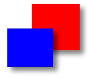 There are plenty of examples on the Internet
where people have just applied a drop shadow to every
overlapping image and you end up with nonsensical
shadows. By that, I mean that if your shadow offset is,
say, 8,8 for your bottom image and relative to that it is
8,8 for your top image (the red and blue rectangles
respectively), the top image is now 16,16 from the
background and therefore should have a 16,16 displacement
for the part of the shadow that belongs to the
background. There are plenty of examples on the Internet
where people have just applied a drop shadow to every
overlapping image and you end up with nonsensical
shadows. By that, I mean that if your shadow offset is,
say, 8,8 for your bottom image and relative to that it is
8,8 for your top image (the red and blue rectangles
respectively), the top image is now 16,16 from the
background and therefore should have a 16,16 displacement
for the part of the shadow that belongs to the
background. |
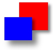 In effect, this is what it should look like.
The blue rectangle is twice as far away from the
background as the red one so its shadow on the background
needs to reflect that (if you'll excuse the pun). In effect, this is what it should look like.
The blue rectangle is twice as far away from the
background as the red one so its shadow on the background
needs to reflect that (if you'll excuse the pun).So, how do we go about doing that? |
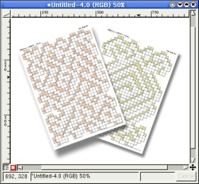
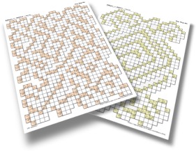
 I've started off with two Kakuro puzzle
images and given them a border of 20 pixels each. To do
that, in the GIMP, right-click and select 'Image'/
'Canvas Size' and the 'Set Canvas Size' dialogue box
opens up. In there, add 40 to the new width and height
and under offset, make it 20 and 20. Click on 'OK' and
the image will grow with your original image centred (the
border is transparent). I've started off with two Kakuro puzzle
images and given them a border of 20 pixels each. To do
that, in the GIMP, right-click and select 'Image'/
'Canvas Size' and the 'Set Canvas Size' dialogue box
opens up. In there, add 40 to the new width and height
and under offset, make it 20 and 20. Click on 'OK' and
the image will grow with your original image centred (the
border is transparent).Next, make sure that your background is the colour you want to extend your image with (white in this case) and then, in the 'Layers, Channels & Paths' dialogue box, right-click on the image in the list (as opposed to the drop-down combo at the top) and from the menu, select 'Flatten Image'. Following that, you have the option of resizing/scaling the images if you want to (say, if they were too big - I resized these images as I knew that the final images that I wanted wasn't going to be anywhere near to how big the originals were) Then, create a new, blank image that is going to be bigger than the one you are likely to need at the end. Remember that you can always crop down the image but you will find it very difficult to add to it later on if your drop-shadows have spilled over the edge.. After that, create a new, transparent layer in the new image by right-clicking on the image list in the 'Layers, Channels & Paths' dialogue and selecting 'New Layer' from the menu. Going to one of the images that you have resized (you can press [Alt][Tab] to do this), press [Ctrl][A] to select all and then [Ctrl][C] to copy it into the clipboard. To deselect the image, press [Ctrl][Shift][A]. In the new image, make sure that this new layer is selected, click on the image and press [Ctrl][V] to paste the image into the new layer. At this stage, you can rotate the images using the rotate transform tool. Next, either click on the rest of the image or on the anchor button in the 'Layers, Channels & Paths' dialogue box. |
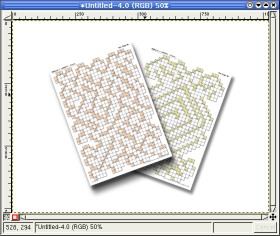
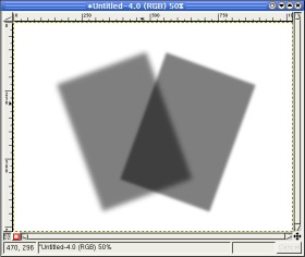
 Repeat the create new transparent layer,
copy, paste, rotate and position process until you have
your image looking the way you want it. Repeat the create new transparent layer,
copy, paste, rotate and position process until you have
your image looking the way you want it.Remember that if you want to use a perspective transformation after the drop shadow, you should move downwards any image layers that are lower - here, I moved the Kakuro on the right down by 8 pixels. Your image should now look something like the one on the right. |
 Next, you need to add the drop-shadows. You
can see that when you add a drop shadow, it creates an
extra layer underneath the object that you have used to
create the shadow with. Essentially, it takes the outline
of the object (here, a transparent layer with dynamic
text on it), creates a new layer, uses the outline from
the upper layer to create a mask, applies any blurring
you have specified, fills it in with the colour you have
specified and then offsets it by the amount you have
specified, setting the transparency of that new layer to
the amount you have specified. Next, you need to add the drop-shadows. You
can see that when you add a drop shadow, it creates an
extra layer underneath the object that you have used to
create the shadow with. Essentially, it takes the outline
of the object (here, a transparent layer with dynamic
text on it), creates a new layer, uses the outline from
the upper layer to create a mask, applies any blurring
you have specified, fills it in with the colour you have
specified and then offsets it by the amount you have
specified, setting the transparency of that new layer to
the amount you have specified.You can do all of this by hand but it is easier if you let the dialogue box handle it for you. |
 Here, I have taken the layer with the right
hand Kakuro and used x=8, y=16, blur=15,
transparency=50%. The reason for having the y
displacement twice the x is that we are going to apply a
perspective transformation later on (otherwise you might
want to have them both as 8). Here, I have taken the layer with the right
hand Kakuro and used x=8, y=16, blur=15,
transparency=50%. The reason for having the y
displacement twice the x is that we are going to apply a
perspective transformation later on (otherwise you might
want to have them both as 8).Next, I have applied the same parameters to the left Kakuro. Normally, people would leave it like that and you would end up with an image like the first red/blue example at the top of the page. We can do better than that. So, next we make sure that our left Kakuro is still selected and apply another drop shadow. This time, we double the x,y and blur to 16, 32 and 30 respectively. Note that the reason they are doubled is because the displacement and blur for the left and right images are the same as each other. If we wanted to create the impression that the distance between the left and right was twice that of the the distance between the right and the background, we might use: 4, 8, 10; 8, 16 15; and, 12, 24, 25 respectively, instead. |
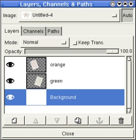
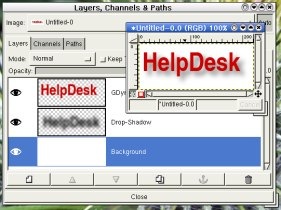
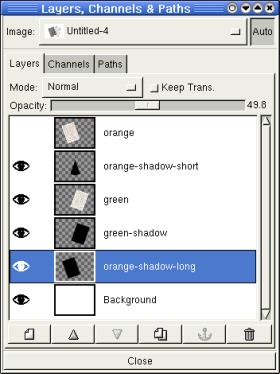
 This is what the image looks like in the
Layers dialogue. You can see that the left (orange)
Kakuro has two shadows. One of these is for the
background (the one with the greater offset and the
larger blur) and the other is for its shadow on the other
Kakuro. When I made these drop shadows, I double-clicked
on the layer's label in the Layers ... Paths list and
typed in the new name. Doing this makes it all easier to
track later on. This is what the image looks like in the
Layers dialogue. You can see that the left (orange)
Kakuro has two shadows. One of these is for the
background (the one with the greater offset and the
larger blur) and the other is for its shadow on the other
Kakuro. When I made these drop shadows, I double-clicked
on the layer's label in the Layers ... Paths list and
typed in the new name. Doing this makes it all easier to
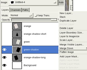
track later on.Next, we want to drag the 'orange-shadow-long' shadow layer down the list so that it is with the 'green shadow' - both of these shadows fall on the 'Background' layer - ie, they are under the 'green' layer. So, just drag that layer down the list and drop it where you want it (see the next image below). Next, we want to turn off the left image (orange) so that we can edit the shadow that it casts on the image (green) below it. So, click on the eye for the top layer (orange) so that it turns off. |
 Now, we can see the shadow case on the right
hand Kakuro by the left one. In addition to this, it
casts a shadow on the left image's (orange) shadow so we
need to remove this as the object only has one shadow. Now, we can see the shadow case on the right
hand Kakuro by the left one. In addition to this, it
casts a shadow on the left image's (orange) shadow so we
need to remove this as the object only has one shadow.So, select the 'Select Regions using Bezier Curves' tool and start marking out the outline of the area we are going to remove. As the objects have straight edges and sharp corners, this is fairly easy. With the area of the left-hand Kakuro marked out, click the last point on where you set the first (to close the outline) and then click inside the outline to turn it into a mask. In the image on the fright, we can see what that mask looks like when you press the ruby mask button (bottom left of the image window) The area that is left white is what we can edit. If you have turned your ruby mask on, turn it off either by clicking on the button next to it (if you are using an older version of the GIMP) or click on the same button again to remove it. Next, press [Ctrl][X] to cut that part of the shadow away. This will leave the transparent background. |
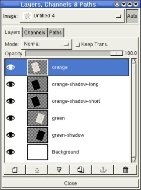
 Here, you can see what the image layers look
like. Here, you can see what the image layers look
like.The 'orange-shadow-short' layer has the now irregular shadow that has been cropped to fit onto the top of the 'green' layer. One of the problems that you will see with irresponsible use of drop-shadows is that where two drop-shadows overlay, their intensity is doubled. This is caused by the fact that image editors edit flat images and drop shadows try to imitate this transition into reality - in effect, normal work, synthesising images with an image editor is about presenting images whereas drop-shadows are about representing things: the transition from presentation to representation. In real life however, when one thing casts a shadow, anything that falls inside its shadow (in the umbra) cannot 'add to the darkness' of the shadow. (Of course, you could say that with more of its view of light sources obscured, it will to some extent be darker but here, we are talking about image processors and not ray tracers.) |
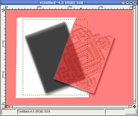
 So, turn off everything except our two
shadows and you should end up with something that looks
like what we have on the right. So, turn off everything except our two
shadows and you should end up with something that looks
like what we have on the right.Next, we need to click on the layer for each of them and turn up the opacity to 100 per cent. (Note that if you wanted to imply that the images that form these shadows (in this case the two Kakuro puzzles) were not 100 per cent opaque themselves, you could use less than 100 per cent - if they were 10 percent transparent, you could argue that around 90 per cent opacity was a good value to use for their shadow's opacity. This is so that you get some extra darkening where the shadows overlap.) |
 So, having changed the opacity, right-click
on the upper layer and select 'Merge Down'. So, having changed the opacity, right-click
on the upper layer and select 'Merge Down'.This layer will now merge with the other shadow layer below it and the most opacity it can have is 100 per cent. Next, we change the opacity of the shadow layer back to 50 percent (or whatever you had it set on before) and your shadow will look uniform with a nice blur at the edge which changes for the distance of the Kakuro that produces it. |
 When you turn on all of the other layers,
this is what it looks like. When you turn on all of the other layers,
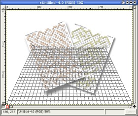
this is what it looks like.Now, we want to use a perspective transform so select that from the toolbox and click on the image. |
 Pull the top-left and -right corners down to
where you want them to go and then click on the Transform
button. Pull the top-left and -right corners down to
where you want them to go and then click on the Transform
button. |
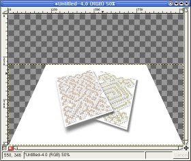 The image should now look like this. The image should now look like this.If you haven't got the perspective you are happy with, you can press [Ctrl][Z] to undo the last step (or repeatedly for the last steps until you are where you want to be - pressing [Ctrl][R] steps forwards through each step again. Next, we want to crop the image - this is one of the reasons why we used a new image that was so much larger than we might otherwise have needed. |
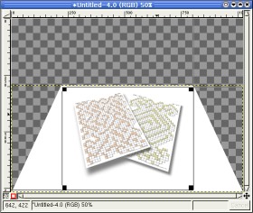 Select the crop tool and get the bit you
want. If you want a tightly cropped image, do the
following two steps but first, crop it fairly loosely. Select the crop tool and get the bit you
want. If you want a tightly cropped image, do the
following two steps but first, crop it fairly loosely. |
 Next, use the 'Select contiguous regions'
tool (like the magic wand) and select the background
(make sure that Threshold is set to zero - you can edit
this by double-clicking on the tool button in the main
window which will make a tool options dialogue box pop
up). Next, use the 'Select contiguous regions'
tool (like the magic wand) and select the background
(make sure that Threshold is set to zero - you can edit
this by double-clicking on the tool button in the main
window which will make a tool options dialogue box pop
up).Next, press [Ctrl][I] to invert the mask (now, you have only the important parts of the image highlighted). If your images are the same colour as the background, as they are here, you can find that the contiguous region includes part of your images. So, use the 'Select Rectangular Regions' tool, hold down [Shift] and drag another area to add to the top of the image so that it isn't cropped out. |
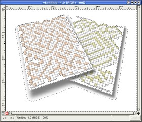
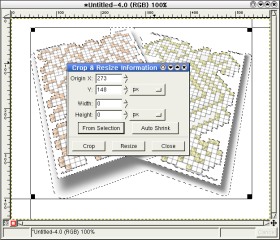 After that, click on the crop tool again and
then just click on the image. After that, click on the crop tool again and
then just click on the image.Now, click on the 'From Selection' button and you will have a very tight crop. Click on 'Crop and you have your image. |
 And this is it. And this is it.Note that if you want to produce a transparent background image, make sure that the background is transparent (you can create a new, transparent layer and then delete any non-transparent background layer if you need to - you will probably need to have a white background for when you are editing your drop shadows so that you can see what you are doing or, use a different transparent background representation - see Properties dialogue for that) and then, instead of flattening the image, merge each layer down until you have only one layer. This can be saved as a PNG file so that your drop shadow is saved. Also, save the background colour (make sure that it is the same as the colour of the web page you will be using) so that Internet Explorer can cope with the image otherwise you might end up with a black box surrounding your image. |
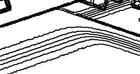 The image on the right is the
portion of the image where the two shadows merge. It has
been blown up, posterised and then put through an edge
detection process so that you can see what are
effectively arbitrary contours showing how the two
shadows merge. The image on the right is the
portion of the image where the two shadows merge. It has
been blown up, posterised and then put through an edge
detection process so that you can see what are
effectively arbitrary contours showing how the two
shadows merge.As you can see, it works quite nicely. In reality, the two shadows would not add to each other when inside the umbra which is where most combined drop-shadows fall down - this would be as dark as only one of the shadows, unless (there's always something isn't there) the objects that cast the shadows are not totally opaque. If there is light coming through the objects then their shadows will add up to some extent - paradoxically adding together mostly when they are totally transparent. |
Nice processes
You can make an existing process nicer by using the renice command or you can use a command like 'setpriority' in your own programs. |
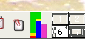 In the image on the
right, the left bar is the CPU/paging load. The red
segment is the Kernel, the yellow is the user load and
the green is the nice load. The total load is 100 per
cent but because the nice load has a lower priority to
the things that I want to do with the computer as a user,
I have priority. As a result, I can do word processing,
image processing and anything that I normally do and the
nice processes just make way for it all.
In the image on the
right, the left bar is the CPU/paging load. The red
segment is the Kernel, the yellow is the user load and
the green is the nice load. The total load is 100 per
cent but because the nice load has a lower priority to
the things that I want to do with the computer as a user,
I have priority. As a result, I can do word processing,
image processing and anything that I normally do and the
nice processes just make way for it all.Global warming in a Flash
However, Flash has also caught the eye of advertisers and they seem to like it. It provides smallish files that download quickly so what is wrong? The answer is that the difference between a static image or even an animated GIF is that a flash advert uses a fair amount of processing power. If this was used to produce an effect that was central to the website's reason for existing then fair enough but just for an advert? That is no justification. So, how much of a resource impact does one of these waste of efforts steal? It can be difficult to see on a Windows machine but on a Linux box, the power meter is clearly visible at all times and as this little monster cycled around, I could see it producing an overall level with some quite large spikes. Using top to monitor the specific plug-in, it took around 9.5 seconds per minute of processor time on a 600MHz processor so that is equivalent to a 95MHz processor. When you multiply this by the number of adverts viewed on the planet each day, you start to wonder just how much of a contribution to global warming it is responsible for. |
 Although Flash breaks
the basic Internet principle of graceful degradation and
without alternative methods of interacting with a site, a
company can fall foul of the Disability Discrimination
Act, if you are running a media site, it can look good
and is a fairly efficient way of conveying images when
compared to other methods.
Although Flash breaks
the basic Internet principle of graceful degradation and
without alternative methods of interacting with a site, a
company can fall foul of the Disability Discrimination
Act, if you are running a media site, it can look good
and is a fairly efficient way of conveying images when
compared to other methods.