PC Plus HelpDesk - issue 262
 |
This month, Paul Grosse gives you more
insight into some of the topics dealt with in HelpDesk.
|
 |
HelpDesk
|
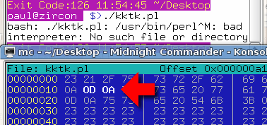 End-Of-Line codes
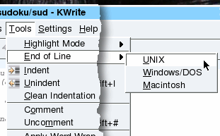 There are
two easy ways to get around this:
There are
two easy ways to get around this:
|
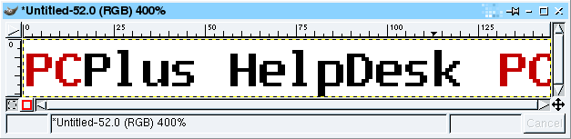 First of all, you need to create the text or
other image(s) that you are going to use. Here, we'll
display some text and have that scroll by us. First of all, you need to create the text or
other image(s) that you are going to use. Here, we'll
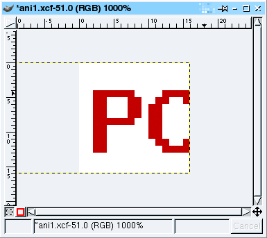
display some text and have that scroll by us.This is
an image that is 16 pixels high. At the end of it, we
have the first part, up to and including the 15th pixel.
If this was not included, the image would jump from some
empty space at the end to the first frame - here, we feed
into the first frame so that it looks nice and
continuous. |
 Next, copy the image (usually by pressing
[Ctrl][D]) and then use the crop tool to make it a 16x16
square at the far left (you'll find it useful to zoom in
by a factor of 10 or so). This will now be the first
frame of the animated .GIF file. Next, copy the image (usually by pressing
[Ctrl][D]) and then use the crop tool to make it a 16x16
square at the far left (you'll find it useful to zoom in
by a factor of 10 or so). This will now be the first
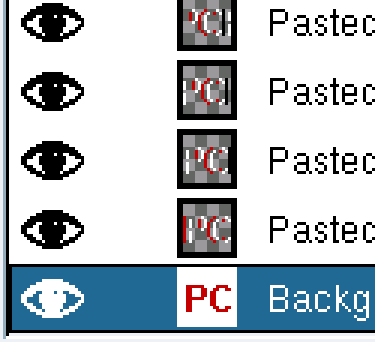
frame of the animated .GIF file.Next, click on the long image again and then, in the Layers dialogue box, drag its image and drop that on the square image. This has now become the top layer. Use the move tool to make it displaced one pixel to the left of the image underneath it. You can check that this is the case either by clicking on the Eye logo in the Layers dialogue or by changing its opacity (remembering to change them back afterwards, of course). Once you have a full strip in your image, you can just drag that from the Layers dialogue and drop it in the image - each one adds a new top layer that you can then move. Once you have got to the last frame (or even before, if you want to see how it is getting on), you can test out the layered image by right-clicking on the image and then selecting 'Filters', 'Animation', 'Animation Playback...' and pressing 'Play' in the dialogue. If it all looks the way you want it, you can trim it
down to size because at the moment, almost all of the
layers are too long. |
 The last image in the sequence looks like
this. You can see from the dotted line that the rest of
the image goes off to the left. Ideally, you want to get
rid of this. You can either: go through each image on the
Layers dialogue box, clicking on 'Layer to imagesize';
or, The last image in the sequence looks like
this. You can see from the dotted line that the rest of
the image goes off to the left. Ideally, you want to get
rid of this. You can either: go through each image on the
Layers dialogue box, clicking on 'Layer to imagesize';
or, |
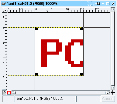 you can select the crop tool from the
toolbox. you can select the crop tool from the
toolbox.Select the whole of the 16x16 image and click
on 'Crop'. |
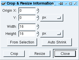 This will cut every layer down to size, all
in one go. This will cut every layer down to size, all
in one go.Next, convert it to a palette-based image by
right-clicking on the image and selecting 'Image',
'Mode', 'Indexed' and... |
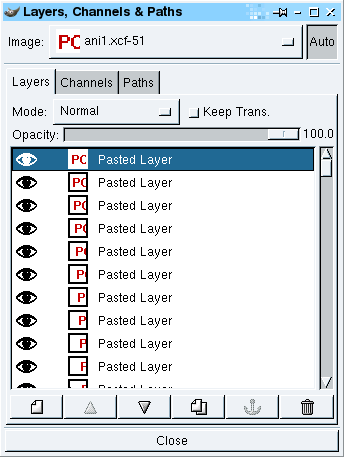
 Next, we can produce an optimised animated
gif by right-clicking on the image and selecting
'Filters', 'Animation', 'Animation Optimize' which
produces a new image. Next, we can produce an optimised animated
gif by right-clicking on the image and selecting
'Filters', 'Animation', 'Animation Optimize' which
produces a new image.You can see from the layers
dialogue screenshot on the right that each layer only
includes the changes that it needs to make from the
previous layer - this keeping down the image size and
processing that is needed in order for the image to work. |
 Finally, we have our image. Right-click on
the image and select 'File', 'Save As...' then type in a
name that ends with '.gif' such as 'anifavi.gif' and then
click on 'OK'. Finally, we have our image. Right-click on
the image and select 'File', 'Save As...' then type in a
name that ends with '.gif' such as 'anifavi.gif' and then
click on 'OK'. |
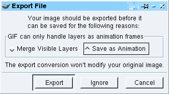 Now, you need to let the program know that
you do want to save it as an animation so click on 'Save
as Animation' and then on 'Export'. Now, you need to let the program know that
you do want to save it as an animation so click on 'Save
as Animation' and then on 'Export'. |
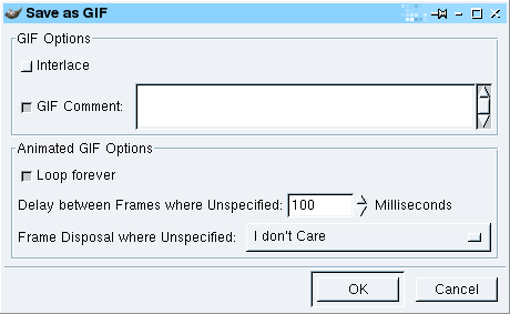 The next dialogue box allows you to specify
how you want any non-specified layers to be dealt with.
If you have followed these instructions, you shouldn't
have any of these so just click on 'OK'. The next dialogue box allows you to specify
how you want any non-specified layers to be dealt with.
If you have followed these instructions, you shouldn't
have any of these so just click on 'OK'. |
 And this is how it should look. If your
browser supports favicon.ico images then this should
work. And this is how it should look. If your
browser supports favicon.ico images then this should
work.You should, of course, remember that you can
specify a normal icon and an icon file for shortcuts as
well so your head section should look like this... <link rel="shortcut icon" href="favicon.ico" > <link rel="icon" href="animated_favicon1.gif" type="image/gif" > |
Never work with children and animalsPhotography using photographic film that was then developed required a certain amount of skill - especially when using medium format - because darkroom skill had to be earned. If you wanted to adjust the density of a certain part of the image, you would be better off changing the lighting when you took the original image. On the whole, you would take care to make sure that you had the correct focussing, lighting and aperture before you took the shot. This is fine if you have a stationary subject - you are taking a picture of a USB drive or something - or a co-operative one - an adult or group - but if the subject matter is moving unpredictably, you might just have to take a shot and hope for the best. This is where image processing software comes in. Unfortunately, there is a tendency for people to take dozens of poor shots and then hope that they can use Photoshop, PaintShop Pro or The GIMP to get something reasonable out of it. If they can't, they then add one of the special effects (make it look as though it is printed on canvas or an old photograph) so that the effect messes it up more than the original photograph was messed up, thus disguising the fact that it was not a very good image to start with. So, assuming that you had a small furry kitten that was not going to sit still and you had to take a photograph of them, what can you do? ... |
Correcting photographs for densityWe're going to have a look at two pictures of a kitten and make them look all right. These are things that you can do in the darkroom if you want but as the images are already digital, we're going to do it with an image processor (or three). They are quite simple things to do to images that
haven't got a lot wrong with them in the first place -
making the picture better to look at by correcting issues
that are a result of lack of opportunity (rather than
just adding meretricious effects to a picture that is not
particularly good to start with, in the hope that the
effects will distract the viewer from the poor
photography). |
|
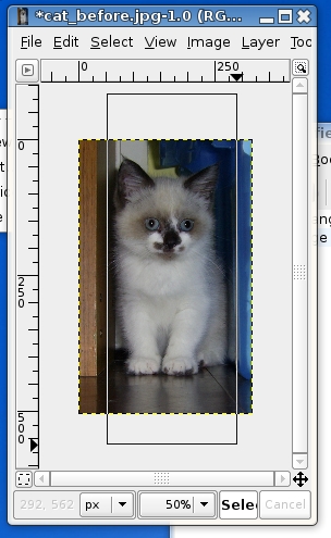
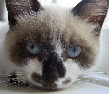 Here is the first image. It is of the kitten
lying down on a window ledge - she had just woken up and
there wasn't a chance to get a light reflector on the
left (you can't see one in the kittens right eye). Here is the first image. It is of the kitten
lying down on a window ledge - she had just woken up and
there wasn't a chance to get a light reflector on the
left (you can't see one in the kittens right eye).If
the opportunity presented itself a reflector would have
been best - if handled with respect, these don't frighten
kittens in the same way that a fill-in flash would. |
|
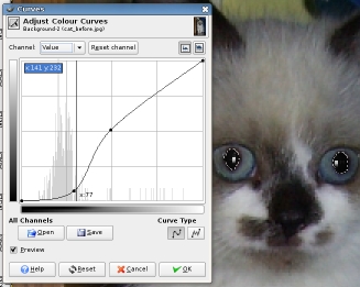
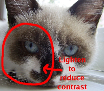 This is what needs doing to it. This is what needs doing to it.We could just open up the curves dialogue and push the darker areas up a bit but that would reduce local contrast and produce an inferior image. We need to boost the luminosity of the darker area overall without losing that local contrast. So, this is the first step. Take a copy of your image (as you should always do - never work on the original) and copy the layer.
|
|
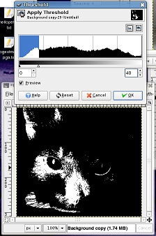 Next, we need to
produce a mask from it that we can then blur - we need to
keep local contrast whilst reducing the overall contrast
between the shadow area and the rest of the image. Next, we need to
produce a mask from it that we can then blur - we need to
keep local contrast whilst reducing the overall contrast
between the shadow area and the rest of the image.
|
|
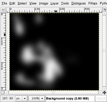 Next, we need to blur
it so that we preserve the local contrast in the image. Next, we need to blur
it so that we preserve the local contrast in the image.
|
|
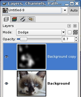 Now, we need to use
this to process our image - the black and white image is
too strong so we will use the 'Opacity'/'Transparency'
control to reduce its effect. We could just take it away
from our image but that would have the effect of reducing
the saturation of the affected part of the image as well
as reducing the overall tonal range of the image. Now, we need to use
this to process our image - the black and white image is
too strong so we will use the 'Opacity'/'Transparency'
control to reduce its effect. We could just take it away
from our image but that would have the effect of reducing
the saturation of the affected part of the image as well
as reducing the overall tonal range of the image.
|
|
Next, we need to make it one
layer.
You can see that the detail in the shadow is a lot more visible and will print better. |
|
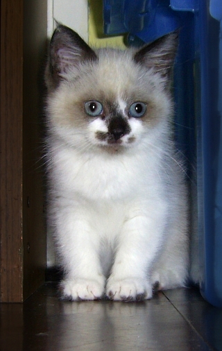
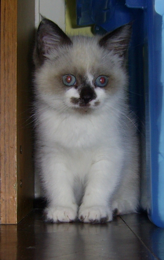 Here's the second
image. Here's the second
image.This was taken a few weeks before the one above and you can see that her eye's aren't as mature - they still have the wappy psycho-kitten look about them and they are pointing in slightly different directions. The kitten eventually settled down between a bookshelf and a blue, plastic storage box. This is the image after straightening and cropping. |
|
 The fur on the
kitten's front is white so we would like to increase the
luminosity of that. The fur on the
kitten's front is white so we would like to increase the
luminosity of that.In addition, we want it to look like a picture of a kitten and not a kitten sandwich so, as the kitten is light and its immediate surroundings are dark, we'll tone down the fronts of the bookshelf and the storage box thus making the kitten the focal point of the photograph. Also we need to remove the red-eye so, first of all, let's do just that... |
|
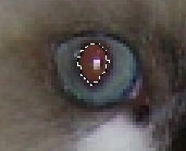 We need to mask off
the pupil. We need to mask off
the pupil.
|
|
 Next, get rid of the
red. We don't want any red but we do want the white
highlight. Next, get rid of the
red. We don't want any red but we do want the white
highlight.
|
|
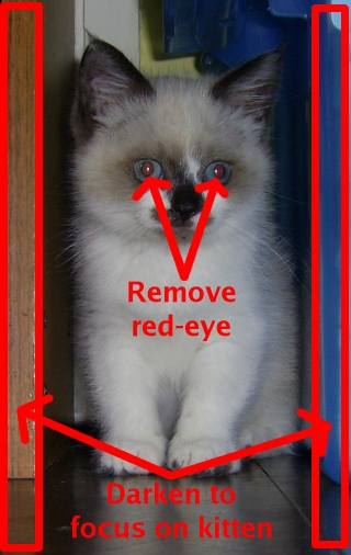
 Now, we want to tone
down the edge of the book case (left) and the blue
plastic container (right) so that our kitten is what we
focus on. The reflective surface of the floor is
horizontal so we need to treat reflections in the same
way as the objects themselves. Now, we want to tone
down the edge of the book case (left) and the blue
plastic container (right) so that our kitten is what we
focus on. The reflective surface of the floor is
horizontal so we need to treat reflections in the same
way as the objects themselves.
One alternative is that you can darken the book case
and the plastic box and then, instead of deleting the
selection, just invert it and make the fur lighter - the
choice is yours. |
|
 And this is it (left)
compared with the original (right). And this is it (left)
compared with the original (right). |
|
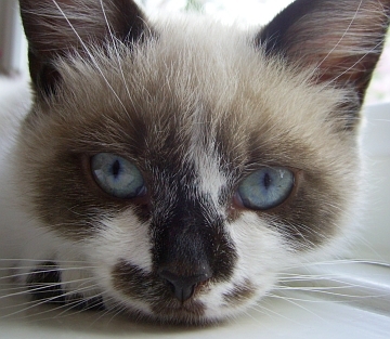 This is the image
(left) compared to the original (right).
This is the image
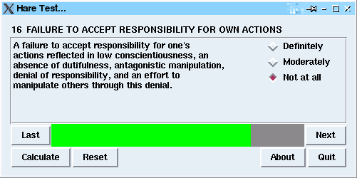
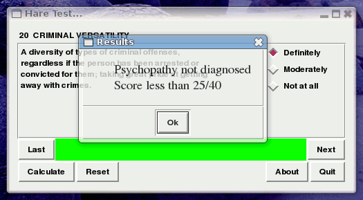
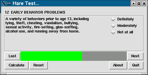
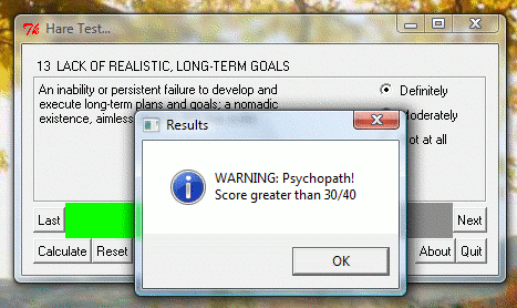
(left) compared to the original (right).Is my manager/partner a psychopath?Note that this runs on Windows, UNIX, Linux, *BSDs, Mac OS X and so on. There is a 20 point questionnaire called the Hare List that was developed over the years by a number of psychiatrists/psychologists so that there could be (along with a number of interviews carried out by a psychiatrist) a reasonably objective way of assessing people to see if they fell into a group of personality types that are known as psychopaths - there are other parts to this assessment that the trained professional would know about but here, we are, in the true tradition of those psychometric tests that you see in women's magazines at the doctor's/dentist's, we're going to throw to one side all attempts to be objective and instead, have a 'fun-to-do' test that will show off some of the aspects of the Perl Tk GUI. This is, of course, light-hearted and you shouldn't take the results seriously. And, just in case you were wondering if psychopaths had any positive contribution to make to society, they do make good managers (although, you might question if that is a positive contribution and also, you might ask why are psychopaths more suited to the requirements of modern management than others?). So, where do we start and what do we need? The Hare psychopathy check-list is freely available on the Internet (you can find it in the Wikipedia for instance) but we have a copy here. The scoring on it for each check-list statement is:
There are four categories for the statements:
However, we will just look at the overall score. So, all we need now is a program. Perl is cross-platform and it has a GUI - unlike the GUIs on some operating systems, Perl's GUI is about getting the job done, not distracting the user with facile special effects. We've all used Perl - it is the industry standard web server language - but whilst it runs on literally millions of servers every day, we can also use it for normal programming as well and, it is particularly easy to learn. The GUI is called Perl Tk and it has the advantage that you can design it using UNIX or Windows and it will run on all of the others. To use Perl Tk, you need to do a bit of object oriented programming but this is fairly easy.
The following line tells the shell in UNIX where the program that needs to run this script actually exists. In this case it is in a directory called /usr/bin but can be in /usr/local/bin or somewhere else. #!/usr/bin/perl -w On a UNIX system, you need to get this correct (you can use the 'whereis' command to find out the answer). On a Windows system. this doesn't matter because the file associations are system-wide through the file extension (normally .PL in the case of Perl programs). The '-w' switch tells perl to use warnings - this is useful when you are developing programs as they give out useful information such as which line the interpreter thinks an error occurs on and so on. To remark a line out (that is, to remove the functionality of a line of code without deleting that line) just start the line with a hash mark '#'. You can deactivate commands or write notes with these. The next two lines tell perl to use the Tk module and the progress bar module use Tk; use Tk::ProgressBar; Now, we will call the program as a whole. Subroutines that I have written start with an ampersand when they are called. The first two lines set things up in terms of variables and the third generates the GUI. The fourth runs the GUI and at that point, the program becomes event driven. &readfile; #input Definitions and explanations (1..20)... &initvars; #initialise the variables &creategui; #make the GUI MainLoop; #run it... exit (0); Here's the first subroutine. We start off by defining the block of program using 'sub name {}'. Anything within the braces is part of the subroutine. sub initvars {
$progress = 0;
$qn = 1;
$c = $d[$progress];
$b = $e[$progress]
}
'$progress' is a type of variable called a 'scalar'. It can have integers, floating points or strings in it. You can also have arrays (such as @myarray) but if you want to address a single scalar within that array, you use the $ sign in front (such as $myarray[17]). Array indices start at zero. In 'readfile' we open the list of statements and descriptions. We give the file a handle (in this case called 'FH') and we can use that to refer to the file in future. open (FH, "list"); There are 20 but they will use the indices 0..19. To get a list of numbers (say 5 to 9), you do the following (5..9) which returns a list '5 6 7 8 9'. If we wanted to go through these in reverse, we would say 'reverse (5..9)' which would produce '9 8 7 6 5'. The foreach statements produces a list of values and stores them in $c foreach $c (0..19) {
$a[$c] = -1; # set element of array @a to -1
$d[$c] = <FH>; # read statement line from file
chomp ($d[$c]); # take return off end of line
$e[$c] = <FH>; # read description line from file
chomp ($e[$c]); # take return off end of line
#chop down the lengths of the string into more handleable portions
my @f = split " ", $e[$c]; # split the description line up into words and
# store them in an array called @f
$e[$c] =""; # empty the description
my ($g, $lg) = ("", 0); # set two local variables at the same time
$w = 50; # set a global variable - the line length
foreach $h (@f) { # create a loop using each word in the description
$lh = length ($h); # find the word's length
if (($lh + $lg) > $w) { # if that plus the length of the existing line
# is greater than the width ($w) then:
$e[$c] .= $g . "\n"; # add a new line character to the end and save it in
# the description array;
$g = $h . " "; # start a new line for the description
$lg = length($g) # find its length
} else { # alternatively:
$g .= $h . " "; # add the word and a space to the end
$lg = length($g) # and find its length
}
} # finish the loop
if ($lg) { # if there is anything left over,
chomp ($g);
$e[$c] .= $g . "\n" # add that as well.
}
}
close FH; # close the file.
}
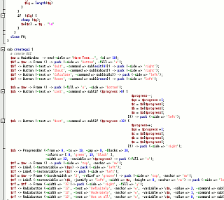
Now for some OOP. sub creategui {
# create GUI
$mw = MainWindow -> new(-title => "Hare Test...", -bd => 10);
^ ^ ^ ^ ^ ^ ^
Variable | | | | | Value
Object type | | set value Variable
| Method
Pointer
Here, we are setting a new variable $mw to contain the pointer to an object (called 'MainWindow'). It doesn't exist until we execute this line so we have to use a method called 'new' which creates it. Optionally we set some of its attributes, in this case, we set the '-title' to have a value 'Hare Test...'. That is almost all there is to it. $bf = $mw -> Frame () -> pack (-side => 'bottom', -fill => 'x'); Now, we create a new variable - pointing to the pointer $mw - that has a frame in it. It needs packing into our main window so we call the pack method which has its own variables. The reason we give it a pointer is that we need to refer to it later so that we can put things in it or modify it in some way. Like this... $bf -> Button (-text => 'Quit', -command => sub{exit(0)}) -> pack (-side => 'right');
The above line doesn't generate a variable with a pointer in it because we don't need one. The button, though, does need to do something when it is clicked so we have something called a 'callback', the '-command' line. In this case, it is an anonymous procedure consisting of just the exit command. $bf -> Button (-text => 'About', -command => sub{&about}) -> pack (-side => 'right');
Here, it refers to an external command (so, if you have a complex subroutine that is called more than a couple of times from a number of different places, you can refer to that; or, $sb -> Button (-text => 'Last', -command => sub{if ($progress >0) {
$progress--;
$qn = $progress +1;
$c = $d[$progress];
$b = $e[$progress];
$n = $a[$progress];
}}) -> pack (-side => 'left');
in the above example, it is a multi-line procedure which goes if ($progress >0) { $progress--;
$qn = $progress +1;
$c = $d[$progress];
$b = $e[$progress];
$n = $a[$progress];
}
and that is about it. Use a few different types of object and you can produce whatever you want. There is plenty of more about this on the Internet and there are loads of books as well. Mastering Perl/Tk is a good start from O'Reilly (ISBN 1-56592-716-8). So, how does it look on various platforms? |
||||||||||
 SuSE 8.2 professional SuSE 8.2 professional |
||||||||||
 SUSE 10.2 with Compiz SUSE 10.2 with Compiz |
||||||||||
 OpenBSD 4.1 with KDE OpenBSD 4.1 with KDE |
||||||||||
 Windows Vista Ultimate. Windows Vista Ultimate.Note that with Windows, you need to install ActiveState Perl (free) in order to run it. |
 You can
find the program
You can
find the program