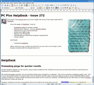
PC Plus HelpDesk - issue 273
 |
This month, Paul Grosse gives you more
insight into some of the topics dealt with in HelpDesk.
|
 |
HelpDesk
|
||||||||||||||||||||
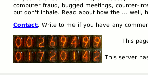 Here is the counter as it appears on a web
page, in this case, displaying the home page hits and the
total page hits for a small, home server. Here is the counter as it appears on a web
page, in this case, displaying the home page hits and the
total page hits for a small, home server. |
||||||||||||||||||||
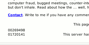 In keeping with policies on graceful
degradation and allowing the visually impaired to know
what is going on, this is what it looks like with images
turned off and, if you hover your mouse over one of the
images when it is on, the same digits appear. In keeping with policies on graceful
degradation and allowing the visually impaired to know
what is going on, this is what it looks like with images
turned off and, if you hover your mouse over one of the
images when it is on, the same digits appear.So, how
do we do this? |
||||||||||||||||||||
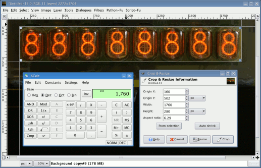
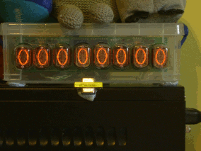 First of all, set up your counter so that it
works and then use a different program to write a series
of all of the digits to it, one at a time. There is a
good reason for this... First of all, set up your counter so that it
works and then use a different program to write a series
of all of the digits to it, one at a time. There is a
good reason for this...In a Nixie tube, the digits are at different depths within the tube - a millimetre or so separates each one - and in this case, they are in the order, from back to front: 1; 6; 2; 7; 5; 0; 4; 9; 8; 3. This means that the tubes on the left are going to be photographed from the right and the ones on the right are going to be photographed from the left (you can see this effect in the image on the right from 2, 3, 4 - look at the right hand digit for the best effect). So, set up your camera on the tripod and get it to photograph all of the tubes displaying each digit, one at a time. Tips:
|
||||||||||||||||||||
 Next, load them all into one image - you can
do this on The GIMP by dragging the first image onto the
main window and then highlight all of the remaining
images in your file explorer and drop them all at the
same time onto the GIMP image you have opened. Next, load them all into one image - you can
do this on The GIMP by dragging the first image onto the
main window and then highlight all of the remaining
images in your file explorer and drop them all at the
same time onto the GIMP image you have opened.These will be added as new layers. (if you dropped the other images onto the main GIMP window, it would open them all as separate, one-layer images.) Next, hide all but the bottom layer. Then, use two guides to note the x-y position of some feature that will not move between shots. This could be part of the background (all right if the focussing is consistent which it should be) or part of the hardware (a bit of grid that is in all of the shots or a part of a cut-out). Don't use a reflection as these move. Then, with cross-hairs in place, unhide the next layer up and move that layer so that the detail in the cross-hairs matches. These shouldn't be far out if at all because we have taken action to preclude this when we took the original shots. Repeat for each layer. Next, save the image as a GIMP xcf.gz image because now, we are going to do destructive things to it. Zoom-out the image so that it is about the right size and make a note of the zoom. Bring it back up to 100% and then you need to crop it. Assuming that you are using an 8-digit counter, crop the image so that the width is an integer multiple of 8 x the width of the final image. Next, colour correct all 10 layers. This is easier without the unwanted background that we have just removed. Now, we can reduce the size to our final size, all in one go. Once you've done this, you need to produce each nixie tube's digits so use the trim tool to crop the image down to the right size. Next, duplicate the image so that you have a new image with all 10, density-corrected, position-corrected images of the fist digit in it. Then, go back to your cropped original, press [Ctrl][Z] to undo the cropping process. Repeat the cropping process for your second digit this time. Then your third. Continue with this process until you have all eight
digit-sets. A good idea is to arrange them in order on
your desktop to avoid confusion. |
||||||||||||||||||||
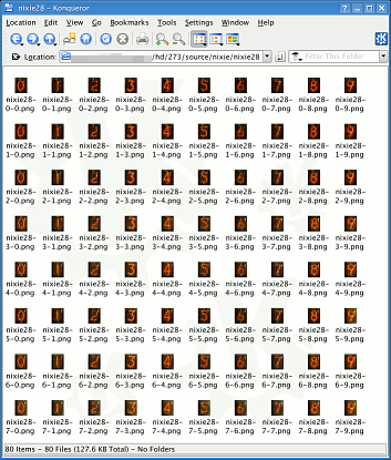 Now, take the first of the digits (the one
on the left) and from the layers dialogue box, drag the
layer with a '0' in it, onto the GIMP main window. Now, take the first of the digits (the one
on the left) and from the layers dialogue box, drag the
layer with a '0' in it, onto the GIMP main window.A new window will open up containing just that one image. Now, save it with a meaningful name. One suggestion is that your files should have something in common that means something to you and then something that means something to the program you are going to write that uses these - the least programming the better. This image is of nixie tube '0' digit '0'. If we call the first one '0', the second tube '1' and so on, it works out better when we write the program because the index of the first character in a string is '0'. Repeat this for all 10 digits on the first tube and then the same again for all of the other tubes. It is worth it - they are all different. You should now end up with a directory like the one on the right. In this case, the images are all 22x28 pixels.
|
||||||||||||||||||||
| Now that we have a counter value and a
directory that has our digit images in it, we can write
the program to put the relevant code on your web pages. If gtct.txt contains the text 1720142 then the following piece of code (written in Perl) will produce that code for you # look up the grand totals counter
$counter_file = "gtct.txt";
open (FILE, "<" . $counter_file);
$count = <FILE>;
close (FILE);
# trim it
chomp $count;
{
my $cc = $count;
$cc = substr ("0000000".$cc, -8, 8);
foreach $x (0..7) {
# slice the string and select and image for each digit
$cs = substr($cc, $x, 1);
print "<img src=\"images/nixie28/nixie28-$x-$cs.png\"
width=22 height=28 border=0 alt=\"$cs\" title=\"$cs\">"
}
}
You can see that naming the images starting with zero for the position has worked out nicely because we just need two variables, one for the position ($x which is used to split the string any way) and one for that position's value which comes from the line $cs = substr($cc, $x, 1); . From that, it is able to assemble the following output (broken up to make it easier to see)... |
||||||||||||||||||||
|
||||||||||||||||||||
| and this is what it looks like (the bottom
one - to get another, just use a <br> tag and
repeat the process (in this case, the home page counter
followed by the total pages counter). Now, everyone can see your counter on your web pages (or, if you just copied the images, my counter on your web pages). Of course, you don't have to use a Nixie counter, you could use photographs of:
|
 On-page Nixie tube
web counter and code
On-page Nixie tube
web counter and code
|
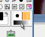
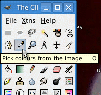 Click on the dropper tool so that you can
pick colours from your image and turn them into the
foreground colour (the pick mode should be 'Set
foreground colour' if you have options on that - the
default if you haven't is that it will). Click on the dropper tool so that you can
pick colours from your image and turn them into the
foreground colour (the pick mode should be 'Set
foreground colour' if you have options on that - the
default if you haven't is that it will). |
 Click on the gradient in the GIMP toolbox to
open up the Gradients dialogue box. Click on the gradient in the GIMP toolbox to
open up the Gradients dialogue box. |
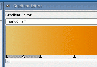
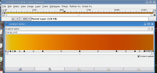
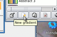 Next, click on the 'new gradient' button to
open up the gradient editor. Next, click on the 'new gradient' button to
open up the gradient editor.Type in the name for your new gradient and then stretch the dialogue box so that it is the same length as your gradient image and then position it so that it is below the gradient so that it is easy to work with. Now, we can start putting colours into the gradient. |
 Use the dropper tool to pick the left-most
colour from your real-life gradient. Right-click on the
gradient bar at the bottom of the gradient and select
'Load Left colour from', 'FG Colour'. This will load the
colour on the left and your gradient will change. Use the dropper tool to pick the left-most
colour from your real-life gradient. Right-click on the
gradient bar at the bottom of the gradient and select
'Load Left colour from', 'FG Colour'. This will load the
colour on the left and your gradient will change.Repeat this with the colour on the right of your image, this time selecting 'Load Right colour from', 'FG Colour'. Now, whilst the endpoints of your gradient are correct, the middle is probably not. So, use the dropper tool to pick the central colour
from your real-life gradient - use the position of the
centre marker from the gradient editor in the window
below it as a guide. |
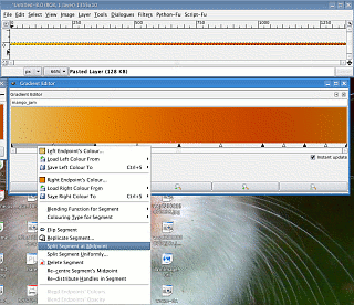
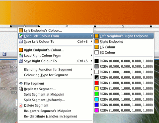
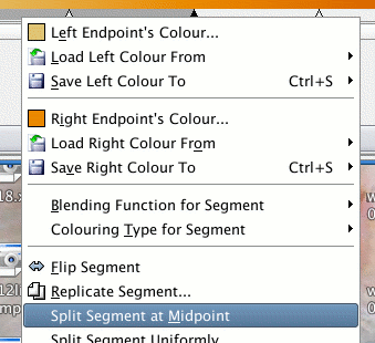 Right-click on the gradient bar at the
bottom of the gradient and select 'Split segment at
Midpoint'. Right-click on the gradient bar at the
bottom of the gradient and select 'Split segment at
Midpoint'.This divides the current segment neatly into
two, at the position where you have your current
foreground colour. |
 Select the left of the two (you don't have
to, you could select the right and laterally reverse all
of the following if you really wanted to) Select the left of the two (you don't have
to, you could select the right and laterally reverse all
of the following if you really wanted to) |
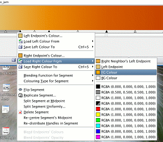 and right-click on the gradient bar at the
bottom of the gradient, and select 'Load Right Colour
from', 'FG Colour'. and right-click on the gradient bar at the
bottom of the gradient, and select 'Load Right Colour
from', 'FG Colour'.Again, this will load the colour on
the left and your gradient will change... |
 although this time, you will be able to see
a step change in your gradient. although this time, you will be able to see
a step change in your gradient. |
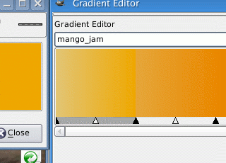
 Now, click on the next segment in the
gradient to select it and then right-click on the segment
bar and select 'Load right colour from', either 'FG
Colour' or 'Left Neighbour's Right Endpoint' - they are
both the same colour. Now, click on the next segment in the
gradient to select it and then right-click on the segment
bar and select 'Load right colour from', either 'FG
Colour' or 'Left Neighbour's Right Endpoint' - they are
both the same colour.Now, the gradient is smooth at the join. |
 Repeat this until you are satisfied that the
gradient is a good enough reflection of the real gradient
you have and, Repeat this until you are satisfied that the
gradient is a good enough reflection of the real gradient
you have and, |
 If you didn't have instant updates on, you
need to click on the gradient dialogue's save button. If you didn't have instant updates on, you
need to click on the gradient dialogue's save button. |
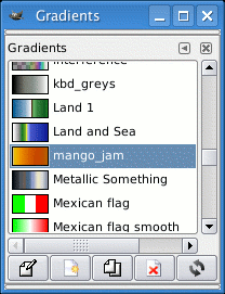 Now, you have your new gradient ready to
use. Now, you have your new gradient ready to
use. |
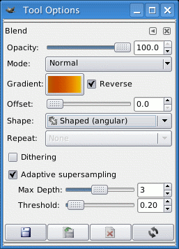 Using a gradient fill with these options,
you can choose from a number of different shapes for
fills but each of the 'shaped' shapes will fill from the
edge towards the centre, using the right-hand colour as
the starting colour at the edge of the mask, working in,
towards the centre, using the same scale as the largest
distance it finds. Using a gradient fill with these options,
you can choose from a number of different shapes for
fills but each of the 'shaped' shapes will fill from the
edge towards the centre, using the right-hand colour as
the starting colour at the edge of the mask, working in,
towards the centre, using the same scale as the largest
distance it finds.So, drag the mouse over the mask (this is so that the gradient fill recognises that you want to fill a gradient) and it then looks for the largest edge-to-centre distance. It then fills according to the distance from the edge
so if your largest distance was 20 pixels, but it only
has to fill to 10 for the current shape, it will only use
half of the gradient on that part. |
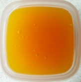
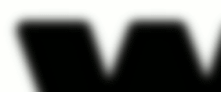
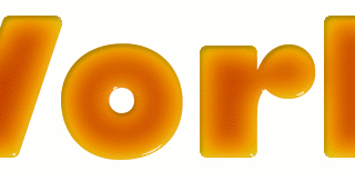
 and this is what you get. Note that because
we have created our gradient using the full width of the
mango jam pot, we have ended up with the shadow part on
the inside of the 'W' of 'World' where it is widest. We
could solve this by having a second gradient that does
not use this (trim the first) but there is a
better-looking way to do it and that is the one used
below... and this is what you get. Note that because
we have created our gradient using the full width of the
mango jam pot, we have ended up with the shadow part on
the inside of the 'W' of 'World' where it is widest. We
could solve this by having a second gradient that does
not use this (trim the first) but there is a
better-looking way to do it and that is the one used
below... |
 the values in the
gradient editor but these efforts rarely produce
acceptable fruit. An answer is to cheat by using a real
subject from which you get the values for your
translucent gradient.
the values in the
gradient editor but these efforts rarely produce
acceptable fruit. An answer is to cheat by using a real
subject from which you get the values for your
translucent gradient.
|
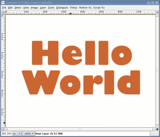
 Create a new image - I've used 800x600. In
the 'Layers' dialogue box, right-click on the
'Background' layer and select 'Add Alpha Channel' - this
will allow you to put other layers below it, out of the
way of where you are working. Create a new image - I've used 800x600. In
the 'Layers' dialogue box, right-click on the
'Background' layer and select 'Add Alpha Channel' - this
will allow you to put other layers below it, out of the
way of where you are working.Then click on the new layer button, creating a new layer with a fill-type of 'Transparency' - click on 'OK'. Write your text - in the example (in the toolbox,
click on the 'Text' - 'Add text to the image' button in
the GIMP toolbox), I've used Gill Sans Ultra Bold at 171
point aligned centrally. It doesn't matter about the
colour. |
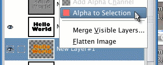
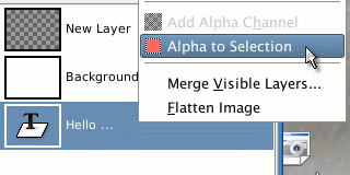 In the layers dialogue, drag the text layer
below the background layer. In the layers dialogue, drag the text layer
below the background layer.Next, right-click and select 'Alpha to Selection' which will allow us to play around with the outline. Click on the new layer in the Layers dialogue and then
right-click on the image itself, and choose 'Select',
'Shrink'; and then, say, '6'. Click on 'OK' and our mask
has shrunk. Next, right-click and choose 'Select',
'Grow'; and then the same value - '6'. Click on 'OK' and
our mask has now grown back to the same size as before
but now, it has rounded corners. |
 Drag the foreground colour into it to fill
the mask in our transparent layer and you have a
reference copy of our new text shape. Drag the foreground colour into it to fill
the mask in our transparent layer and you have a
reference copy of our new text shape.Now, create a new
transparent layer and then drag our filled text layer
below the background to put it out of the way. |
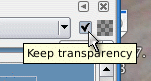 Select the transparent layer to make it the
current layer and then check its 'Keep transparency'
checkbox. Select the transparent layer to make it the
current layer and then check its 'Keep transparency'
checkbox.Next, drag black from the colour toolbox into the layer to fill it. Still in the Layers dialogue, right-click and choose
'Alpha to Selection'. |
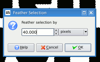 On the image, right-click and choose
'Select', 'Feather...' and then use 40. On the image, right-click and choose
'Select', 'Feather...' and then use 40. |
 Next, drag white from the colour toolbox
into the layer to fill it. Then, press [Ctrl][Shift][A]
to remove the mask. Next, drag white from the colour toolbox
into the layer to fill it. Then, press [Ctrl][Shift][A]
to remove the mask. |
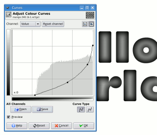 Then, click on the Adjust colour curves tool
in the toolbox and click on the image. Then, click on the Adjust colour curves tool
in the toolbox and click on the image.Adjust the curve so that the lowest density coincides with the bottom of the curve and pull the highest density down so that we get the central part of the mango jam curve (this will be lit from both sides, not just one so we don't need the shadow side of the gradient). Adjust the gamma of the curve - one way is to perform the following step having saved this gradient, then undo the following step, reapplying this step but by opening the curve you saved, adjusting the gamma then saving it again, repeating until you have exactly what you want. Once it is right, click 'OK'. |
 Then, right-click on the image and select
'Filters', 'Colours', 'Map', 'Gradient Map'... Then, right-click on the image and select
'Filters', 'Colours', 'Map', 'Gradient Map'...... and here it is. Now, we can make it look as though the surface is concave at the edges (like the meniscus of a liquid that has cooled) by creating a bump map and applying that. So, first of all, create a new layer filled with white (this is the lazy way because black is not offered). Next, feather the mask by right-clicking and choosing 'Select', 'Feather' and using '12' as the value - click 'OK'. Then, cut out the image by pressing [Ctrl][X]. |
 Now, create a new layer and drag black into
it. Now, create a new layer and drag black into
it.Place it below the mask. This gives us fuzzy edges on the high and low density sides (the left hand curve) which is not what we want - we want a meniscus that has a sharp edge to it like the curve on the right. However, the part we don't want falls on the outside
of our mask so we don't need to worry about it at the
moment. |
 We now have two layers - one with a white
background and one that is black beneath it. We now have two layers - one with a white
background and one that is black beneath it.In the
Layers dialogue, right-click on the white image layer and
select 'Merge Down'. |
 Next, click on the foreground/background
tool, (foreground) and then again to bring up the
foreground editor and edit the current colour to a mid
grey. Next, click on the foreground/background
tool, (foreground) and then again to bring up the
foreground editor and edit the current colour to a mid
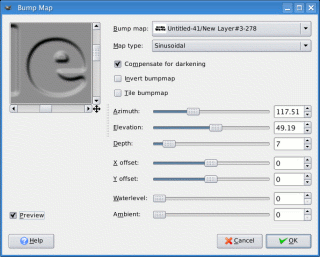
grey.In the Layers dialogue, create a new layer with the foreground colour - this grey layer becomes the current layer. Next, on the image, right-click and select 'Filters', 'Map', 'Bump Map'. Select the bump map layer we have created in the previous step and the Map type should be 'Sinusoidal'. Adjust the 'Depth' until it is what you want. When you have finished, click on 'OK'. |
 Next, use the colour picker to get a sample
of the new background colour of the bump-mapped image
(the one at the top in the screen-shot on the right). Next, use the colour picker to get a sample
of the new background colour of the bump-mapped image
(the one at the top in the screen-shot on the right).Then, in the Layers dialogue, duplicate that image layer but hide it. Then, right-click on the text layer and select 'Alpha to Selection'. Select the bump-mapped image. Then, in the image, press [Ctrl][I] to invert the mask (alternatively, right-click and choose 'Select', 'Invert'). Now, press [Ctrl][X] to cut away the outside. If you hide the mask so that all you can see is the current layer and the background (the text is the same size so we can't see that) then it should look like it's made from grey plastic lit from the lower-left. Next, right-click on the image and select 'Filters',
'Colours', 'Colour to Alpha...'. |
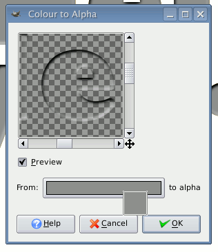 Now, drag the colour from the foreground
colour (that we picked earlier) and drop it on the colour
bar in the dialogue box. Now, drag the colour from the foreground
colour (that we picked earlier) and drop it on the colour
bar in the dialogue box.This is taken from the image and as you can see, we have eliminated all but the highlights and shadows that the bumpmap process has created. Click on 'OK' and you can see it on the image. You can adjust its Opacity until you have the result
you want (I used about 25%) |
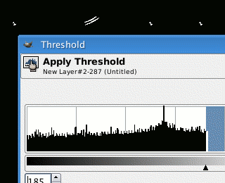 Next, select the other bitmapped image and
then the threshold tool from the toolbox. Next, select the other bitmapped image and
then the threshold tool from the toolbox.Click on the image and with preview selected, choose a value that is close to the upper limit so that you only get the very highlights of the image. Now, in the Layers dialogue box, right-click on the text/transparent background layer and select 'Alpha to Selection'. Select our 'thresholded' layer. Go back to the image and press [Ctrl][I] to invert the mask and then [Ctrl][X] to cut out the background. Back in the Layers dialogue, select the 'Mode:' as
'Lighten only' (it is only black and white so black will
not lighten anything). |
 Now, it looks like it is made from some sort
of jelly or sugar preparation, illuminated from the
lower-right. It certainly looks good enough to eat (but
would probably be bad for you). Now, it looks like it is made from some sort
of jelly or sugar preparation, illuminated from the
lower-right. It certainly looks good enough to eat (but
would probably be bad for you).You can change the shininess of the surface by changing the transparency of the layer we have just created - around 60% gives a good value for what we want. Now to make it look as though it is in something (and therefore lit from the top-left), just add a container, drop-shadow and other visual clues to reinforce this. Thus... |
 |
| Believe it or not, the only thing that
has changed between the two images is the background, the
letters are completely unchanged. The important thing to remember here is that by having all of your highlight, reflections and so on as different layers, you can change them until you are satisfied with it - you are not stuck with a load of options on a dialogue box that you have to tweak and re-run all of the time: If you want to make the surface a bit more reflective, make the reflections more opaque; If you want to make the lighting harder, increase the opacity of the drop-shadow; and, so on. |
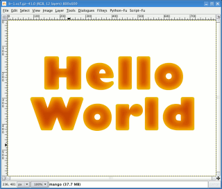
 Mango Jam - Hello
World
Mango Jam - Hello
WorldWord counts in HTML documents over SMB
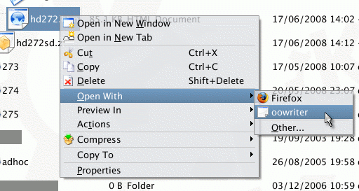
In this example, we want to perform a word count on last month's SuperDVD HTML file. If we open up a browser, go to the SMB share and open
the file into the word processor... |
 ... it takes five seconds for the word
processor to load and then a further 36 seconds for the
document to load. We can't do anything about the time it
takes for the word processor to load but we can about the
rest of the process. ... it takes five seconds for the word
processor to load and then a further 36 seconds for the
document to load. We can't do anything about the time it
takes for the word processor to load but we can about the
rest of the process.For the sake of performing a word count, the images don't matter so if we drag and drop the file from the browser window onto the desktop, we lose the relative links in the HTML file (they aren't modified by the copy process so now they all point to files that don't exist in its current context). This means that when the word processor looks for them, it won't find any of them and therefore won't waste any time trying to load them from a remote machine (it doesn't know where the HTML file came from). In our example, copying the file took two seconds (if
that). |
 Next, we open the file as before and get it
to load in the word processor. Next, we open the file as before and get it
to load in the word processor. |
 But now, there are no images for it to pull
over the network. But now, there are no images for it to pull
over the network.Now, the loading process takes only two seconds. The total processing time from locating it on the smb
share in the browser to having it loaded is just |
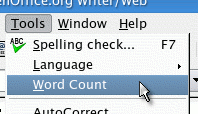 As we only want to count the words, we do
that as we would have before As we only want to count the words, we do
that as we would have before |
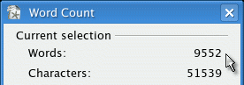 and here we are with 9,552 words. and here we are with 9,552 words.Whilst we have only saved just over 30 seconds for this one file, if we want to do this procedure for ten or so files, we are already talking about substantial savings. |
 SMB is a
fairly good way of mounting directories on other
computers into your system so that you can access files
and other resources as though they were local. However,
being network-based, there are limits to its speed (even
with Linux which is around four times faster than the
same process in Windows) so if you need to transfer a lot
of files, you will experience an impact on your
productivity.
SMB is a
fairly good way of mounting directories on other
computers into your system so that you can access files
and other resources as though they were local. However,
being network-based, there are limits to its speed (even
with Linux which is around four times faster than the
same process in Windows) so if you need to transfer a lot
of files, you will experience an impact on your
productivity.