PC Plus HelpDesk - issue 259
 |
This month, Paul Grosse gives you more
insight into some of the topics dealt with in HelpDesk.
|
 |
HelpDesk
|
 Awful clicking noise in Vista
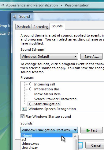
Bring back Telnet on Vista
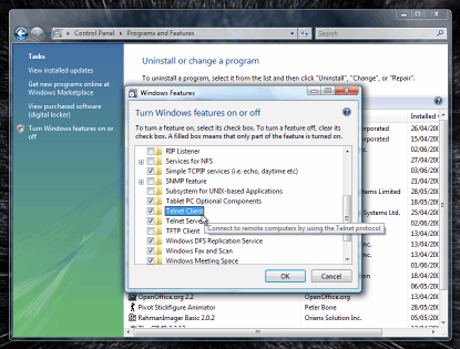
So, as telnet isn't running in the default configuration of Vista, is there any way of getting it back? Click on 'Start', 'Control Panel' and then, in the 'Classic View', click on 'Programs and Features'. In the left pane, click on 'Turn Windows features on or off', type in your root/admin password and the Windows Features dialogue box opens up. This takes ages for the box to fill - even on a fast machine. So, after a short wait, you see a listbox full of
programs. |
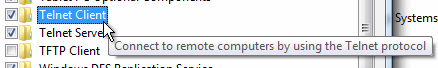 Scroll down to 'Telnet client' and check the
box. Scroll down to 'Telnet client' and check the
box.Click on 'OK' and then another little window opens up telling you that it might take several minutes - and it does. Now, you can use telnet from the command line just like you used to on XP. No SSH yet though - maybe on SP1. |
 We all
know that telnet isn't secure but it has a lot of uses if
you know what you are doing. Normally, we would use SSH
for communicating with another machine's command line but
there is more than that to telnet. For instance, you can
change the port number that it uses so that you can check
that text-based protocol using servers are running all
right - examples include HTML, POP3 and SMTP.
We all
know that telnet isn't secure but it has a lot of uses if
you know what you are doing. Normally, we would use SSH
for communicating with another machine's command line but
there is more than that to telnet. For instance, you can
change the port number that it uses so that you can check
that text-based protocol using servers are running all
right - examples include HTML, POP3 and SMTP.Ubuntu install screen
Pressing the [Enter] key will work to a certain extent, until it comes to having a choice - such as when you need to choose a partition to install it on. So, there are several ways around this:
The solution is to drag the upper and lower panels to the sides of the screen as in the screenshot. Simply press the mouse button on a clear part of the panel and drag the whole thing to the side of the screen. You can now move the panel upwards. You still won't see all of the dialogue box but you will be able to see enough of the writing on the buttons to know what they say. |
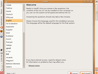 If you've
tried to install Ubuntu 7.04 and had the problem that the
dialogue box is too large because the screen resolution
is too small - a maximum of 800x600 - you'll find that
you can't get to the buttons at the bottom of the
dialogue box.
If you've
tried to install Ubuntu 7.04 and had the problem that the
dialogue box is too large because the screen resolution
is too small - a maximum of 800x600 - you'll find that
you can't get to the buttons at the bottom of the
dialogue box.
|
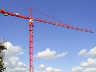 The problem with JPEG (files saved with
'.JPG' as the extension) is that it is not very good at
keeping local detail. On the right, there is a photograph
of a tower crane in the middle of Derby (UK). It has a
nice, steady transition from darker blue to lighter blue
and some fine details in the ironwork. The problem with JPEG (files saved with
'.JPG' as the extension) is that it is not very good at
keeping local detail. On the right, there is a photograph
of a tower crane in the middle of Derby (UK). It has a
nice, steady transition from darker blue to lighter blue
and some fine details in the ironwork. |
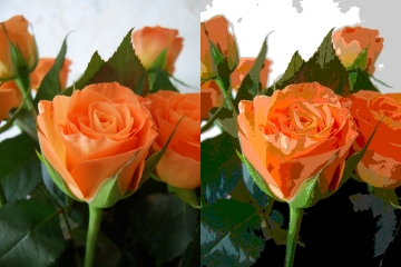
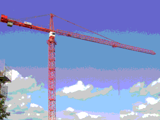 This is the GIF version using a standard
palette (not a customised palette) and you can see that
the algorithm has chosen the closest colour that is
available from the palette. This is the GIF version using a standard
palette (not a customised palette) and you can see that
the algorithm has chosen the closest colour that is
available from the palette.In the case of the blue sky, this has ended up as bands of colour - almost as though it has been posterised. By choosing a custom palette (most image processors
will make you one up on the fly and it will usually be a
pretty good choice of colours), you can make this look a
lot better. |
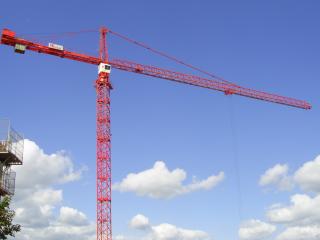 This is the same image but preserved as a
JPEG. You can see that there is a peculiar fuzziness
around the fine detail of the iron work This is the same image but preserved as a
JPEG. You can see that there is a peculiar fuzziness
around the fine detail of the iron work If you have a
diagram with writing on it and blocks of colour, the
boundary between the background and the foreground will
be poorly defined, leading to smudged writing and loss of
saturation at the border of coloured blocks. Also, there
is no support for transparency. |
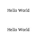 This is how jpeg does with text (ie, high
contrast borders). The Hello World on the top is how it
was at the beginning and the one at the bottom is how it
looked after being saved as JPEG. (This image and the one
below are actually saved as GIF because there are less
than 256 colours.) This is how jpeg does with text (ie, high
contrast borders). The Hello World on the top is how it
was at the beginning and the one at the bottom is how it
looked after being saved as JPEG. (This image and the one
below are actually saved as GIF because there are less
than 256 colours.) |
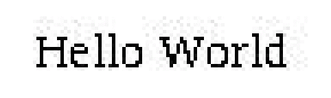 Just in case you cannot see the aberrations
above, here they are blown up five times. You can see how
the algorithm has to make guesses to save on file size
and correct for them as well, leading to the image on the
right. Just in case you cannot see the aberrations
above, here they are blown up five times. You can see how
the algorithm has to make guesses to save on file size
and correct for them as well, leading to the image on the
right. |
| So, if you have photographs, use JPEG compression and for diagrams, use GIF. |
 JPEG or GIF on the web
|
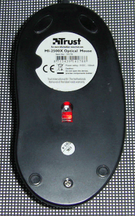
 Many optical mice run all right on many
surfaces - but not all of them. The image on the right is
of the sensor. It is only small and therefore can only
see a small part of your mouse mat. If there are areas of
your mouse mat where the surface is smooth and there is
little pattern, then you can encounter dead spots. Many optical mice run all right on many
surfaces - but not all of them. The image on the right is
of the sensor. It is only small and therefore can only
see a small part of your mouse mat. If there are areas of
your mouse mat where the surface is smooth and there is
little pattern, then you can encounter dead spots.The
trick is to make the mouse mat very even. |
 So, try printing out the file for the
mouse mat (standard size - it is just on its end so that
it will fit onto a piece of A4 paper) - click on the
mouse mat image on the right to open the PDF file in a
new window. Cut it out and laminate it. You should find
that it works just fine. So, try printing out the file for the
mouse mat (standard size - it is just on its end so that
it will fit onto a piece of A4 paper) - click on the
mouse mat image on the right to open the PDF file in a
new window. Cut it out and laminate it. You should find
that it works just fine. |
 Optical mouse movements
Traceroute and LFTSome people have noted that pathping seems to take ages to work However, there are alternatives and if you use an OS that was designed as a networking OS right from the very outset, you can get accuracies that are substantially better than 1ms.
Each router that the packets go through decrements the TTL and the router where the TTL becomes zero sends back a type 11 (TTL exceeded) ICMP packet that encapsulates the header of the original packet (containing the sequence number and so on). In this way, the first router that is encountered is identified, along with the time delay of the round-trip. The program that is sending out the packets increments the TTL and sends it out again. This time, the next router sends back a type 11 ICMP packet and so on. From the results, a map is built along with the delays involved. The difference is that pathping does a more detailed analysis although times are limited to whole milliseconds because of the way that Windows works. Traceroute works slightly differently in that it sends out UDP (User Datagram Protocol) packets instead of ICMP - although the routers still send back type 11 ICMP packets when the TTL is exceeded. Traceroute's output also includes any alternative routers, along with their times. Traceroute runs on UNIX variants so its times are limited to microseconds. There is another program (UNIX-like OSes) called 'lft' (Level Four Trace). It can be made to run using ICMP (like tracert or pathping), UDP (like traceroute) or TCP. It is highly configurable and can be made to run adaptively to go through some firewalls. You can download LFT from http://pwhois.org/lft/index.who and compile it for your system using by typing the following... ./configure make make install One thing that is worthy of consideration is the time it takes to perform the analysis. Here is a table of how long it took (figures taken from the packet stream sniffed by Ethereal/Wireshark) for a subsequent lookup (ie, this is not the first time the program was run therefore the DNS caches in the servers along the way already had the appropriate information).
It must be said that judging where exploration finishes and verification starts is difficult (they seem to happen pretty much at the same time on traceroute and tracert and there is less than a second's difference with LFT) although the important figure is the total time for the program to run. One thing to remember is that if this is the first time that a particular route has been used, there may be delays whilst other machines en route perform DNS lookups. I found that this was the case with Traceroute where a later (several days) traceroute command to the same address (so the en route DNS caches did not contain the required information) took around 10 seconds and a subsequent traceroute command using the same address took less than a second. The first of these two took only around 10 seconds which is still substantially less than all of the others which were all performed as subsequent runs - ie, the figures above are what you would get on a second or subsequent run so that en route DNS caching is not an issue. For a look at screenshots of the command line output, click here and for a look at the Wireshark files, for each of the above runs, click here. |
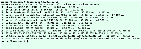 Pathping
and tracert - the DOS versions of Van Jacobson's
traceroute - work in pretty much the same way as each
other. They both send to the destination, type eight
(Echo request) ICMP (Internet Control Message Protocol)
packets with a TTL (Time To Live) of one to start with.
Pathping
and tracert - the DOS versions of Van Jacobson's
traceroute - work in pretty much the same way as each
other. They both send to the destination, type eight
(Echo request) ICMP (Internet Control Message Protocol)
packets with a TTL (Time To Live) of one to start with.
|
||||||||||||||||||||||||||||||
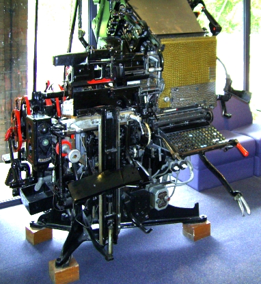
 This is it from the other side. You can see
at the top, at an angle of around 45 degrees, the trays
with the different typefaces on and some of the wiring. This is it from the other side. You can see
at the top, at an angle of around 45 degrees, the trays
with the different typefaces on and some of the wiring.These machines were electrical so there was no need to arrange the keyboard so that levers would not get tangled with each other. With this in mind, the keys were arranged in columns according (roughly) to the popularity of the letters. The keyboard arrangement went so...
|
||||||||||||||||||||||||||||||
| Computer keyboards are entirely electric
as well so there is also no reason to hang onto the
QWERTY layout as this is slow. (The only reason that I
can see for the QWERTY layout to prevail is that there
are sufficient of them out there and there are so many
established writers that use it that the manufacturers
and users cannot justify setting out the required capital
for the changeover.) So, how can it be improved? The Dvorak layout is a substantial improvement on the normal QWERTY keyboard layout. With a right-handed person, the left hand sits over the vowels and the right hand covers the most common letters with the last five letters in the Linotype list (KQJXZ), well out of where either hand would normally go. |
||||||||||||||||||||||||||||||
 |
||||||||||||||||||||||||||||||
| As a result, (if you are right handed)
your least dexterous hand just does the vowels whilst
your most dexterous hand dances around with the most
common letters either under the home row or above it -
this does lead to the common questions; 'where is the
K?', 'where is the W?' and so on. So, it's clearly a good thing to have but how do we get one? However, if you've ever tried to find new ones on the Internet, you might find that you cannot find new ones or you have to pay through the nose for them (you can get old IBM keyboards in US Dvorak layout). There is one that I am aware of that has a switch on it so that you can switch between QWERTY and Dvorak but you are probably better off making your own - if you think you can do it. This is not as bad as it might at first sound and I
did it in around 30 minutes. |
||||||||||||||||||||||||||||||
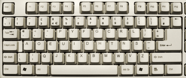
 First, catch your keyboard - this will have
to be a QWERTY because Dvorak keyboards are a bit thin on
the ground. First, catch your keyboard - this will have
to be a QWERTY because Dvorak keyboards are a bit thin on
the ground.However, many keyboard designs on the market will not do: you need to get one that has all of the keys on the three letter rows at the same height and angle. Reject those that have the top-letter-row keys higher
and/or at a steeper angle than the middle row or the
reverse for the bottom row such as the keyboard on the
right. |
||||||||||||||||||||||||||||||
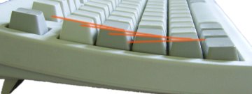
 Also, the keys on all three letter rows need
to be the same shape and size - this is because you are
going to swap them over. The most likely candidates are
cheap, flat keyboards which you can pick up for less than
£10.00 such as the one on the right which I got for
around £7.00. Also, the keys on all three letter rows need
to be the same shape and size - this is because you are
going to swap them over. The most likely candidates are
cheap, flat keyboards which you can pick up for less than
£10.00 such as the one on the right which I got for
around £7.00.One other thing to consider is that the home keys (on a QWERTY, they are the 'F' and the 'J' keys) will not end up in their normal places. The home keys are designed to feel different so they either have a smaller radius of curvature, a raised spot in the middle or they have a little raised bar across the bottom of the key face. This last type is the best because if it is particularly annoying, you can take that off with a knife and still leave the legend on the key. Your new home keys will be 'U' and 'H'. |
||||||||||||||||||||||||||||||
|
||||||||||||||||||||||||||||||
| You can prise the keys off from the
front but you run a serious risk of breaking or snapping
something internally if you do that. This will also
increase the tendency for this to happen in normal use. It is better to take the keyboard apart carefully (remembering where each screw goes - get a piece of paper and draw a map of the screw locations on it then, as you take them out, push the screws into the paper so that when it comes to putting them back, you know where each one goes). With the back off, you will probably be met with either a single sheet of rubber with conductive pads or, with a lot of separate silicone cones.
|
||||||||||||||||||||||||||||||
Next, you need to take out the keys.
Rather than take them all out (there are some that don't change position), Take out one, say the 'S/s' and put that to one side. Where the 'S/s' used to go, you need to put the 'O/o' key so take that out and put that where the 'S/s' used to go. Next, take out the 'R/r' and so on.... Once you have, swapping them so that they end up in the order in the photograph - only the 'A', 'M', '\', back-tick and the numbers don't move - screw back the top again and you have your keyboard. Just in case you were interested, there are other versions of Dvorak keyboard: a design for use only with the left hand, one for use only with the right hand and, the US design. The UK designs keep the double quotes above the '2' and the '@' goes where the 'Q' on a QWERTY keyboard goes so that in our world of electronic mail, the most used key is within easy access (if we wanted to stretch to get it, we would have used a QWERTY keyboard layout, now, wouldn't we?). |
 Dvorak keyboard - making
 With
the conductive sheet, you will probably see a
printed circuit board. On the underside of the
rubber cones, there is a conductive patch that
comes into contact with the printed circuit
board, thus making electrical contact when the
key is pressed. Take off the sheet and put it
with the printer circuit board; or,
With
the conductive sheet, you will probably see a
printed circuit board. On the underside of the
rubber cones, there is a conductive patch that
comes into contact with the printed circuit
board, thus making electrical contact when the
key is pressed. Take off the sheet and put it
with the printer circuit board; or, With
the silicone cones, make a note of the position
of any different ones (such as colour-coded cones
for the Enter or Shift keys) and put them to one
side. With this type, you have two printed
circuit boards but instead of board, they are
printed on thin, plastic sheet. Between these two
sheets is another, but this time with holes that
correspond to the key positions. In this case,
the two printed circuits come into contact when
the key is pressed, forcing them together with
the silicone cone, through the hole in the middle
sheet. Put these to one side if you can (or, if
you cannot safely remove the printed circuits,
just make sure you look after them whilst you do
the next operation).
With
the silicone cones, make a note of the position
of any different ones (such as colour-coded cones
for the Enter or Shift keys) and put them to one
side. With this type, you have two printed
circuit boards but instead of board, they are
printed on thin, plastic sheet. Between these two
sheets is another, but this time with holes that
correspond to the key positions. In this case,
the two printed circuits come into contact when
the key is pressed, forcing them together with
the silicone cone, through the hole in the middle
sheet. Put these to one side if you can (or, if
you cannot safely remove the printed circuits,
just make sure you look after them whilst you do
the next operation). The keys
usually travel in a cylinder with the key pad expended on
top. They can be hold in by a catch and if you examine
the underside of the key - where it comes through the
panel, into the back, you might be able to see a latch of
some sort. You can probably unlatch this with a
screwdriver or similar instrument but be careful not to
damage it.
The keys
usually travel in a cylinder with the key pad expended on
top. They can be hold in by a catch and if you examine
the underside of the key - where it comes through the
panel, into the back, you might be able to see a latch of
some sort. You can probably unlatch this with a
screwdriver or similar instrument but be careful not to
damage it.
|
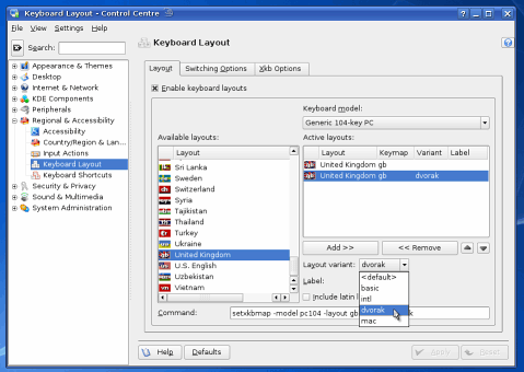
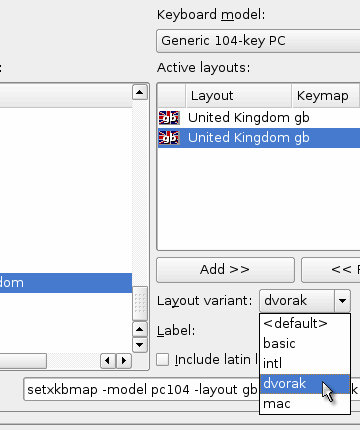 Under the 'Layout' tab, select the country
layout you want and then add to the active layouts,
choosing 'dvorak' as one and 'basic' as the other. Under the 'Layout' tab, select the country
layout you want and then add to the active layouts,
choosing 'dvorak' as one and 'basic' as the other. |
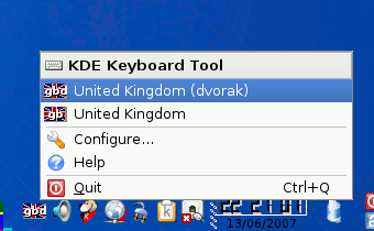 In the panel, you should now get a little
Union Jack with 'gbd' or 'gb' in it. Click on it to
change the global layout. In the panel, you should now get a little
Union Jack with 'gbd' or 'gb' in it. Click on it to
change the global layout.If you want to change the layout on a more global scale, open YaST 'Control Centre'/ 'Hardware'/ 'Keyboard' and under 'Layout' you have two configurations. Under the primary set-up, change the variant to 'Dvorak'. You can check that the letters match by using the test box at the bottom. This is just what it says it is - United Kingdom Dvorak. Click 'OK', then 'Save' then 'Exit Sax2'. On Windows Vista, click on 'Start'/ 'Control Panel'/ 'Classic View' then double-click on 'Regional and Language Options'. On the 'Keyboards and Languages' tab, click on the 'Change Keyboards...' button. In the 'Text Services and Input Languages' dialogue, under the 'General' tab, click on the 'Add...' button, go down the list and under 'English (United Kingdom)'/ 'Keyboard', check the 'United States-Dvorak' box - there is no other choice at the moment. If you click the 'Preview button, you can see that the double quotes, '@', '£' and '#' keys are in different places or non-existent and that the tilde ('~') is a shifted back-tick. To get a '£', hold down [Alt] and use the number pad to key in [0][1][6][3]. When you release the [Alt] key, the character will be displayed. |
 Dvorak keyboard - using
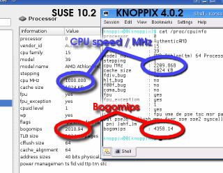
Bogomips on scalable processorsThe bogomips value can be an invaluable measure of just how fast your computer is (although this is a measure of floating point maths in the integer part of the kernel so it is just about as meaningless as any other performance value on any system - doesn't stop it being an indicator of speed though, you just have to realise that it is no more meaningful than any other value). So, if your rig has an AMD 3700+ processor but when you click on on 'Menu', 'System', 'Monitor', 'KInfoCenter' and then on 'Processor', although it says that it is an AMD Athlon 64 ... 3700+, it also says the bogomips value is only 2,010.94.
The Athlon64 3700+ we used here runs normally at 1,000MHz but scales up to a maximum of 2,210MHz when it is needed. The figure you see on your computer could well be the one that was calculated at 1,000MHz which is what the Linux Kernel now does. If you run a recent version of KNOPPIX (such as 5.1.1) and look at '/proc/cpuinfo', you will see that the CPU speed is reported as 1,000MHz which gives 2,010.94 bogomips. Using an earlier version of KNOPPIX such as 4.0.2 (where the CPU speed is full during the bogomips calculation), looking at '/proc/cpuinfo' shows a CPU speed of 2,209.868MHz and 4,358.14 bogomips. Mystery solved. |
 The
'Processor' page in KInfo Center is predominantly the
output of 'cat /proc/cpuinfo'. The bogomips figure is
calculated during the boot process and stored along with
the rest of the information in '/proc/cpuinfo'.
The
'Processor' page in KInfo Center is predominantly the
output of 'cat /proc/cpuinfo'. The bogomips figure is
calculated during the boot process and stored along with
the rest of the information in '/proc/cpuinfo'.Liquid nitrogen cooling
In articles about liquid nitrogen cooled computers, the only protective equipment a lot of the people in the photographs seem to be wearing are goggles and gloves. As somebody who has worked in a laboratory, I am utterly appalled by this as they appear to be putting across the message that goggles and gloves are safe enough and, the only protection and precautions required. It is more dangerous than that. Liquid nitrogen ('LN', boiling point -196C) is actually very dangerous and goggles and gloves are not enough. Nitrogen is roughly 78 per cent of the air we breathe - the remainder being mainly 21 per cent oxygen and one per cent argon. The level of oxygen is quite important.
If you want to try LN cooling, you need to consider the following brief, non-exhaustive list first:
So, if you read up further on the issues and take appropriate precautions, you might be able to do this reasonably safely. One problem that a lot of LN cooled systems have is that they attract frost. This is caused by the air being cooled below its 'dew-point'. The dew-point is a temperature below which water will condense out from the air - in other words, when the relative humidity goes above 100 per cent. To stop this from happening, you need to have the circuit board and anything else that gets cold, surrounded in air that has a low dewpoint - one that is lower than the temperature of the equipment. So, rather than trying to get dry air from somewhere, you can use the evaporated LN as a source of dry air. If you have your computer in a case of some sort, just let the nitrogen from the CPU LN cooler purge the case and without water vapour in there, you shouldn't get any frost formation. |
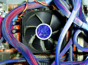 Liquid
nitrogen cooling produces performance gains but you also
need to consider the hazards. So, if you want to replace
the dust collector on the right with something out of a
Frankenstein film, do so by all means but put safety
first.
Liquid
nitrogen cooling produces performance gains but you also
need to consider the hazards. So, if you want to replace
the dust collector on the right with something out of a
Frankenstein film, do so by all means but put safety
first.Linux Elevator types
Well, the elevator is a system-wide setting for the In/Out scheduler, affecting all of the disc drives. When your system boots, it uses the default scheduler (usually cfq) unless you have specified otherwise. This is done in the grub menu and seen as a boot option. CFQ ('cfq') stands for 'Completely Fair Queuing' and it is not the only option. There is also: 'Anticipatory' ('as'); 'NOOP' ('noop'); and, 'Deadline' ('deadline'). They differ in the way that they work.
The best way to find out which one works best for you is to try them all and benchmark them under normal use. This will not affect what is written to your drive so it is safe to play around with. To change your configuration, either:
'elevator=as' should work all right on home systems so give it a try. |
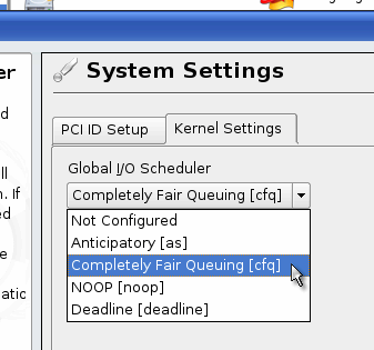 if you've
played around with your Linux computer, you might have
noticed that in Grub, there is a kernel option;
'elevator=cfq' and wondered what it is.
if you've
played around with your Linux computer, you might have
noticed that in Grub, there is a kernel option;
'elevator=cfq' and wondered what it is.
|
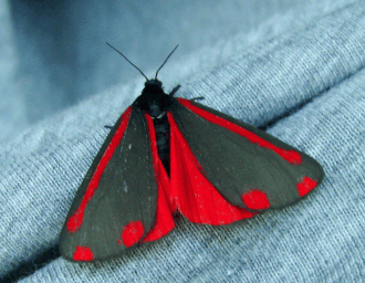
|||
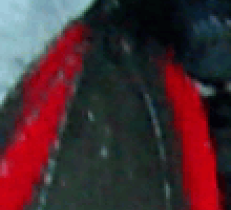 This is part of the above picture, blown up
to three times its size so three pixels here represent
one pixel on the original. This is part of the above picture, blown up
to three times its size so three pixels here represent
one pixel on the original.You can see that the detail
appears to be fairly consistent as the light grey lines
travel across the darker colours of the wing. However,
where the border is between red and the darker grey, the
level of detail is half of that - giving it the blocky
appearance. |
|||
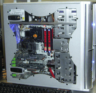 This is an image of a computer that appeared
at the Computer Trade Show in May 2006. This is an image of a computer that appeared
at the Computer Trade Show in May 2006.The 'R's of
'CORSAIR' definitely have a clipped appearance about
them. |
|||
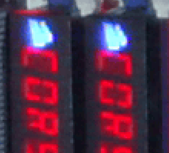 And here, you can see just how clipped - you
can also see that the pure red only has half the detail
again. So, what's going on? And here, you can see just how clipped - you
can also see that the pure red only has half the detail
again. So, what's going on? |
|||
 The image sensors in your digital camera are
sensitive from blue right down to red (and beyond, into
the infra-red range) and therefore are not capable of
differentiating between colours. To get over this, the
sensor manufacturers use filters so that a given cell
will be sensitive to red, green or blue - corresponding
to the primary colours that our eyes use. The image sensors in your digital camera are
sensitive from blue right down to red (and beyond, into
the infra-red range) and therefore are not capable of
differentiating between colours. To get over this, the
sensor manufacturers use filters so that a given cell
will be sensitive to red, green or blue - corresponding
to the primary colours that our eyes use.A cell can only detect one colour so they have to be placed next to each other - a demosaicing algorithm being used to guess the levels of the two missing colours so that the cell can form a three-colour pixel. A hexagon- or triangle-based pattern would be best for fitting the colours on the sensor but unfortunately, colour monitors and every image processing/handling software and hardware component down the line uses a rectangular raster. To get over this, each 2x2 sub-square of the layout of the cells has the three primary colours and the fourth cell is used for an additional green - the Bayer filter mosaic. Our eyes are more sensitive to green so having twice as many of these than the other colours allows for more detail in the final image. Whilst green is all right for detail, the red and blue are impoverished and you can see in the images on the right that every other row/column doesn't have either a red or a blue. |
|||
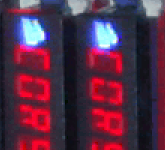 This has the unfortunate effect that where
you have a narrow, saturated red or blue detail that
crosses one of these blind rows/columns, there is nothing
there to form a guess with. This has the unfortunate effect that where
you have a narrow, saturated red or blue detail that
crosses one of these blind rows/columns, there is nothing
there to form a guess with.In the photograph, you can see how the Bayer mask overlays the memory card displays and that the bottom of the 'C' in 'CORSAIR' on the display falls in one of these blind spots. Unfortunately, you are stuck with this and even using a RAW image will only give you the same information. The solution is to use a camera with a completely different type of sensor - one that uses a trichroic beam splitter and three different sensors so that three cells (red, green and blue) map onto each other leaving no blind spots for thin lines to disappear into. But first, you've got to find one. |
 Bayer mask interpolation
|
 The result of this is that if you were
interested in a range of detail that only existed in the
darkest one per cent of the image density, a JPEG image
(being 8-bit) would give you two or three values to
choose from whereas you might well find that you could
extract a whole eight-bits-worth of data from that range
using RAW. The result of this is that if you were
interested in a range of detail that only existed in the
darkest one per cent of the image density, a JPEG image
(being 8-bit) would give you two or three values to
choose from whereas you might well find that you could
extract a whole eight-bits-worth of data from that range
using RAW.Another advantage of cutting down the
dynamic range to 8-bit is that you are able to perform
corrections to: colour temperature; linearity; gamma;
saturation; and, so on - at the end of this, you still
have an 8-bit per pixel per colour image and haven't
introduce any JPEG artefacts. |
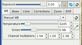 Here is the White balance tab. You can
select the level of green you need to have, along with
the colour temperature. Here is the White balance tab. You can
select the level of green you need to have, along with
the colour temperature. |
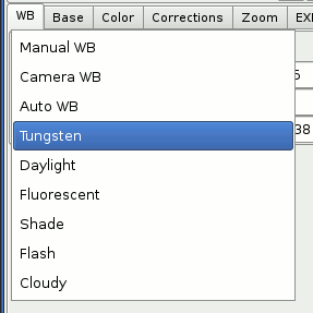 If you click on the dropdown combo, you can
see a number of different white balance choices. If you click on the dropdown combo, you can
see a number of different white balance choices. |
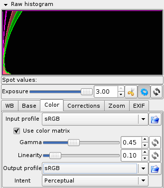
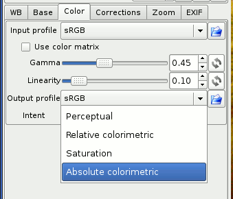 The colour tab allows you to choose an input
profile and an output profile, changing the gamma and
linearity in the process. The colour tab allows you to choose an input
profile and an output profile, changing the gamma and
linearity in the process.Notice the file icons on the
right hand side. You can load or save curves and other
settings as you go so if you encounter these conditions
again, you can just call them up when you need them. |
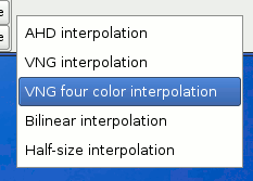 Here, we have the interpolation algorithms
to use. AHD should do for most operations but you can
choose any you like. Here, we have the interpolation algorithms
to use. AHD should do for most operations but you can
choose any you like. |
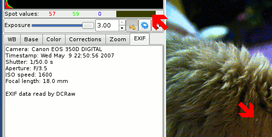 You can also take spot measurements either
by clicking on the image and reading the values or... You can also take spot measurements either
by clicking on the image and reading the values or... |
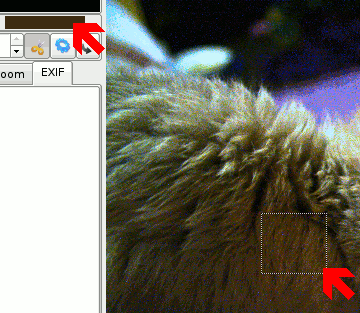 ...dragging an area. ...dragging an area. |
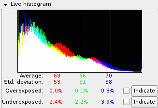 In the column on the left, at the bottom,
there are a couple of buttons and check boxes: for under-
and over-exposed pixels. Clicking and holding down the
buttons will show you which channels are over exposed and
where on the image; whereas checking the checkboxes will
mark the under exposed as black pixels and the over
exposed as white pixels. In the column on the left, at the bottom,
there are a couple of buttons and check boxes: for under-
and over-exposed pixels. Clicking and holding down the
buttons will show you which channels are over exposed and
where on the image; whereas checking the checkboxes will
mark the under exposed as black pixels and the over
exposed as white pixels.So, whilst RAW files are normally at least twice the size of a corresponding JPEG, the amount of extra data you have to play around with makes it all worthwhile because you can look at sections of the image that are usually destroyed by the process that makes the JPEG image for you. |
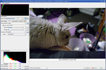 Raw image format