PC Plus HelpDesk - issue 208
This month, Paul Grosse gives you more insight into
some of the topics dealt with in HelpDesk and HelpDesk
Extra
|
 |
HelpDesk
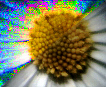
CURING PSYCHEDELIC GREYS
Where the values for each colour are close to each other, perhaps only a few apart, perhaps RGB values of 128,127,127 for example giving a hue of red, although the original hue might have been more of an orange, amplifying the hue will take the vector off in a direction that it was not supposed to go. If, instead of 8 bits per pixel per colour, there were 16, the hue vectors would be defined more accurately and these errors would not occur so much. Having said that, many digital pictures that are taken in low light levels will have a lot of noise, thus rendering useless any information in the least significant bits. These bits are effectively only useful in image editing where taking an image beyond the 8 bit extremes and bringing it back again would effectively posterised the colours of low saturation areas of the image. In The GIMP, you can produce the effect of the upper left portion of the above image by right-clicking on it and selecting Image/ Colours/ Filter Pack..., selecting Saturation in the Windows section and changing the roughness. Unless you are looking specifically for this type of effect, it is not desirable. This is how to work around it.
Grap the small circle and drag it over to one side so
that any unsaturated colours contrast to the other
colours.
Click on the Main tab and then set the From angle to zero and click on select all again. This should restore your image to the way it did before you rotated it. If you increase the saturation using the Filter Pack now, the greys will stay grey. |
 When increasing the
saturation of a photograph, any colours that are close to
grey force the graphics program to guess the hue. The
reason that these errors occur is that the images are
stored with only 8 bits per colour, ie values of 0 to 255
and the hue is effectively a vector derived from these.
When increasing the
saturation of a photograph, any colours that are close to
grey force the graphics program to guess the hue. The
reason that these errors occur is that the images are
stored with only 8 bits per colour, ie values of 0 to 255
and the hue is effectively a vector derived from these.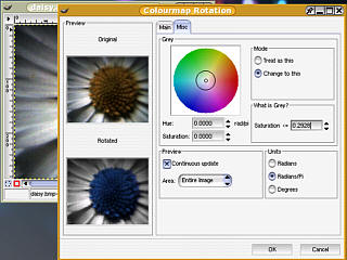 If you right-click on
the image and select Image/ Colours/ Colourmap
Rotation... Click on Select all in the To and From panes
then in one of them, rotate the colour by at least 0.3
radians by dragging the arrows from within the circle.
Then click on the Misc tab.
If you right-click on
the image and select Image/ Colours/ Colourmap
Rotation... Click on Select all in the To and From panes
then in one of them, rotate the colour by at least 0.3
radians by dragging the arrows from within the circle.
Then click on the Misc tab.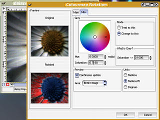 Then, in the What is
Grey? pane, increase the value until the lower image has
all of the appropriate grey areas coloured.
Then, in the What is
Grey? pane, increase the value until the lower image has
all of the appropriate grey areas coloured.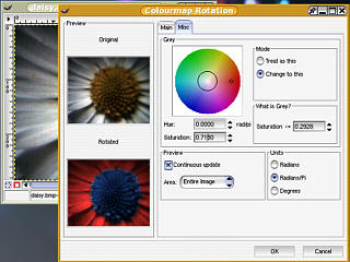 Once this has been
done, change the hue and saturation on the left, back to
zero so that the image below looks the way it did after
you rotated it.
Once this has been
done, change the hue and saturation on the left, back to
zero so that the image below looks the way it did after
you rotated it.HelpDesk Extra
Ice Windows Manager
Window decorations can be broken down into two areas: the border and the title bar. They are both configured in the default.theme file.
Borders
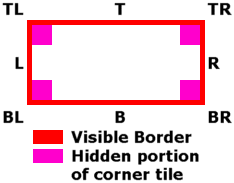 The borders consist of
corners and the image that is tiled to make the edges. The corner
images have a portion that is visible which has a horizontal
portion that has the same height as the top and bottom, and a
vertical portion that has the same width as the left and right.
The area that cannot be seen is of no concern: some people make
it transparent and others fill it with a colour that contrasts.
These just make it easier to visualise it when you are building
up the images but it could contain other information if you
wanted it to or did not bother with it.
The borders consist of
corners and the image that is tiled to make the edges. The corner
images have a portion that is visible which has a horizontal
portion that has the same height as the top and bottom, and a
vertical portion that has the same width as the left and right.
The area that cannot be seen is of no concern: some people make
it transparent and others fill it with a colour that contrasts.
These just make it easier to visualise it when you are building
up the images but it could contain other information if you
wanted it to or did not bother with it.
 The height of the corner is defined in
the default.theme file and IceWM knows how much to have as the
border by the definition of the thickness of the edge. Similarly
for the vertical portions.
The height of the corner is defined in
the default.theme file and IceWM knows how much to have as the
border by the definition of the thickness of the edge. Similarly
for the vertical portions.
Note that, as in the image on the right, horizontal and vertical values need not be equivalent. Also, the height of the corner need not be the same as the height of the top plus the height of the title bar.
Borders are defined as so:
BorderSizeX=7
BorderSizeY=7
CornerSizeX=30
CornerSizeY=30
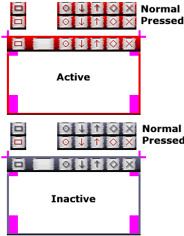
Remember that there are also two sets: one for the Active and one for the Inactive borders. If any single image is missing, the borders will not load so here are the names of the files:
frameAT.xpm
frameATR.xpm
frameAR.xpm
frameABR.xpm
frameAB.xpm
frameABL.xpm
frameAL.xpm
frameATL.xpm
frameIT.xpm
frameITR.xpm
frameIR.xpm
frameIBR.xpm
frameIB.xpm
frameIBL.xpm
frameIL.xpm
frameITL.xpm
Title Bar
The title bar itself can be broken into two areas: the buttons and the tiles.
Tiles
Artistically speaking, the tiles need to convey a sense of continuity between the buttons. On the SuperDisc, I have included two demonstration themes which you can load onto your machine and use as themes. To do this, follow the instructions in the magazine. The files are HDXDemoCentre.tar.gz and HDXDemoLeft.tar.gz. If you select these and open up a few windows, you will be able to see how the tiles work as you re-size the windows.
Also, if you open up the relevant default.theme file, you can play around with the parameters, changing the values to see how they interact.
Buttons
The buttons are twice the height of the title bar tile images, having a normal and a pressed image - the normal one being above the pressed. Make sure that you have not included any of the border with these images. Ideally, they should all be the same width but do not have to be. Also, it is a good idea to make the Active and Inactive versions the same width or you are just asking for trouble.
It is a good idea to use symbols that the users are likely to understand for these so, unless you are embarking on a planet-changing mission, subverting the whole computer user population, stay with the known ones - have a look at existing themes to see what others have done.
As all ways, there are Active and Inactive versions. A typical filename would be menuButtonA.xpm
default.theme file
A default.theme file has the following elements:
ThemeDescription="BrassWireAndTinplate"
ThemeAuthor="Paul Grosse <paul.grosse@futurenet.co.uk>"
Look=pixmap

TitleButtonsLeft="s"
TitleButtonsRight="dhrimx"
TitleBarHeight=20
TitleBarCentered=1

# borders

BorderSizeX=7
BorderSizeY=7
CornerSizeX=30
CornerSizeY=30

# titlebar

ColorNormalTitleBarText="#404040"
ColorNormalTitleBarShadow="#FFFFFF"
ColorActiveTitleBarText="#FFDD53"
ColorActiveTitleBarShadow="#404040"
The TitleButtonsLeft and TitleButtonsRight variables let the computer know where the buttons go in the default setup. The letters are as follows:
| Button | File Name | Letter |
|---|---|---|
| Menu | menuButton | s |
| Sticky | depth | d |
| Minimise | minimize | i |
| Restore | restore | m |
| Maximise | maximize | m |
| Close | close | x |
| Roll Up | rollup | r |
| Roll Down | rolldown | r |
| Hide | hide | h |
Note that although all of the buttons have different file names, some buttons have the same letter - this is because they are not normally shown at the same time.
Making your own
Design the Active first
Using your favourite drawing package, create a largish, blank new image. Draw on it a rectangle of the border thickness you would like and then, if you want a different top and bottom border thickenss to the left and right, either cut and paste the existing ones or draw thicker lines.
Next, draw your title bar and then, with a magic select tool of some sort, select the whole of the borders and title bar and make it look the way that you want, taking into account that you will have various parts of it being tiled and eaten up in various ways.
 Once you have your tile
background made, put on it the area for buttons and the title, if
they are going to be different. One way that I found useful was
to make a small background with the left and right edges and then
duplicate this with the size cut down to make the buttons. Then,
draw the button symbols (menu, sticky, minimise, restore,
maximise and close) and then, duplicate the part of the menu
buttons minus the border, to a space nearby. Generate another set
just above it and then differentiate the two so that you know
that the upper set is for normal and the lower set is for
pressed. An easy way of doing this is to use a drop shadow so
select all of the button shapes at once and then use the
Script-Fu drop shadow or whatever you want for whichever graphics
package you are using. Doing this will give you the buttons in
their 'ready to cut out' form for later.
Once you have your tile
background made, put on it the area for buttons and the title, if
they are going to be different. One way that I found useful was
to make a small background with the left and right edges and then
duplicate this with the size cut down to make the buttons. Then,
draw the button symbols (menu, sticky, minimise, restore,
maximise and close) and then, duplicate the part of the menu
buttons minus the border, to a space nearby. Generate another set
just above it and then differentiate the two so that you know
that the upper set is for normal and the lower set is for
pressed. An easy way of doing this is to use a drop shadow so
select all of the button shapes at once and then use the
Script-Fu drop shadow or whatever you want for whichever graphics
package you are using. Doing this will give you the buttons in
their 'ready to cut out' form for later.
Then the Inactive
Next, we need to create the inactive set. The easiest way of doing this is to alter the colours as changing the sizes will lead to inconsistencies. However, we must remember to make sure that the icons in the pressed versions stays the same colour as the active version of the buttons.
To do this, copy the entire image that you have created into a spare bit of the image and then highlight the whole of the inactive part. Then, deselect the areas we want to leave alone.
With this done, you can now change the saturation, luminosity, gamma or whatever you want and you can see what it will look like before you settle on a fixed idea. Here, I have changed the hue to make it a little bluer and decreased the saturation thus giving a steely grey appearance. Next, you have to start chopping up the image.
Chopping it up
It is best to work logically otherwise there are so many images that you will miss one out. Start off by creating a directory that you have permissions to - create one on your desktop for instance. Then start on the borders.
Using the select tool, highlight the corners of the border image and then hold down [Ctrl]+[C] to copy it into the clipboard, then right click, Edit/ Paste as New and that will appear as a new image. Do this with all eight (remember that there are active and inactive versions) and save them as .xpm files using the correct names. Ignore the transparency. I find it useful to have a list of the names and tick them off as I do them. That way, none get left out. Next, do the edges.
If you right-click on an image and select Image/ Canvas Size..., you will see the dimensions of the image. You can use these values in the default.theme file. For a corner image, determine the CornerSize values and with the top and left border images, determine the BorderSize values.
Next, do the same with the buttons, using the image pairs that you have created. Next, you have to create the JLSPTMBR and Q images for a centred title bar or just the LPTMBR images for a left justified title bar. The height of these, which is half the height of the button images is the value entered in TitleBarHeight
Last of all, you can state what colours you want the title text to be and if you want to use a drop-shadow.
If the drop-shadow is darker, the letters will appear to stand out. If it is lighter, the letters will appear to be indented or engraved. For the letters themselves, if you want to choose a colour that goes with the image you have worked on, you can see the hex values for it by using The GIMP. Select the colour picker tool (the eyedropper) and click on the image. The colour you have chosen will appear in the Colour Picker window along with the hex triplet. As you move the mouse around, you can see the value vary. Use this in the Colour values part of the default.theme file.
To install your theme, simply copy to the destination you want (for all or just yourself as described in the magazine) and Control Centre will see it.
Distributing it
Open up a copy of Konqueror and point it at your theme directory. In the tree on the left, right-click on the directory that the theme directory is in (not the theme directory itself) and on the menu, select 'Open Terminal Here'. Say, for argument's sake that you have named your folder 'MyTheme'.
In the terminal, type...
tar czvf MyTheme.tar.gz MyTheme
This will create a tarball of your theme.
The options are as follows:
- c create a new archive
- z filter the archive through gzip
- v verbose - list the files processed
- f use archive file
Note that the default zipped folder in Windows XP Home will not open tar.gz files but WinZip will.
The tarballs that are produced by this can be copied around and posted on the Internet. To install a tarballed file, follow the instructions in the magazine.
On the SuperDisc, I have included the two demo themes as tarballs and in addition, I have included the themes: BrassAndTinplate and HelpDesk also as tarballs. For those who would like to investigate making a theme, I have included a bitmap file of the theme discussed above (DemoTheme.bmp) for you to play around with.