PC Plus HelpDesk - issue 206
This month, Paul Grosse gives you more insight into
some of the topics dealt with in HelpDesk
|
 |
HelpDesk
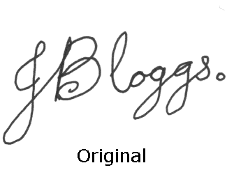
MAKING A SIGNATURE FONTIf you are discovering that along with the privilege of using the mail-merge facility of a word processor, there is also the responsibility of signing each printed out letter and when you have 300 or so to sign, you can foresee that the bank is going to be inviting you in for another specimen signature if it deteriorates much more, you may well consider putting your signature on the word processor before it is printed out. There are a number of security issues to take into
consideration before you commit to making a signature
font: one of them being the use of the signature by those
who have access to the font; and the other main one is
the use of it by those who receive the document with the
signature on it. Another way of doing it is to make it obvious that the signature is an electronically placed representation of a signature and that it could not appear on cheques. One way of doing this is to write the signature carefully with a wide pen, spelling out the name so that it is all completely legible -- something that no real signature is -- so that any information about pen speed and pressure is not recorded An alternative to that and possibly giving better results is to trace over the signature (that has been written with a normal pen) using a circular brush on the image processor. Another way is to pixelise it so that any such information is disguised in the same way that people's faces are on the television if their identity is to be concealed for some reason. Pixelising . . .So, assuming that you have scanned your "special signature" into your favourite image processing program, if you are going to pixelise it, you need to go through the next two steps. You might need to play around with the block size you choose to get the best results in the second stage so save a copy of it just in case. First of all, pixelise the image. Make a copy of the image that you can then play around with and then:
Or, Tracing . . .Clearing a (density) space . . .You need to go over the signature carefully with a solid, circular paintbrush with a definite (not feathered) edge. in order to allow you to see the signature while you work on it but to hide any parts of it that you haven't gone over from the rest of the process, you should first of all move it out of the density range you are going to use later on so first:
Painting . . .
Doing this will hide the details in the signature that show speed and pressure. Using black makes the image that you are generating, separate from the original. Then . . .Some font editors will look at the image you have supplied and allow you to select an image density around which it will draw the contour but just to make life simpler, you can do it in the image editor. You need to turn your image into a black and white image (as opposed to greyscale) and the way to do this is to use "Threshold".
Into a Font . . .Save the image and then load up your font editor: If there are any parts that need altering, you can change the position of the nodes or, if you need to add any new contours, you can do that as well, remembering that the outside of a shape goes clockwise and the inside goes anticlockwise (otherwise, your holes will not appear). Save the glyph and map it to (for argument's sake) the letter "A" (65), save a space (32) and save the font. Install it into the Windows/Fonts directory or install
it on Linux and you can then use it in your documents.
The jbsiga.ttf is on the SuperDisc. |
 With
preventing fraud in mind, it might be useful to make an
alternative signature -- one that is not recognised by
the bank as the one that appears on cheques and other
documents -- so that anybody that is tempted to put it to
unauthorised use, is stopped before any transaction can
take place.
With
preventing fraud in mind, it might be useful to make an
alternative signature -- one that is not recognised by
the bank as the one that appears on cheques and other
documents -- so that anybody that is tempted to put it to
unauthorised use, is stopped before any transaction can
take place.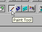 In
MPP, select the paint tool and then zoom in to at
least 400% and then carefully go over the
signature with a circular shape of at least 5
pixels (depending upon the scale of your
signature) -- if you scanned it in with a high
resolution, you might want to increase this to,
say, 20 pixels. Use the colour black which is isolated,
thanks to the fact that we cleared some space in
the density range.
In
MPP, select the paint tool and then zoom in to at
least 400% and then carefully go over the
signature with a circular shape of at least 5
pixels (depending upon the scale of your
signature) -- if you scanned it in with a high
resolution, you might want to increase this to,
say, 20 pixels. Use the colour black which is isolated,
thanks to the fact that we cleared some space in
the density range.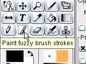 In
the GIMP, select the paint tool, the brush size
(using a hard edged circle) and the colour black
-- again, blow the image up so that it is
easier to work on.
In
the GIMP, select the paint tool, the brush size
(using a hard edged circle) and the colour black
-- again, blow the image up so that it is
easier to work on.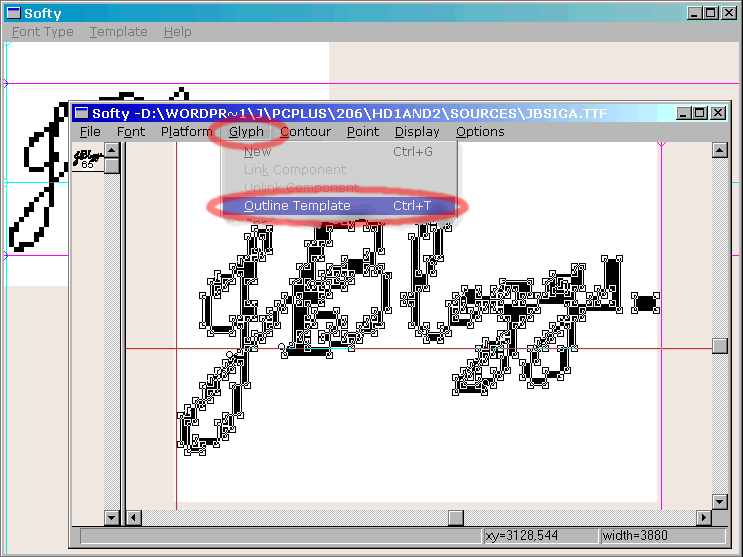 we shall use the
Softy font editor (shareware, [used to be available from http://users.iclway.co.uk/l.emmett/ but now] mirrored
we shall use the
Softy font editor (shareware, [used to be available from http://users.iclway.co.uk/l.emmett/ but now] mirrored 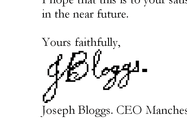 All you need to do is
to type the letter "A" and with the letter
highlighted, change the font to the signature font.
Increase the font size to 72 or so and that is it.
All you need to do is
to type the letter "A" and with the letter
highlighted, change the font to the signature font.
Increase the font size to 72 or so and that is it.HelpDesk
CURING UNWANTED DUAL-BOOTING
If you have had reason to 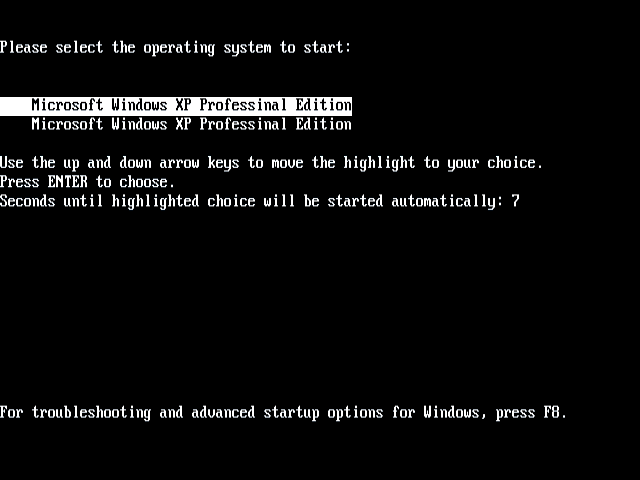 install Windows xp again (in this case,
it was a machine that had been set up incorrectly by the supplier
and rather than reformat and the resintall, the user just
reinstalled), you might get a screen like the one on the right.
install Windows xp again (in this case,
it was a machine that had been set up incorrectly by the supplier
and rather than reformat and the resintall, the user just
reinstalled), you might get a screen like the one on the right.
In this case, it is because Windows has seen an existing operating system and decided that it will allow you to run either (the fact that they are both the same and run from the same place doesn't seem to concern it at all).
The BOOT.INI file, usually found on the root drive is the one
to edit and getting rid of one simple line will stop this menu
from appearing.
The file looks like this . . .
[boot loader]
timeout=15
default=multi(0)disk(0)rdisk(0)partition(1)\WINDOWS
[operating systems]
multi(0)disk(0)rdisk(0)partition(1)\WINDOWS="Microsoft Windows XP Professional Edition" /fastdetect
multi(0)disk(0)rdisk(0)partition(1)\WINDOWS="Microsoft Windows XP Professional Edition" /fastdetect
All you need to do is delete the last line and without a choice, the menu will never appear.