PC Plus HelpDesk - issue 245
This month, Paul Grosse gives you more insight into
some of the topics dealt with in HelpDesk
|
 |
HelpDesk
Preserving Permissions on USB Flash Drives
Taking into account that the files can always be copied, if you want to make it effectively impossible for people to read files that are on there, you should also use some form of encryption. By default, these drives come formatted with one of the FAT file systems. This means that they can be read and written to on virtually any Personal Computer, whether it is a PC running Windows, a PC running any of the flavours of Linux/BSD/UNIX or even a Mac. However, there are several subtle disadvantages: |
So, how do we get around these inflexibilities? The answer is that we can format the USB Flash Drive with a UNIX-like file system such as ReiserFS (this also has the advantage that it is a proper journalling file system). |
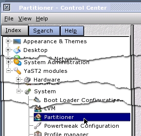 Open up Control Center and select 'YaST2
modules'/ 'System'/ 'Partitioner'. Open up Control Center and select 'YaST2
modules'/ 'System'/ 'Partitioner'. |
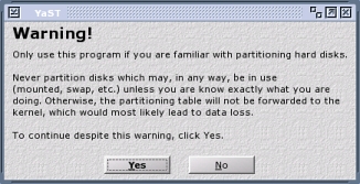 On the right, you will see a warning appear.
Click on 'Yes'. On the right, you will see a warning appear.
Click on 'Yes'. |
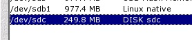
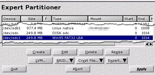 This is the drive and partition display -
heavily condensed. This is the drive and partition display -
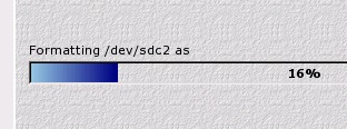
heavily condensed.Our USB Flash Drive - being a serial device - is in '/dev/sdc' and has a FAT32 partition in '/dev/sdc1'. We need to get rid of this, replacing it - for the purposes of this tutorial - with a Fat32 partition and a ReiserFS partition. So, make sure that the existing Fat32 partition is highlighted and then click on 'Delete'. |
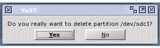 Don't worry about making a mistake with the
previous step because you are protected by a query box. Don't worry about making a mistake with the
previous step because you are protected by a query box.If you are sure that you have selected the correct partition, click on 'Yes'. |
 Now, it looks like this with only the disk
listed - in this case, '/dev/sdc'. Now, it looks like this with only the disk
listed - in this case, '/dev/sdc'.Next, we have to put some partitions on it. |
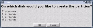 Click on 'Create' and the dialogue box
on the right appears. This allows you to select the drive
that you want to create a partition on. Click on 'Create' and the dialogue box
on the right appears. This allows you to select the drive
that you want to create a partition on. |
 MAKE SURE YOU
SELECT THE CORRECT ONE. MAKE SURE YOU
SELECT THE CORRECT ONE.In this case, it is '/dev/sdc'. |
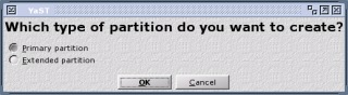 Next, you will be asked what type of
partition you want to create (so, even if you did select
the wrong one in the last dialogue box, you can still
select 'cancel'). Next, you will be asked what type of
partition you want to create (so, even if you did select
the wrong one in the last dialogue box, you can still
select 'cancel'). |
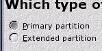 We'll select 'Primary' - you are allowed four
primary partitions. We'll select 'Primary' - you are allowed four
primary partitions. |
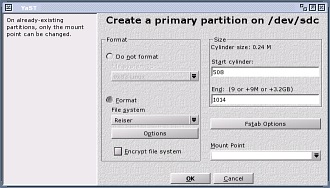
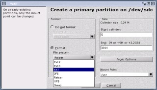 This is the dialogue box that we'll use to
create our partition. This is the dialogue box that we'll use to
create our partition.In the 'Format' frame, we need to select our file system - as there are no file systems on the partition yet, the 'Format' radio button is already set. |
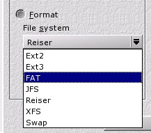 Click on the drop-down combo - it is already
set to 'Reiser' which is the default. Click on the drop-down combo - it is already
set to 'Reiser' which is the default.Select 'FAT' from the list - you can see that there are a number of file systems that you can choose from: some journalling and some not. |
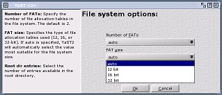 If you click on 'Options', you get the
dialogue box on the right. It allows you to specify the
number of FATs in the file system, the size of the FATs
(12-, 16- or 32-bit) and the number of root directory
entries. These are all set to reasonable defaults by the
system, according to the size of the partition you want
to specify so there is no real need to specify them here. If you click on 'Options', you get the
dialogue box on the right. It allows you to specify the
number of FATs in the file system, the size of the FATs
(12-, 16- or 32-bit) and the number of root directory
entries. These are all set to reasonable defaults by the
system, according to the size of the partition you want
to specify so there is no real need to specify them here. |
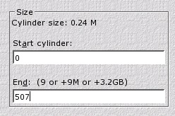 Next, we need to specify the number of
cylinders that this partition will have. There are 1015
cylinders on this drive (0-1014) so, as we want to make
two, roughly equal partitions, I have typed 507 for the
end cylinder. Next, we need to specify the number of
cylinders that this partition will have. There are 1015
cylinders on this drive (0-1014) so, as we want to make
two, roughly equal partitions, I have typed 507 for the
end cylinder. |
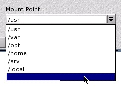 Following that, we need to specify that the
partition doesn't get mounted in the file system - we
want to be able to remove it and not have it there at
boot up time. So, select the blank option in 'Mount
Point'. Following that, we need to specify that the
partition doesn't get mounted in the file system - we
want to be able to remove it and not have it there at
boot up time. So, select the blank option in 'Mount
Point'. |
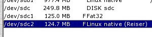
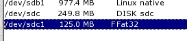 Finally, it looks like this. Note the 'F' in
the column before 'Fat32' - that means that it will
format this partition. Finally, it looks like this. Note the 'F' in
the column before 'Fat32' - that means that it will
format this partition. |
 Repeat the process although, this time, we
choose a ReiserFS format for the partition. Repeat the process although, this time, we
choose a ReiserFS format for the partition. |
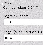 Note that the start cylinder number has been
inserted automatically - this is a fence-post issue so
507 was the last one of the first partition and 508 is
the first cylinder of this partition. We could, instead
of accepting 1014 as the last, choose a lower number if
we wanted to put further partitions on it but we will
not. Note that the start cylinder number has been
inserted automatically - this is a fence-post issue so
507 was the last one of the first partition and 508 is
the first cylinder of this partition. We could, instead
of accepting 1014 as the last, choose a lower number if
we wanted to put further partitions on it but we will
not.Again, we select no mount point. |
 It now looks like this. We are all ready to
proceed. It now looks like this. We are all ready to
proceed. |
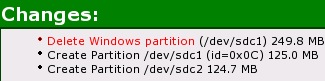
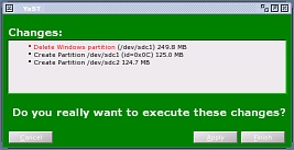 Actually, we haven't done anything to the
drive up until this point. Now, things will change. We
are presented with a list of changes and we can still
chicken out if we want to. Actually, we haven't done anything to the
drive up until this point. Now, things will change. We
are presented with a list of changes and we can still
chicken out if we want to. |
 If the list of things on the right is what we
really want to do, click on 'Finish' (or 'Apply' if there
are other things we want to do later on). If the list of things on the right is what we
really want to do, click on 'Finish' (or 'Apply' if there
are other things we want to do later on). |
 You can, of course, do these actions one at
a time by clicking on 'Apply' each time. You can, of course, do these actions one at
a time by clicking on 'Apply' each time. |
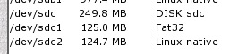 If you clicked on 'Apply', you should see
something like the shot on the right. We now have a 125MB
Fat32 partition that is readable by Windows (including
Windows 98SE which works without any fuss with that
partition) and just about any other operating system on
the planet; and a 124.7MB ReiserFS partition that is
readable by Linux. We can now take the drive out and, as
there was nothing written to the /etc/fstab file, next
time we start Linux (sounds a bit incongruous), the
system will not search for that drive and (if it was)
would not then fail to find it and dump you at the
command line so that you can edit the /etc/fstab file
using 'vi'. If you clicked on 'Apply', you should see
something like the shot on the right. We now have a 125MB
Fat32 partition that is readable by Windows (including
Windows 98SE which works without any fuss with that
partition) and just about any other operating system on
the planet; and a 124.7MB ReiserFS partition that is
readable by Linux. We can now take the drive out and, as
there was nothing written to the /etc/fstab file, next
time we start Linux (sounds a bit incongruous), the
system will not search for that drive and (if it was)
would not then fail to find it and dump you at the
command line so that you can edit the /etc/fstab file
using 'vi'. |
 If you run
a Linux/UNIX-like operating system, you will no doubt
like the file-level security that exists. If you save
files on a USB Flash Drive, then you will probably want
to make it more difficult for you to change by accident
certain files that are on a USB Flash Drive and this is
where UNIX-like file system permissions come in to play.
If you run
a Linux/UNIX-like operating system, you will no doubt
like the file-level security that exists. If you save
files on a USB Flash Drive, then you will probably want
to make it more difficult for you to change by accident
certain files that are on a USB Flash Drive and this is
where UNIX-like file system permissions come in to play.Light-weight PaperCheap, supermarket paper is a God-send if you have children using your printer all of the time but its quality can vary between 'very good' and 'execrable': sometimes it feeds and prints beautifully and other times ... well ... forget the ink bleeding through it, you can read a newspaper through it (yes, you really can). By definition, a sheet of DIN A4 paper is 1/16th of a square metre. The standard is that A0 has an area of 1m2 and has a ratio of short to long side lengths of 1 to the square root of 2 (1:1.414). If you then slice an A0 sheet in half, it now has a ratio of 1:0.7071. If you invert it and multiply it by 1.414, you get 1:1.414 again. This means that you can slice it in half any number of times and you always get the same aspect ratio. To find the area (in square metres) of a sheet of DIN A paper, the area = 1/2x where x is the number of the paper so, for A4, 1/2x is the same as 1/24 or 1/16m2. Paper is sold as a certain weight per unit area - usually 80GSM which means that one square metre weighs 80 grammes. So, if we know the weight per unit area of the paper and the area, we can work out how much it should weigh. Nowadays, a ream is 500 sheets so 500/16 = 31.25 m2. If you multiply this by the weight for a square metre (80 grammes), you get the weight of a ream which is, for 80GSM, 2.5kg. For 70GSM, it is just under 2.2kg. Normally, you would find 80GSM but card is usually 120GSM (or even heavier, depending upon your intended purpose) and 'Bank' paper is 40GSM (this is really light and used for typing records on where you have a lot of records to keep using as little weight of paper as you can get away with). You can also get 75GSM and 70GSM which have advantages if you are putting manuscripts through the post as every gramme saved works out cheaper in postage. So, when is 80GSM paper not 80GSM? Arguably, you could claim that if it worked out at 75GSM, it wasn't within the 80GSM range any more but quite a lot of the weight of paper is actually water and if you keep paper badly - in too dry an environment for too long - it can lose water and therefore weight. As an experienced paper purchaser myself, I would argue that if a ream of 80GSM clocked in at 2.2kg, it was well out of range and should be called 70GSM. So, if you are thinking of buying some cheap, supermarket paper, get a ream of it and weigh it on one of the sets of scales in the fresh veg section or get one of the cashiers to weigh it at a spare checkout. Paper is effectively sold by weight so if your ream of 80GSM paper weighs in closer to 70GSM, it is a Weights and Measures issue that needs to be addressed as it could be construed as 'passing off'. |
Sendmail in programs - Sending mail from programs |
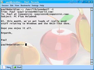 Sendmail is one of those programs that is
particularly useful. Sendmail is one of those programs that is
particularly useful.The screenshot on the right shows a typical session. First of all, you call it using its full path (which is normally /usr/lib although it can be in other places) and then, use the 'From:', 'To:', 'Subject:' and any other lines you need ('Cc:' and 'Bcc:' for instance) and then, leave a blank line (if you use the '-t' switch: see 'man sendmail' on the command line or click here man://sendmail for more details). Next, you type in your message and then, when you have finished, you put a full stop on a line on its own (nothing before or after it) and then press [Enter]. Sendmail then sends the email for you. |
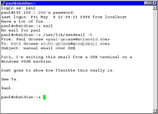 Even if you can't get to your computer but
you can log into it, you can still use Sendmail because
it is used from the command line. The session in the
screenshot on the right is taken from a Windows98SE
machine using an ssh session. Even if you can't get to your computer but
you can log into it, you can still use Sendmail because
it is used from the command line. The session in the
screenshot on the right is taken from a Windows98SE
machine using an ssh session.You can see that exactly the same thing happens. So, we know that we can send emails using it and that it is interactive but how do we send an email from within a program? |
Here's how to do it in Perl. #!/usr/bin/perl use warnings; # This demonstrates how to get one of the methods of how to get your # programs to send emails to you. You might want to do this if you # have a daemon that monitors something and needs to get in touch # with you - perhaps sending a report automatically on a daily basis. # Let us assume that we already have the message that we want to send # from the rest of your program in the following scalar: $content = "Put the text from your program in here - you could just have this string end here and then concatenate your report or message to it in another line of code. There is more than one way of doing it.\n"; # The rest of this program should be static as the only thing you are # going to get the program to do is to change the above message. # # Start off by creating the message in the $msg scalar. # # Note that you need to have a 'From:', a 'To:' and a 'Subject:' line. # You can also use 'Cc:' and 'Bcc:' # Next, you need to leave a blank line and then your message. # With sendmail, you can use the '-i' switch when inputting from a # program because sendmail will know when the end of the file is. Otherwise, # you need to have a dot on its own as the only character on the line to # signify the end of the message (in the same way that you would if you # were using sendmail from the command line. # # Note that we are using 'EOF' to terminate the string. You can use # anything - especially if it is likely to crop up in your string # anyway. Remember that this will be computer generated so you don't # need to interact with it once you have written it - you just need # to be able to make sense of it when you need to edit it - such as # if you change your configuration. # Note that the @ characters have to be escaped because this is # equivalent of using "" rather than '' $msg = << "EOF"; From: Monitoring daemon <yourname\@yourisp.com> To: your name <yourname\@yourotherisp.com> Subject: daemon daily report EOF # Next, add the message to the header $msg .= $content; # Unremark the following two lines if you want to check that the # string that the program is producing is working all right. #print $msg; #exit; # next, open up sendmail and send it the string. Note that you might have to # change the location of sendmail if it is in a different place. # If you want to change the options that you send to it, look them up on your # system by using 'man sendmail'. open (SM, "|/usr/lib/sendmail -t -i"); print SM $msg; close (SM) or warn "Sendmail sent a warning."; # and that is it. If you take out all of the comments, you have a nice # little program fragment that you can add to your own work and increase # its functionality. |
Note the lines...open (SM, "|/usr/lib/sendmail -t -i"); print SM $msg; close (SM) or warn "Sendmail sent a warning."; By opening sendmail - complete with any command line arguments that it needs such as -i so that it looks for an EOF rather than a '.' - as a pipe, we can print to it and when we close it, we effectively send it the EOF that it is looking for. Although this is in Perl, it is easy enough to translate it to any other programming language. |
Sub-Pixel Hinting a.k.a. Cleartype(tm)Sub-pixel hinting has been around for a while but only recently has the price of flat-screen monitors come down so that a substantial proportion of the user population can enjoy them. So, how good is it really? In Microsoft's press release (Autumn 1998), it stated 'ClearType improves display resolution by as much as 300 percent and works especially well on existing LCD devices, including desktop flat panels, laptops and smaller devices such as Handheld and Palm-size PCs.' Okay, so Microsoft's PR people don't know how to do the maths because a 300 per cent improvement would mean it was 4 times as good but, as you will see below, it could, at the most be only 3 times as good, hence an improvement of resolution by 200 per cent. So, taking that into account, can it be three times as good?
So, does it provide a '300 percent increase in image resolution'? in a real life environment, 100 percent is probably as much of an improvement as you will see and then only if you are completely colour blind (so that the colour fringes don't irritate you). Look at these two examples... |
|
Normal
Anti-Aliasing |
 Sub-pixel Hinting Sub-pixel Hinting |
| So, if you look over the next few items, you will learn how it works and can judge for yourself that if you try it out and you decide that you don't like it, you will know that it is sub-pixel hinting that you are blaming rather than something else. | |
How Sub-Pixel Hinting Works |
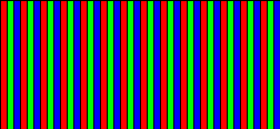
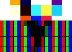
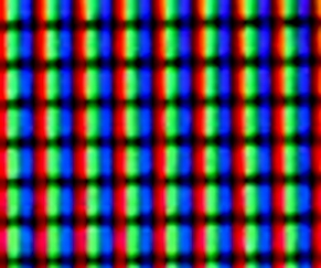 This is an
actual TFT display showing the cells. This is an
actual TFT display showing the cells.The cells are so tiny that you would be convinced that they were square. |
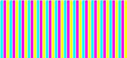
 If you are
using a TFT with the cells in order of RGB, you should
see that the distance between the blue and red is a lot
smaller - they might well appear to be touching. You will
see this without using any sub-pixel hinting (which
doesn't affect pixmap images such as the GIF on the
right). In fact, there is a one-pixel-wide line of black
between the red and green, the green and blue and a third
between the blue and red - even though it doesn't look
like it (get a magnifying glass out and look at the
screen). If you are
using a TFT with the cells in order of RGB, you should
see that the distance between the blue and red is a lot
smaller - they might well appear to be touching. You will
see this without using any sub-pixel hinting (which
doesn't affect pixmap images such as the GIF on the
right). In fact, there is a one-pixel-wide line of black
between the red and green, the green and blue and a third
between the blue and red - even though it doesn't look
like it (get a magnifying glass out and look at the
screen). This is, in effect, an example of sub-pixel hinting (well, shifting stuff around the screen by amounts smaller than a pixel) because the red displays a third of a pixel to the left and the blue displays a third of a pixel to the right, hence the gap being smaller. |
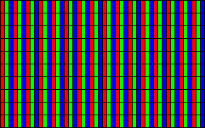
 Just in
case you were wondering if it was only red green and blue
it does this with, have a look at this yellow, magenta
and cyan screen - if you think of yellow being the
complimentary colour of blue, magenta of green and cyan
of red, when we have a white line in between, it also
works between the yellow and cyan (complimentary blue and
red). Just in
case you were wondering if it was only red green and blue
it does this with, have a look at this yellow, magenta
and cyan screen - if you think of yellow being the
complimentary colour of blue, magenta of green and cyan
of red, when we have a white line in between, it also
works between the yellow and cyan (complimentary blue and
red). |
 This is
the mask that we are going to put our text on. This is
the mask that we are going to put our text on.You can see that it mimics the real screen that is shown above. |
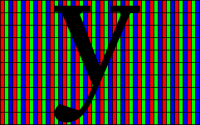 This is
the letter we want to put on it - a lower-case 'y'. This is
the letter we want to put on it - a lower-case 'y'.You can see that we are asking for a hopelessly large amount of detail to put in there but in reality, you wouldn't expect much from a small letter like this as long as the shape made sense in context - a lot of reading is recognising the overall shape of a word rather than identifying each letter individually. |
 This is
what we get. If you almost close your eyes, you can make
out that it is a 'y'. This is
what we get. If you almost close your eyes, you can make
out that it is a 'y'. |
 This is
what it looks like if you add the three colours together
so you have what your eye would expect to see and, at the
scale it is supposed to be at, it looks like this: This is
what it looks like if you add the three colours together
so you have what your eye would expect to see and, at the
scale it is supposed to be at, it looks like this: |
 If,
instead of taking the pixel location and finding out how
much of the pixel is covered by a line, we look at each
third of a pixel and see how much of that is covered by
each line, we generate colours instead of grey scale. As
a result of this, you can see in the image on the right
that there appear to be diagonal lines that are only 1
sub-pixel wide - you can see this especially at the lower
end of the y's tail where it is only a blue pixel wide. If,
instead of taking the pixel location and finding out how
much of the pixel is covered by a line, we look at each
third of a pixel and see how much of that is covered by
each line, we generate colours instead of grey scale. As
a result of this, you can see in the image on the right
that there appear to be diagonal lines that are only 1
sub-pixel wide - you can see this especially at the lower
end of the y's tail where it is only a blue pixel wide. |
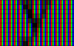
 If we look
at the colours generated, we end up with the image on the
right. Note that where there is a horizontal structure
that goes all of the way across a full pixel, the
resulting colour is a grey - as in the horizontal bars at
the top of each branch of the 'y'. If we look
at the colours generated, we end up with the image on the
right. Note that where there is a horizontal structure
that goes all of the way across a full pixel, the
resulting colour is a grey - as in the horizontal bars at
the top of each branch of the 'y'.Whilst the colours in the image on the right might seem to be utterly wild, a blue next to an orange will, at the pixel level cancel out to make a grey average over two pixels. However, on the sub-pixel level they are two dark sides of adjacent pixels. |
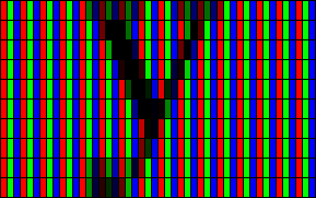
 If you
look at the part near to the middle that is orange, blue,
red, you can see in the image above that it is the bottom
of the 'v' part of the y, just above the row where they
meet. If you
look at the part near to the middle that is orange, blue,
red, you can see in the image above that it is the bottom
of the 'v' part of the y, just above the row where they
meet.If you look at the actual-scale image of the 'y' below, you can see that the colours have largely disappeared. It is when they do not disappear that they can be an annoyance. |
| At the scale it is supposed to be viewed at, it looks
like this: If you compare the two, side by side,
they look like this (pixel, then sub-pixel) - If you have a TFT monitor, you will be able to see that the sub-pixel hinting version is a lot clearer if you ignore the peculiar colours that you sometimes get. |
Adding/Removing Sub-Pixel Hinting - WindowsThis is done on the default (SP2) installation of Windows XP home without any plug-ins or toys. If you want to try out sub-pixel hinting on a Windows XP machine, this is what you need to do... |
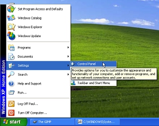 Click on
'Start'/ 'Control Panel' - note that this step will be
slightly different if you have the other (XP) menu type
but you end up at the control panel display which is
next... Click on
'Start'/ 'Control Panel' - note that this step will be
slightly different if you have the other (XP) menu type
but you end up at the control panel display which is
next... |
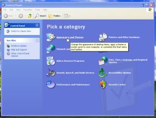 Next,
select 'Appearance and Themes'. Next,
select 'Appearance and Themes'. |
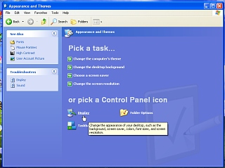 Then,
click on 'Display'. Then,
click on 'Display'. |
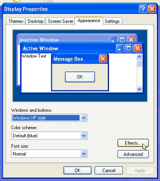 Now, we
have the 'Display Properties' dialogue box. Now, we
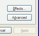
have the 'Display Properties' dialogue box.If you had the other type of Control Panel display, you could have got to this stage just by clicking on Display. Next, select the 'Appearance' tab and then, click on 'Effects...'. |
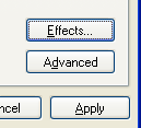
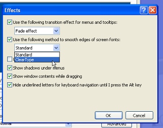 Now, we
see the 'Effects' dialogue box. Make sure that the 'Use
the following method to smooth edges of screen fonts:'
(yes, no definite article) checkbox is checked and then
select 'ClearType' from the dropdown combo box. Now, we
see the 'Effects' dialogue box. Make sure that the 'Use
the following method to smooth edges of screen fonts:'
(yes, no definite article) checkbox is checked and then
select 'ClearType' from the dropdown combo box.Next, click on OK |
| Following that, click on Apply and you will be able
to see the results...
|
 After
(with)... After
(with)...You can see that the contrast is greatly reduced and that there are some chromatic aberrations around the letters. It's a bit like looking at it through a dirty lens. |
 Just in
case you are wondering to what extent the effect is
there, here it is magnified four times... Just in
case you are wondering to what extent the effect is
there, here it is magnified four times...You can see that just about every vertical has been extended into the pixel on the left (the red line of pixels up the left) and is an example of poor font placement. This has the effect of smudging it. |
 Before (without)...
Adding/Removing Sub-Pixel Hinting - Linux/KDELike Windows XP above, this is done on the default installation of KDE without any plug-ins or toys. |
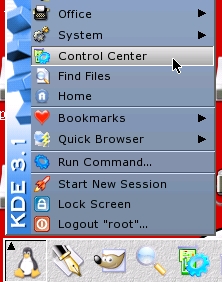 Fist of
all, click on the KDE menu and select Control Center. Fist of
all, click on the KDE menu and select Control Center.(Yes, this is on KDE 3.1 (this was part of the default installation at least that long ago) and we are now on 3.5.2.) |
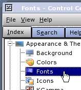 Next,
under 'Appearance and Themes', select 'Fonts'. Next,
under 'Appearance and Themes', select 'Fonts'. |
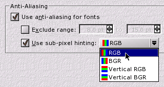 Following
that, in the 'Anti-Aliasing' frame, check 'Use
anti-aliasing for fonts' and 'Use sub-pixel hinting:'. Following
that, in the 'Anti-Aliasing' frame, check 'Use
anti-aliasing for fonts' and 'Use sub-pixel hinting:'.Note that you have four types:
|
| On KDE, Horizontal RGB looks like this: |
 Before
(without)... Before
(without)... |
 After
(with)... After
(with)... |
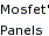 Just in
case you reckon that in the second one, it isn't there,
here it is, magnified four times... Just in
case you reckon that in the second one, it isn't there,
here it is, magnified four times...You can see that the font placement is a lot better than in Microsoft's version. The contrast between the vertical bars and any adjacent smudging is far greater so any smudging is only minimal - this is largely down to the choice of a better font and better font placement to start with. With other fonts at the right (wrong) size, the effect is just as psychedelic as in the Microsoft version. However, if you do want it, you can - with the KDE version - use it with any flat-panel display regardless of orientation. |