PC Plus HelpDesk - issue 220
This month, Paul Grosse gives you more insight into
some of the topics dealt with in HelpDesk and HelpDesk
Extra
|
 |
HelpDesk
Camera shutter speeds and delays
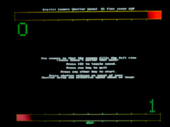
Using the results from your testing, you might not be able to do anything about the delay or the amount of time it takes for your camera to take a shot, but at least you know the values and can adapt your picture taking accordingly. |
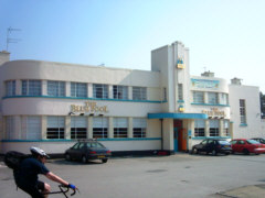 If
you have used your digital camera on anything
that moves reasonably fast, you will probably
have noticed that anything that moves from one
side of the image to the other will appear
slanted - here, we have a normal, everyday
picture of one of Derby's Art Deco buildings that
just happens to have a cyclist in the foreground
If
you have used your digital camera on anything
that moves reasonably fast, you will probably
have noticed that anything that moves from one
side of the image to the other will appear
slanted - here, we have a normal, everyday
picture of one of Derby's Art Deco buildings that
just happens to have a cyclist in the foreground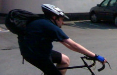 As
you can see, the cyclist is quite distorted and
as he appears to be leaning back, we can tell
that the image was scanned from top to bottom (or
the cyclist was moving backwards).
As
you can see, the cyclist is quite distorted and
as he appears to be leaning back, we can tell
that the image was scanned from top to bottom (or
the cyclist was moving backwards).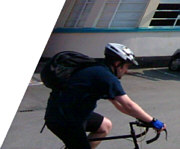 The
amount of trapezoidal distortion that has to be
applied to get him back to something that looks
reasonable is around 30 degrees. Cars on
motorways or aircraft in motion would clearly
suffer too much to produce images that were of
any use.
The
amount of trapezoidal distortion that has to be
applied to get him back to something that looks
reasonable is around 30 degrees. Cars on
motorways or aircraft in motion would clearly
suffer too much to produce images that were of
any use.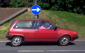 The
car on the right was moving at only a moderate
speed - less than 30MPH - and the camera was held
upside down - the only thing missing is the Road
Runner. Before you draw any conclusions about
distance and speed, note that the car was further
away from the camera than the cyclist.
The
car on the right was moving at only a moderate
speed - less than 30MPH - and the camera was held
upside down - the only thing missing is the Road
Runner. Before you draw any conclusions about
distance and speed, note that the car was further
away from the camera than the cyclist.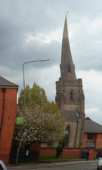 You
can see for yourself just how much of this effect
you can generate by wiggling the camera from side
to side whilst taking a shot.
You
can see for yourself just how much of this effect
you can generate by wiggling the camera from side
to side whilst taking a shot.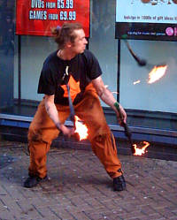 Another
aspect of this scanning effect is that anything
that is rotating fast will appear to be bent.
Another
aspect of this scanning effect is that anything
that is rotating fast will appear to be bent.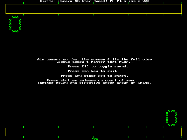
 From
a Praktica G 2.0
From
a Praktica G 2.0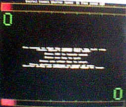 From
one of the MN100-based cameras - a Digital Dreams
l'espion.
From
one of the MN100-based cameras - a Digital Dreams
l'espion.Misleading disk capacitiesThis is a problem in that there is a lot of confusion about just what is meant. It is also a hangover to the days when disk capacities were not that greate - 20MB being enormous - when the errors involved were not that great. So, what is the problem? The international system of prefixes (SI) has a series of standard powers of 1,000. The IT industry uses 1024 instead (210). The advertising industry does what it knows best and mixes the two. As a result, we find mixtures of factors of 1,000 and 1024. Thus,
As you can see, the values range from a few percent to almost 10 percent so it is fairly convenient to talk about MB, GB and so on. However, some people like to make round numbers and you can do this by mixing them up. Clearly, a kB is either 1,000 or 1,024 bytes but when you start getting into the 'giga' range, things can get interesting - thus...
In the shop, a 160GB drive has a nice, round number that is easy to remember. However, when it was on the machine, the two factors were 321,672,960 and 512 which, when multiplied together, gives 164,696,555,520 bytes or 164.7GB (103 x 3). If, instead, you take a different mix of k factors, you can get 160.8GB (103 x 2 x 210), 157.0GB (103 x 210 x 2) or 153.4GB (210 x 3). In Linux, you will see it reported as 153.3GB (depends whether you round or truncate as to whether you get .3 or .4) but in the shop you will see 160GB meaning 160,000MB which is not the same thing. However, whether you see 164GB or 153GB, there is no need to worry where that 10+GB has got to because it is still there. The problem is knowing whether or not it was there in the first place |
||||||||||||||||||||||||||||||||||||||||||||||||||||||||||||||||||||||||||||||||||||||||||||
Partitioning and formatting external drivesThere are many programs that you can buy for Windows that will partition your disks for you and like Windows programs, you have to pay good money for them. However, the ethos in the Linux world is rather different and instead of some utility being a potentially expensive addition to the system, you are most likely to find that it is already part of the system. The partitioning tools are like this and you can find them in the Control Center.
|
 To
add your new drive, you need to have a mount
point so create one in the Konqueror file manager
by right-clicking on a location in the tree and
then selecting 'Create Directory..."
To
add your new drive, you need to have a mount
point so create one in the Konqueror file manager
by right-clicking on a location in the tree and
then selecting 'Create Directory..."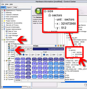 Next
you need to check that the system can actually
see it.
Next
you need to check that the system can actually
see it.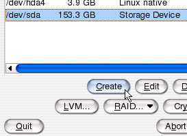 Click
on YaST2 Modules/ System/ Partitioner, click on
'Yes' and you will see the device in the /dev
directory appear in the list.
Click
on YaST2 Modules/ System/ Partitioner, click on
'Yes' and you will see the device in the /dev
directory appear in the list.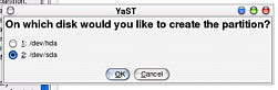 Select
the disk you want to partition - make sure you
get the right one - and click on 'Ok'.
Select
the disk you want to partition - make sure you
get the right one - and click on 'Ok'.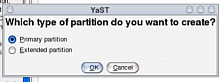 Select
'Primary' and click on 'Ok'.
Select
'Primary' and click on 'Ok'.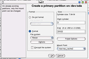 Now,
you can play around with the partitions on your
new disk. It is a good idea to have thought about
the use you are going to make of this resource so
choose well.
Now,
you can play around with the partitions on your
new disk. It is a good idea to have thought about
the use you are going to make of this resource so
choose well.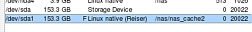 You
can now see the new partitions appear in the
list.
You
can now see the new partitions appear in the
list.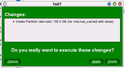 Click
on Apply to confirm that you wanted to do this...
Click
on Apply to confirm that you wanted to do this...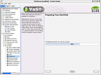 ...
and you will see the progress bar move as your
new partitions are created and then formatted.
...
and you will see the progress bar move as your
new partitions are created and then formatted.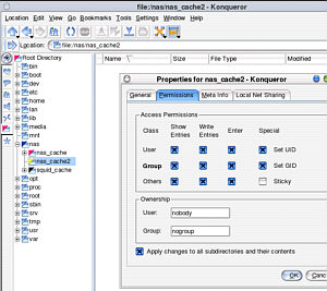 To
go on and make the NAS (Network Addressable
Storage), you need to adjust the permissions for
the directory - if you are going to make it
available to everybody then set the user as
nobody and the groups as nogroup.
To
go on and make the NAS (Network Addressable
Storage), you need to adjust the permissions for
the directory - if you are going to make it
available to everybody then set the user as
nobody and the groups as nogroup.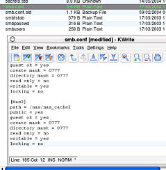 Go
into /etc/samba/smb.conf and generate a section
for your network share. The name in the square
brackets is the name that will be presented on
Konqueror under smb:// and Windows Explorer as
you look around the network neighbourhood.
Go
into /etc/samba/smb.conf and generate a section
for your network share. The name in the square
brackets is the name that will be presented on
Konqueror under smb:// and Windows Explorer as
you look around the network neighbourhood.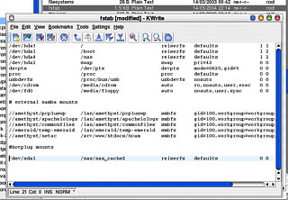 You
can check the mount point of the drive and alter
it if you want.
You
can check the mount point of the drive and alter
it if you want.Tabs in browsers
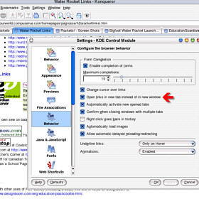
Konqueror users can open up pages in tabs instead of new browsers just by setting the 'Open links in a new tab instead of a new window' checkbox. This is found under 'Behaviour'. With this set, each time you click on a link with a target="new" or target="_blank", a new tab opens up. |
 Internet Explorer
fans are stuck with having many browsers littering the
desktop and with only one desktop to go at, that is a
limited resource as well.
Internet Explorer
fans are stuck with having many browsers littering the
desktop and with only one desktop to go at, that is a
limited resource as well.HelpDesk Extra
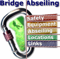
Making Webpages accessibleCreating a homepage imageYou don't have to have an image to have on your main index page but if you want people to remember your site such that they will be able to remember that this was the one that they wanted when they come back to it, an image is a pretty good idea. Another function of the main index page is to give the user an idea of the layout of your site - a way of visualising how you have chosen to divide up the pages so that if they understand it, they can get to where they want in a minimum of mouse clicks. Over the years, I have visited many sites that are virtually unnavigable because there is no idea that is conveyed to the user just how the information is ordered. So, with an idea of the major categories you want to present as navigation routes and with a knowledge of the content and theme of the site, you can get down to playing around with your favourite image processing package and create what you want. For this, I decided that I could demonstrate the concept by creating a fictitious site about abseiling off bridges - don't try this at home - although there is no content here that actually relates to how you would go about doing this. I suggest that if you really are interested in abseiling, you research it yourself. That's me off the hook - now onto the image...
The carabiner is on its side for two reasons: 1, it was easier to align the straps that way, and 2, the lighting was correct that way around. To correct that, I just rotated the image clockwise by 90 degrees. As you can see the lid of the scanner came out as a grey (this is because it is meant to be down flat when it scans and not to have a chunk of aluminium in the way) so that needed to be masked off and then whitened out. I also took the opportunity to give it a drop-shadow. Using a white background means that when people print your pages, they will use less ink which can only be a good thing. Also the straps I had were only in red, yellow and blue and I wanted some of the colours of the rainbow. This was quite easy to do because the background was white by then so I just masked off each strap in turn and changed the hue until I had the set of colours that I wanted.
|
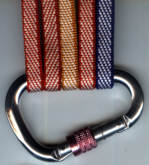 I could have spend a
few hours with a 3D modelling program, creating a virtual
carabiner and then populating it with virtual straps but
as I happened to have 22kN locking carabiners and straps
already, I just scanned them in, producing the image on
the right (okay, so I used a strip of blu-tak to keep the
straps in place).
I could have spend a
few hours with a 3D modelling program, creating a virtual
carabiner and then populating it with virtual straps but
as I happened to have 22kN locking carabiners and straps
already, I just scanned them in, producing the image on
the right (okay, so I used a strip of blu-tak to keep the
straps in place).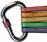 So, with it now the
right way up, on the right background and with the right
coloured straps, it is time to add the main menu items.
This is where a little thought should come in because you
will have gone to a lot of trouble to get this image and
by the time you restructure your site (and need to
replace or renew this image), you should have got quite a
lot of use out of it. Take your time and make sure that
your menu is correct (I have got a 30kN carabiner that
can take an extra strap if I required 6 menu items).
So, with it now the
right way up, on the right background and with the right
coloured straps, it is time to add the main menu items.
This is where a little thought should come in because you
will have gone to a lot of trouble to get this image and
by the time you restructure your site (and need to
replace or renew this image), you should have got quite a
lot of use out of it. Take your time and make sure that
your menu is correct (I have got a 30kN carabiner that
can take an extra strap if I required 6 menu items).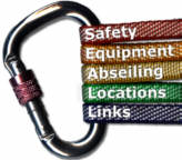 Enter your text in
the area you want your menu to appear and make sure that
you have the right font, size and colour for your needs.
Next, type in each item and position it carefully. I used
white text and added a centred drop shadow to each menu
item so that it stood out from the strap better by
increasing local contrast. With each one in place and
everything looking all right, I burned them into the main
image.
Enter your text in
the area you want your menu to appear and make sure that
you have the right font, size and colour for your needs.
Next, type in each item and position it carefully. I used
white text and added a centred drop shadow to each menu
item so that it stood out from the strap better by
increasing local contrast. With each one in place and
everything looking all right, I burned them into the main
image. To restore the balance, I decided to
put a photograph inside the carabiner so that
outside, out image remained white so that it was
still printer-friendly.
To restore the balance, I decided to
put a photograph inside the carabiner so that
outside, out image remained white so that it was
still printer-friendly.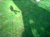 This is the shadow but rather than
being taken from the bridge, the fact that the
reflection in the grass is brightest around the
shadow of the abseiler shows that it is taken by
the abseiler (many things reflect light back in
the direction from which it came whether this is
water droplets, crystals in rocks, glass beads in
cat's-eyes, reflective paint or plant cells).
This is the shadow but rather than
being taken from the bridge, the fact that the
reflection in the grass is brightest around the
shadow of the abseiler shows that it is taken by
the abseiler (many things reflect light back in
the direction from which it came whether this is
water droplets, crystals in rocks, glass beads in
cat's-eyes, reflective paint or plant cells).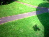 This one, again, is taken by the
abseiler.
This one, again, is taken by the
abseiler. This is the mask. It is based on the
inside of the carabiner but then shrunk by 12
pixels so that there is a border around it.
This is the mask. It is based on the
inside of the carabiner but then shrunk by 12
pixels so that there is a border around it. Before combining it with the base, I
also messed around with the colours a bit with it
in situ to make it look better.
Before combining it with the base, I
also messed around with the colours a bit with it
in situ to make it look better.Placing the image and other links on the page using tablesOne of the advantages of tables is that they are supported by many browsers in a fairly standard way - even text-only browsers such as Links support tables. Tables are very versatile in the way that you can use them to organise images and text on a page. Here we are going to use a series of nested tables to get our image and its supporting text in the middle of the page such that if the page is bigger than the image (plus text) it will be in the middle no matter how you resize it. First of all, you need to have a single-cell table that covers the whole page. To do this, you need to have the right attributes - the height and width need to be set to "100%" (note the use of quotes) and the align for the cell needs to be set at "center" <table border="0"
cellpadding="0" cellspacing="0"
width="100%" height="100%">
<tr>
<td align="center">The middle of the page.</td>
</tr>
</table>
Note that there is no valign="middle" attribute in the <td> tag because that is the default and it is therefore unnecessary in most cases. If you want to, you can add it just to make sure. One thing to be aware of is that some wysiwyg html page editors will take out tags that they see unnecessary or do not recognise - the result being that your image stays at the top of the screen instead of centring itself nicely because it has stripped out the height="100%" attribute. All you have to do once you have finished getting the page the way you want it is to load up the html file in a text editor and restore the attributes manually. Click here to open up a page with the above code in it in a new window. If you resize the page, the text will stay in the middle, regardless of the size or shape of the page. Of course, you can put anything in there (images, text, other tables, iframes) as long as you tell it what to do.
Click here to see this in action in a new browser window. Just like the text in the example above, the image and its text links stay in the middle, regardless (unless your window is smaller than the table block). |
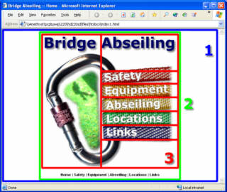 Here, you can see
that the above table is represented in blue (1). Inside
that, we have the image in a table (-set) of its own (red
- 3) and below that is the additional text under the
image - if all else fails, the user has the text links to
fall back on. In this way, the nested tables, of which
number two is the outer one, sit at the centre of the
browser, within the nested code above. As with the code
above, if you resize the page, (the user might want to do
this or there might be within the population of users a
variety of browsers on screen resolutions going from
800x600 through 1024x768 to 1600x1200 and beyond. With
this set-up, it will always be in the middle - just where
their eyes are supposed to be aimed.
Here, you can see
that the above table is represented in blue (1). Inside
that, we have the image in a table (-set) of its own (red
- 3) and below that is the additional text under the
image - if all else fails, the user has the text links to
fall back on. In this way, the nested tables, of which
number two is the outer one, sit at the centre of the
browser, within the nested code above. As with the code
above, if you resize the page, (the user might want to do
this or there might be within the population of users a
variety of browsers on screen resolutions going from
800x600 through 1024x768 to 1600x1200 and beyond. With
this set-up, it will always be in the middle - just where
their eyes are supposed to be aimed.
|
 Split
Image
Split
Image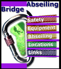 It is very tempting
just to place all of the images in just one table but
this has a bit of a problem. It just doesn't render
correctly.
It is very tempting
just to place all of the images in just one table but
this has a bit of a problem. It just doesn't render
correctly.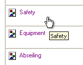 In Internet Explorer
on Windows, with images turned off, it renders as the
part-screen-shot image on the right with the alt tag text
in the right places and the borders of the images
outlined correctly.
In Internet Explorer
on Windows, with images turned off, it renders as the
part-screen-shot image on the right with the alt tag text
in the right places and the borders of the images
outlined correctly.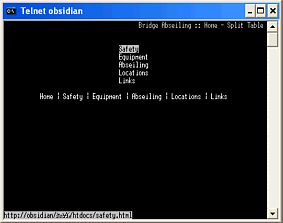 In Links, it looks
like this...
In Links, it looks
like this...Image MapThe image map is simpler in some respects because you can make changes to your image (tweak the colours, use a different effect here and there) and as long as your links stay in the same place, you will only have one image to save.
|
 Collecting
co-ordinates
Collecting
co-ordinates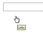 Without images, it
renders like this:
Without images, it
renders like this: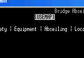 On a text browser, it
looks like this:
On a text browser, it
looks like this: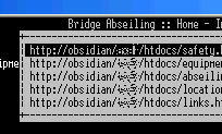 and when you press
enter or the right arrow key, it expands to this:
and when you press
enter or the right arrow key, it expands to this: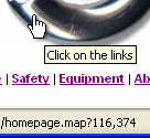 If you do this, any
clicks on the image will send a request to the server,
along with the mouse co-ordinates - you can see the name
of the program and the data passed to it on the status
bar of the browser as in the screen-shot on the right.
If you do this, any
clicks on the image will send a request to the server,
along with the mouse co-ordinates - you can see the name
of the program and the data passed to it on the status
bar of the browser as in the screen-shot on the right.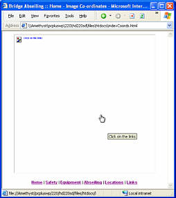 If you have images
switched off, you will see nothing as the browser itself
knows nothing as in the screen-shot on the right. Also,
there is the problem that some browsers do not know what
to do and as a result, display nothing.
If you have images
switched off, you will see nothing as the browser itself
knows nothing as in the screen-shot on the right. Also,
there is the problem that some browsers do not know what
to do and as a result, display nothing.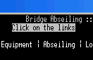 This is all that is
seen in a text-only browser. It does recognise it as a
link though and if you press enter or the right arrow key
to call the link, it will pass on the co-ordinates 0,0 to
the server.
This is all that is
seen in a text-only browser. It does recognise it as a
link though and if you press enter or the right arrow key
to call the link, it will pass on the co-ordinates 0,0 to
the server.Creating images for other pagesIf you just want a menu down the left side, a table will work the best for organising its appearance but you have a few options - do you use:
The first is most flexible as it is not bound by the limitations of an image and the user can impose his/her own style if it is required (such as in the case of visual impairment). The second is still fairly flexible as long as the text does not get bigger than the image. The third is the one favoured by many web designers because absolute control over the appearance of the page remains with them but it means that if you have a screen that does not resolve clearly enough, you could end up with links that are blurred that you cannot do anything about. If users cannot use a site easily enough, they will go somewhere else.
You can see that in both of these cases, the images created are quite simple. You just need a way of making them work for you... |
 So, if we are going
to have a background image for a menu, we need one that
will tile - the top and bottom match as to the left and
the right such as the one on the right.
So, if we are going
to have a background image for a menu, we need one that
will tile - the top and bottom match as to the left and
the right such as the one on the right. If you want a menu that
links up with links on the other side of the page, you
need to create that - dividing it up so that it works is
the clever bit. The one on the right is a variant of one
that I used on a website of mine recently. It allows a
number of links down the left with a contact link on the
right. The use of tables means that it will change its
size to fit any browser window. Additionally, if the user
changes the font or its size, it will accommodate that as
well. You just need to cut the image up into sections
for: bottom-left menu item; middle-left menu item;
left-hand vertical; top-left; horizontal; top-right;
right-hand vertical; bottom-right menu item;
If you want a menu that
links up with links on the other side of the page, you
need to create that - dividing it up so that it works is
the clever bit. The one on the right is a variant of one
that I used on a website of mine recently. It allows a
number of links down the left with a contact link on the
right. The use of tables means that it will change its
size to fit any browser window. Additionally, if the user
changes the font or its size, it will accommodate that as
well. You just need to cut the image up into sections
for: bottom-left menu item; middle-left menu item;
left-hand vertical; top-left; horizontal; top-right;
right-hand vertical; bottom-right menu item; Using tables to make it look good at any sizeWe know how to make a table fill the width of the screen by using the width="100%" attribute.
or...
You can take the image of the over-the-top menu, slice it up (making sure that your images have the same dimensions), copy the code for the above page into a page of your own, insert the images as described, change the border size to zero and see how it works. |
Using tables for menusThere are a number of ways of using tables with a background image in a menu. These are very simple solutions that look good. If you want to mess around with edge graphics in the same way as we built up the tables in the last menu above, you can and retain the flexibility required for different text sizes and so on. Using text in menus is by far the best idea as, unlike graphics which are static in size and style, text can be translated by online translators. If you have tried to navigate your way around a website that is written in a language that you do not understand but have solved the problem using an online translator, you will have found that if the site is constructed with graphics-only menus, they will still be in their original language and therefore of no use to you. If you don't use text in your menus, you will cut out a lot of people who do not understand your language.
or
but...
|
Using Server Side Includes (SSIs)Adding the same menu, over and over again can become a little laborious, even for a website with only half a dozen pages on it - especially if you decide to make a change. There is a better way though. If you get the menu looking just the way that you want it, you can save a lot of time. Implementing SSIs for a simple menuOnce you have created your menu, you can open up the code in a text editor and select the piece you want. Copy the text (highlighted with bold in the example below) into a new file and save it (with any extension - it doesn't matter). Note that this new file should only contain the code fragment and is not a full html page. <table border="0" cellpadding="0"
cellspacing="0" width="100%">
<tr>
<td valign="top">
<table border="1" cellspacing="0"
width="100" bordercolor="#00FF00">
<tr>
<td align="center">Menu</td>
</tr>
<tr>
<td align="center">Links</td>
</tr>
<tr>
<td align="center">Here</td>
</tr>
</table>
</td>
<td valign="top">Lorem ipsum dolor sit
Instead of the now missing code in the page, you need to add a tag to let the server know where to insert what file... <table border="0" cellpadding="0"
cellspacing="0" width="100%">
<tr>
<td valign="top">
<!--#include file="menu1.text" -->
</td>
<td valign="top">Lorem ipsum dolor sit
...where menu1.text is the name of the file with the menu code in it. In order to let the server know that it needs to parse a html file you need to tell it, either by changing its extension (usually to .shtml) or by changing the permissions attribute to executable (XBitHack on). Doing the latter will enable you to change the status of a file (from plain html to one that has SSI code in it such that the server will scan it) without needing to change its name and therefore, any file that referred to the static (html) file will still refer to the now SSI html file. For example: you might have a page called somepage.html that thirty or so other pages refer to and decide to add some SSI code to it. If you changed the extension to .shtml, you would have to edit every page that referred to it. However, with HBitHack on, you just have to change the file's permission to executable. As it keeps the file name, the files that refer to it do not need to be edited. You can see the Server-Side Includes website version on the SuperDisc by looking in the directory by clicking here. If you have a server and you want to check that it can do SSIs (not all servers can) then just copy this directory to it and see if it works. It works with Apache and a number of other servers support SSIs as well. One interesting thing about this is that you are not limited to menus. You can have a page that uses SSIs to to include other parts of the page as well such as footers (say a copyright notice that you have at the bottom of every page and you just update that each year instead of having to trawl through and edit every page individually. Other SSI functionsSSIs are not limited to including files in server html output - other things such as variables and program output can go there as well. You can include the output of variables such as the date or when the document was last modified: eg, This file was last modified on <!--#echo var="LAST_MODIFIED" --> You can also run programs in bash or a DOS shell (depending whether you are using one of the Unices or Windows - Windows users beware of using programs that give output that includes < and > such as DIR and so on). Use the <pre></pre> tags to format the text properly. eg, <pre> <!--#exec cmd="ls -las" --> </pre> and you can use environment variables and test them with conditional program flow. In section 1 of your httpd.conf file you would have... BrowserMatchNoCase MSIE IE which searches the browser string for "msie" and puts the result in a variable called "ie" You then might have a web page with a body fragment that looks like this... <body>
<!--#if expr="${IE}" -->
Internet Explorer is not supported by this Server.
<!--#else -->
<!--#include file="homepage.text" -->
<!--#endif -->
</body>
One word of caution is that running executables on a remote machine can be dangerous if people can write their own web pages such as with WEBDAV on home pages or with guestbooks. In that case, make sure that you disable this in the Options directive using the 'IncludesNOEXEC' argument which will still leave the other SSI functions available for use. There is a lot more about SSIs, possibly enough to do a HelpDesk Extra about in the near future. |
FramesFrames are a way of dividing up the browser into areas so that each area can have pages sent to it without the other areas needing to be downloaded as well. There are some benefits (for the programmer, similar to those with SSIs) but when you take into account local caching, the fact that:
They are not a particularly graceful solution to a problem that can usually be solved better in other ways. Having said that, here is how to do it... Creating the same site but using framesIf we want to generate a site that appears to function the same as the site we have already created without frames, we have a little bit of a problem but more about that in a while. First of all, frames load on your page instead of the body and appear in something called a frameset. A full frames page might look like the following: <html>
<head>
<title>Bridge Abseiling :: frames example</title>
</head>
<frameset cols="100,*" border="0"
frameborder="0" framespacing="0">
<frame src="menu1.html" name="menu">
<frame src="abseiling.html" name="main_page">
<noframes>
<body>
<p>It appears that your browser
doesn't support frames.</p>
<p>I'll have to write a better
website, won't I?</p>
</body>
</noframes>
</frameset>
</html>
Instead of the body, we have some tags called frameset that define areas of the browser display. Any particular frameset can only divide an area into rows or columns but you can divide a row into columns and vice versa by nesting framesets.. The frameset tag has the attributes cols= (you can use rows= instead) and then, in quotes, a number of pixels (100, 20, 350 whatever) or it can have a percentage (10%, 23% or whatever) followed by an asterisk. If you are only using percentages, you could have then add up to 100% but if you are using mixed or don't know the width of the screen, the asterisk lets the browser know that the rest of the screen wants filling up with that column. If you had cols="60,3*,2*" (note - no spaces), the browser would be divided up into three columns of 60 pixels and then 3/5ths and 2/5ths of whatever was left. Note that you can mix so, rows="10%,32,*" would be valid. Next, we have the frame tag which allows us to define the content of each frame in the order that they appears in the frameset definition. The first frame (the one that is a column, 100 pixels wide) is occupied by a file called 'menu1.html' as defied in the scr attribute. Note also that we have given it a name - 'menu'. If we have anything later on that needs to go into this frame, we can use the target attribute to direct it there as in target="menu" The second frame is called 'main_page' and it is to this that the file menu1.html will direct all of the pages. Following this, we have a section bounded by noframes tags. Within this we have a body tag pair just like a normal web page. This is your chance to create an alternative site for people with browsers that do not support frames - either: linking to an alternative, fully functional site with the same content, assembled with the same care giving the same browsing experience; or, a link to your alternative site that functions identically. However, most people just have a message that most people would read as; "so you haven't got a browser that interprets frames - tough." If you do this, you might just as well say; "go somewhere else and have a better time." So, if we want to have a home (index) page that has the image and associated text as before, when we click on an individual link in the image (or associated text), we need to be able to call up a frame that not only has the same index page on the left but also the correct page on the right. This means that for our five page site (that is to say five pages linked directly from the index page) we need to have five frame sets - one of which will be loaded, dependent upon which link is selected in the index page. However, once it is loaded, it stays there, loading other pages within it until someone clicks on home upon which command, it loads the home page into the _top, overwriting the frameset. Click here to see it in action If we drop the pretence of having a site that functions exactly the same, we can cut down on the number of files we need to have... Creating an alternative layoutThe only real difference here is to have a different home page - this having our image on the index page (as people will load it although it is in fact the index.html frameset that they are loading) but tolerating the menu on the left. Click here to see it in action. A BenefitThere are actually some benefits of using frames once you have set up a second (frames) website with the same functionality, content, navigability and so on as the first (non-frames) version. One of them is that with having only a small, single file to edit for your menu, you can be more versatile with it - giving it sub-menus instead of having to use scripts (which will get filtered out at the firewall by responsible sys-admins anyway) or other means. In short, you can get the menu file to load up another version of itself into the same window without having to load the page in the other frame. You can use this to expand on menus. Of course, in the non-frames world, you can load up the main page of that section with that part of the menu already expanded. If you click here, you can see a crude version of this in action (click on equipment to expand this) - this is only a start (you can do more with formatting and so on), if you want to expand on this idea, you can end up with a number of menus and before you know it you have one for each section of your site again. 1935 SaxophonesJust in case you are interested why I mentioned this as a possible subject for a website, up to the beginning of the 1930s, saxophones had the pads on the bell (the big bit at the front at the bottom) on the left. By the end of the 1930s, they had migrated over to the right so that people in marching bands wouldn't have the brass protective structure around the pads scuffing against their trousers whilst they marched. In the mid-1930s, there was a situation where only one of the pads had moved over. As this was a decade of change, these instruments are not as common as those that were made afterwards. |