PC Plus HelpDesk - issue 247
This month, Paul Grosse gives you more insight into
some of the topics dealt with in HelpDesk
|
 |
HelpDesk
Galleries in web browsersPrograms such as Microsoft FrontPage will do a lot of work for you if you want to produce web pages quickly and it can be quite helpful if you are in a hurry and you are not that bothered how your code looks and how it renders on various web browsers. |
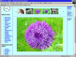 On the right is a web page that was created
with MS FrontPage (I have substituted the images and
otherwise bowdlerised it so that the identity of the
original pages shall remain hidden). This is how it
renders in IE6 and you can see that it is all right
(except that the HTML code is awful to look at with messy
directories and bits everywhere and, each time you click
on an image, in the thumbnail strip, it produces a
JavaScript error). On the right is a web page that was created
with MS FrontPage (I have substituted the images and
otherwise bowdlerised it so that the identity of the
original pages shall remain hidden). This is how it
renders in IE6 and you can see that it is all right
(except that the HTML code is awful to look at with messy
directories and bits everywhere and, each time you click
on an image, in the thumbnail strip, it produces a
JavaScript error).You would expect that it would render all right in IE after all. |
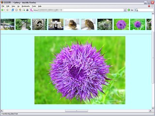 This is the same page as rendered by
Firefox. If you are wondering what has happened to the
menus on the left and the right, they are still there and
the scroll bar at the bottom should give a clue as to
what has happened to them. This is the same page as rendered by
Firefox. If you are wondering what has happened to the
menus on the left and the right, they are still there and
the scroll bar at the bottom should give a clue as to
what has happened to them.Firefox, it seems, looks at the list of thumbnail images and notes correctly that there are no spaces between the tags and therefore they should not be wrapped at all. |
 This is how it is arranged on the page. If
only they made monitors with 4:1 aspect ratios. This is how it is arranged on the page. If
only they made monitors with 4:1 aspect ratios. |
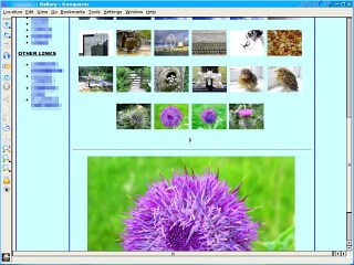 This is how it renders on Konqueror. Whilst
Konqueror might seem to aim at a small market, its KHTML
rendering engine is the one that is used by Mac OS X's
Safari web browser so, if you can get your pages looking
all right on these three, you have a lot of the
Internet's browsers sown up (okay, so there are others
but so far, nobody's sent me a press copy so that I can
evaluate them). This is how it renders on Konqueror. Whilst
Konqueror might seem to aim at a small market, its KHTML
rendering engine is the one that is used by Mac OS X's
Safari web browser so, if you can get your pages looking
all right on these three, you have a lot of the
Internet's browsers sown up (okay, so there are others
but so far, nobody's sent me a press copy so that I can
evaluate them).You might notice that the thumbnails are rendered as a table. In the code for this page, there are spaces within the tags that appear every block of six thumbnails. It seems that Konqueror sees these, works out that it ain't going to fit on the page unless it breaks it up some way and so decides to break it there. Looking at the code, I would say that that was the intention. Any way, it is totally unacceptable that this page renders in three different ways in these browsers. The IE example is clearly how it intended to look so we have to get a way of generating that in all three browsers, using a single version of the page. Also, people with any sense don't browse with scripts running so it also has to be able to work without any scripting |
| One way of doing this is to use
embedded, floating frames - these are called 'iframes'.
They are like images in that they can be placed anywhere
on a page but they are also effectively a little browser
window. Like normal frames, you can give them names and as a result, get other hyperlinks to load new pages into the iframes, using 'target="whatever"' in the anchor tags. You will need to have a regular page that loads the images but also you will need a web page that contains all of the thumbnail images and one each for the full-sized images. Whilst this might sound like a lot of work, you can write a Perl script to do it automatically for you. Here, we will use two:
Note, if you only need to display full-sized images that are all the same size, you can get away with a second iframe window that only displays the image - if you need to display different sized/aspect ratio images or you need to add more coding (such as links or notes) you will need to create a web page for each image. So, first of all, what images and pages do we need and what is a reasonable way to structure them? |
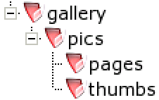 If we have: If we have:
If you wanted to run multiple galleries, you could organise it so that you had a pics directory for each and you could also have a sub-directory with the large pictures in it instead of pics - this would allow you to keep the layout simple but this will do for now... |
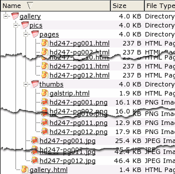 Here, you can see the directories with their
files in them. Here, you can see the directories with their
files in them.Note that in 'thumbs', there is the gallery strip page - galstrinp.html - which we will cover later on. First of all, iframes... |
| The coding for an iframe is quite simple
and is largely like the image tag (although you needs a
tag pair for some reason and usually, there is nothing
between the start and end tags). We will organise it
using tables as this is robust in almost every browser. First of all, the page that holds the two iframes has coding that looks like this ... <table>
<tr>
<td align="left">Click on an image ...</td>
</tr>
<tr>
<td><iframe hspace="0" vspace="10" width="90%" height=100
frameborder="0" bgcolor="#ffffff"
SRC="pics/thumbs/galstrip.html"></iframe></td>
</tr>
... which renders like this ... |
| Click on an image ... |
and the coding for the other frame looks
like this... <tr>
<td align="center" valign="top"><iframe align="center"
hspace="0" vspace="10" width="600"
height=450 bgcolor="#ffffff" name="mainpic"
frameborder="0" SRC="pics/pages/hd247-pg001.html"
scrolling="no"></iframe></td>
</tr>
</table>
... which renders like this ... |
| Note that if you click on the strip
above, the image will change in the iframe just above. So, how does it work? The code for the first frame - the galstrip.html file - looks like this... <html>
<body leftmargin="0" topmargin="0"><table
cellspacing="0" cellpadding="0"
border="0" height="75">
<tr>
<td align="center" valign="middle"><a
href="../pages/hd247-pg001.html"
target="mainpic"><img src="hd247-pg001.png"
hspace="2" border="0"></a></td>
<td align="center" valign="middle"><a
href="../pages/hd247-pg002.html"
target="mainpic"><img src="hd247-pg002.png"
hspace="2" border="0"></a></td>
(snip...) href="../pages/hd247-pg012.html"
target="mainpic"><img src="hd247-pg012.png"
hspace="2" border="0"></a></td>
</tr>
</table></body>
</html>
It is set out as a table so that it is robust. If you had pictures which were a mixture of portrait and landscape, you could use align="center" and valign="middle" within the <td> tag to make sure that everything was spaced nicely - use hspace and vspace to modify this was well if you want to. You can also (as you are coding this by hand) use the alt tags so that each image can have a description if you want. Note that each thumbnail image is a hyperlink to a page (or it could be just an image if you wanted) that is then targetted at the other iframe - the one called 'mainpic'. One other thing of note is that the body tag takes leftmargin="0" and topmargin="0" so that there is no space at the top or left of the window. If you left this out, you would get a gap on those sides and it would mean that the iframe window needed to be taller than the images. Also, note that the iframe height for the strips needs to be tall enough to hold the scroll bar (which is usually around 16 pixels high) so take your maximum image height (plus twice the vspace value) and add 16 to it to get the height of your thumbnail image strip with scroll bar. |
The code for each of the pages that are
called by galstrip.html looks like this...<html>
<body topmargin="0" leftmargin="0"><table
border="0" cellpadding="0" cellspacing="0"
width="100%" height="100%"><tr><td align="center"
valign="top" bgcolor="#ffffff"><img
src="../hd247-pg001.jpg"></td></tr></table></body>
</html>
...again, note that the image is in a page that has no top or left margins and also, that there are no spaces between tags within the body (this can be interpreted differently between browsers so iron out any potential for disagreement here). |
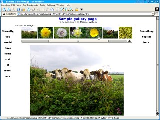 So, it is already to
assemble as a page and on the right, this is what it
looks like. So, it is already to
assemble as a page and on the right, this is what it
looks like.If you click on the image on the right, the full-sized version will open up in a new browser window and you can play around with it.
|
Standard exposures
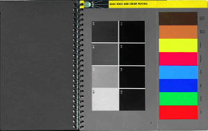
On the right, you can see a shot of the Kodak Professional Photoguide (ISBN 0-87985-100-7, first edition, first 1981 printing). I dare say that there are others but I have used this one for years (since 1981 in fact). The idea is that you take your photographs and also, in the same lighting, a picture of this. Then, you can modify your processing so that the final prints have roughly the same densities as the images on the right. Why would you want to do this? Because, if you were taking pictures of paintings or something else that had to be reproduced accurately, you would need to get it right. So, what do those numbers mean? On the left is a matt sheet of 18% grey card. This reflects 18% of the light that falls on it and being matt (it is a fairly good matt finish as well), it will give you a good idea of the incident light at that point. If you aim a light meter at this (from around 6" or 15cm but so that you don't cast a shadow on the card) you will get the same reading as if you slide the little white dome over the sensor. So, if you have a light meter without a white dome, use one of these instead. 18% grey is also the average colour of your image if it is exposed correctly. On the right, there is a fold-out section with the primaries and skin tones on it - along with their names so that you can recognise which is which if they get separated in the processing - and, a photographic print of some standard exposures. These have the absorbencies printed on them and that allows us to work out the values for correction purposes. The amount of light absorbed divided by the amount of light illuminating the area gives us a number which is analogous to transmission (in spectrophotometry) but if we take -log10 of that, we get the absorbency. So, to work out the absorbency from a photographic perspective, we need to know what white looks like (I0) and what our test piece looks like (I). So... |
|||||||||||||||||||||||||||||||||||||
|
|||||||||||||||||||||||||||||||||||||
| To work the other way, we can use a calculation that
gives us the proportion of light reflected and then - as
we are working with a system that gives us values between
0 and 255 - we can multiply that by 255 to give us our
RGB values. If you remember, on the SuperDisc for PC Plus HelpDesk issue 236, I wrote a calculator that takes arguments in calculator order (no BODMAS), you can use that like so (where you replace 'n' with the absorbency value you want such as 0.7 or whatever)... calc 10^n a-1 b/a 1-c d*255 ...and that will give the proportion of reflected light (This is not to be confused with reflectivity which is the power and therefore (I/I0)2 ) as the penultimate line and the RGB value as the last line. Our absorbency test sheet has the following values; 0.1; 0.4; 0.7; 1.0; 1.3; 1.6; 1.9; and 2.2. For good measure, I'll throw in the figures for the 18% grey as well. |
|||||||||||||||||||||||||||||||||||||
|
|||||||||||||||||||||||||||||||||||||
| So, now you know what to aim at with your colour
corrections.
You can either print this out on your own printer or, you can click on the links in that page to open a JPG or GIF image of the page that you can then copy to an SD card and get printed out at a chemist or photography shop. |
|||||||||||||||||||||||||||||||||||||
 If you
want to do photography in an objective way, you need to
standardise the way that you do things. One element of
that is to standardise the input part of taking a
photograph. The problems is getting hold of something
that has standard densities.
If you
want to do photography in an objective way, you need to
standardise the way that you do things. One element of
that is to standardise the input part of taking a
photograph. The problems is getting hold of something
that has standard densities.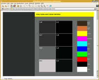
GIMP my picsAfter a long hard holiday of taking photographs, you will, once you have recovered from the exhausting process of getting back into the swing of things, like to look at your digital pictures. However, there are some limitations to digital images and there are some features that lead to problems that more conventional cameras tend not to suffer from to the same degree.
So, to summarise: we need to straighten the image; adjust its tone ranges; and then, clone out anything we don't want. There are other steps but we are not covering them here. But what program can do this and the many other things that we need to do? Fortunately, we don't need to spend hundreds of pounds on any commercial program to get what we need as there is a very good quality program that is free. It is called the GIMP and if you can't get a copy from the PC Plus SuperDisc, you can download it from http://www.gimp.org/. In addition to running on Windows, it also runs on Mac OS X, Linux and UNIX and, it uses the same interface in each of these OS groups so if you learn how to use it on one, you can use it on the others. |
Custom key sequences in the GIMPThe GIMP is quite easy to use - all you do to edit your image is to right-click on the image you want to edit and work your way through the menus to get to the tool you want. In later editions of the GIMP, there is also the same menu across the top of each image. The GIMP's menus are laid out logically and like every program, the more you use it, the easier it is to know where any particular tool is. However, like every GUI program, the keyboard is quicker at menus than the mouse and the GIMP accommodates this very well...
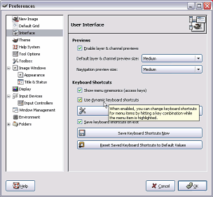
On newer versions of the GIMP, you need to turn on dynamic keyboard shortcuts (this allows you to program the key combinations - you can use the existing combinations or those that you have already programmed whether this is on or not). To do this, click on the 'File' menu item and select 'Preferences'. Under 'Interface', in the 'Keyboard Shortcuts' frame, make sure that the 'Use dynamic keyboard shortcuts' checkbox is checked then click on 'OK'. Now, you can program your own like so... |
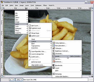 Here, as
an example, we will introduce a shortcut key combination
for the 'Levels' dialogue box. Here, as
an example, we will introduce a shortcut key combination
for the 'Levels' dialogue box.First of all, right-click on an image (any image will do) and then work your way through the menus until you get to where you want - in this case 'Layers'/ 'Colours'/ 'Levels...' and without clicking on it, make sure that 'Levels...' is highlighted and then press [Ctrl][Alt][Shift][L] and this key combination will appear as you can see it in the screen shot. Now, whenever you press [Ctrl][Alt][Shift][L] (it doesn't matter which order you press the modifying keys [Ctrl] [Alt] or [Shift] as long as you press [L] when you have the others already pressed), you will get the 'Levels' dialogue box. These keyboard shortcuts will be saved if you have that box checked and you can, if you want, reset them to the original set of shortcuts you had when the GIMP was installed. In addition, you can program other key combinations for other features at the same time. |
 Many
people like to use key sequences to get to the tools they
want quickly, instead of chasing through layers of menus.
The GIMP can be configured quite easily to accept any key
combination to any tool or other menu item. This can help
if you use two image processing programs of which the
GIMP is one. For example, on one system, I use Micrografx
Picture Publisher. To paste the contents of the clipboard
into a new image, you use the combination
[Ctrl][Shift][N]. In the GIMP, I can give this key
combination to the same process so when I want to create
a new image from the contents of the clipboard, all I
need to do is use the same key sequence as I did in
Picture Publisher. Here is how to do that...
Many
people like to use key sequences to get to the tools they
want quickly, instead of chasing through layers of menus.
The GIMP can be configured quite easily to accept any key
combination to any tool or other menu item. This can help
if you use two image processing programs of which the
GIMP is one. For example, on one system, I use Micrografx
Picture Publisher. To paste the contents of the clipboard
into a new image, you use the combination
[Ctrl][Shift][N]. In the GIMP, I can give this key
combination to the same process so when I want to create
a new image from the contents of the clipboard, all I
need to do is use the same key sequence as I did in
Picture Publisher. Here is how to do that...
|
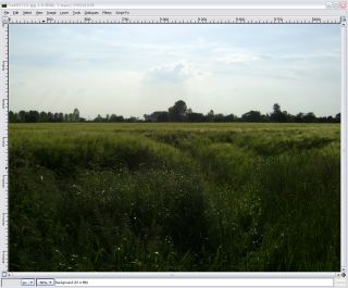
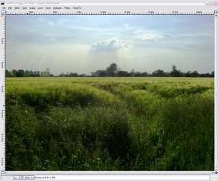
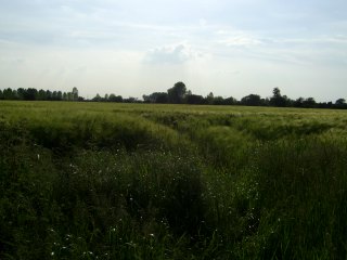 If we look
at the image as we would see it on the computer, we
notice that there is a distinct tilt. This ground is
flood plane and is essentially flat and horizontal so it
is not that, it is the camera. If we look
at the image as we would see it on the computer, we
notice that there is a distinct tilt. This ground is
flood plane and is essentially flat and horizontal so it
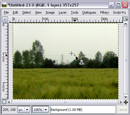
is not that, it is the camera.So,click on the 'Rotate' tool in the GIMP toolbox and then click on the image itself. |
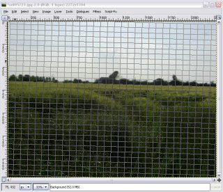 You now
get a grid overlaid on the image You now
get a grid overlaid on the imageIn the middle of it, there is a little filled grey circle that you can drag where you like - this is the point around which the image will rotate. You can drag the grid and it will rotate around this point. However, how do we know how much we need to rotate it? Normally, when you move a grid like the one in the screenshot on the right, it will rotate it in that direction so the image will end up twice as rotated. |
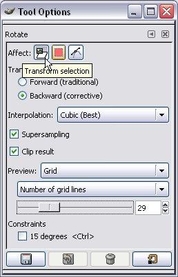 If you
double-click on the tool icon in the tool box, you will
get the 'Tool Options' dialogue box like the one on the
right. If you
double-click on the tool icon in the tool box, you will
get the 'Tool Options' dialogue box like the one on the
right.Note that you can run the rotate tool in two directions:
So, select backwards and rotate the grid so that the formerly horizontal lines now run parallel with the horizon. |
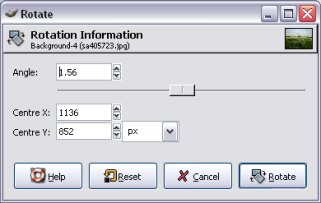 When you
clicked on the image and the grid appeared, the rotate
dialogue box also appeared. This is it on the right. When you
clicked on the image and the grid appeared, the rotate
dialogue box also appeared. This is it on the right.You can see just how small the correction angle is as well - only 1.56 degrees. Note that the angle of the grid is the angle relative to the centre of rotation and relates to where you have the mouse in relation to that. In other words, if you can't get the angle quite right - just a bit one way or the other - then move the mouse further away from the centre of rotation and you will get a finer resolution on your angle. Once you have got it right, click on the 'Rotate' button... |
 ...and
this is what you have. ...and
this is what you have.Note that if you don't like the results, you can press [Ctrl][Z] to undo the edits, one at a time, and [Ctrl][R] to redo them. |
 Straightening
Density ranges
The main control that most image editors have is gamma. This allows you to lighten and darken things. So, let's use gamma to darken the sky so that we can see the clouds... |
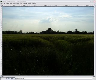 And this
is what we get. And this
is what we get.The sky looks reasonable but we can see even less of the field. So, what happens if we use gamma to lighten the fields... |
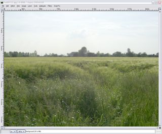 Now, we
can't see anything in the sky - so much for taking that
picture. Now, we
can't see anything in the sky - so much for taking that
picture.However, not all is lost. Let's look at the distribution of densities in the image using the levels tool. |
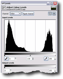 Here you
can see that we have a lot of dark and a lot of light
pixels but not a lot in between. Here you
can see that we have a lot of dark and a lot of light
pixels but not a lot in between.This explains why the gamma correction didn't work because whilst we were expanding one part of the density range, we were also compressing the other. So, how do we spread the densities into the gap in the middle? |
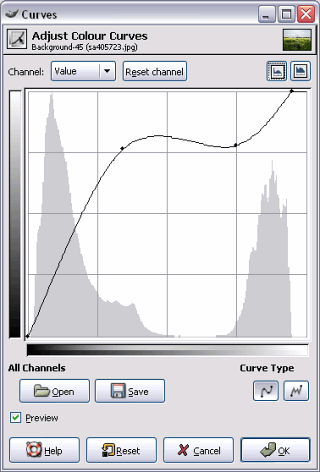 If we use
the curves tool instead, we have much more control over
where the densities go. If we use
the curves tool instead, we have much more control over
where the densities go.In the diagram on the right, you can see that the x axis is the input density and that the y axis is the output density. Just to make it clearer where things are in your image, the graph from the levels dialogue box is superimposed over it. Now, we can fix the image. When you start off with this tool, the line you can see has no points on it apart from at the beginning and at the end and it just travels in a diagonal straight line. You can grab one of the end points with the mouse and move it to where you want or, you can click somewhere on the line - introducing a new point - and drag it where you would like the line to go. To remove a point, just drag it out of its range. Being a smooth curve (look at 'Curve Type' towards the bottom right), the computer draws a smooth curve between the points. If you want to make more of a 'corner', you can just add another point so that the line goes where you want it. If you want to make the curve finer, you can click on the 'Free' curve type (the one with the jagged line) and then, you can make the graph do what you want. For our image here, the area on the left can be spread over more of the density range - here, taking up around three quarters of it and the area on the right can still occupy the range it did before but in this case, the brightest density in the original is not as bright as it could be so that is moved over as well. Normally with a graph like this, I would flatten the bit in the middle to prevent solarisation of the intermediate pixels which can be an unwanted effect here. |
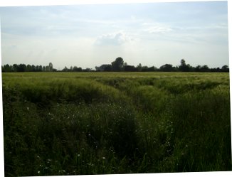
 And here
is the final result. We can now see the detail in the sky
(remember that we extended the density range up to white
so its contrast is increased) and the detail in the field
(which again has had its density range greatly extended). And here
is the final result. We can now see the detail in the sky
(remember that we extended the density range up to white
so its contrast is increased) and the detail in the field
(which again has had its density range greatly extended). |
CloningThe next step is to remove the National Grid and the car factory.
When dragged across an image, the clone tool picks up a piece of the image and translates it through a vector to where the mouse cursor is. This has the effect of keeping image detail (such as noise and other textures) as well as keeping any tones that are their so that if you are copying something across a density gradient, you effectively 'draw' with the local colours and textures. |
 Just click
on this tool icon and you will be able to draw over any
area of the image with parts of the image itself. Just click
on this tool icon and you will be able to draw over any
area of the image with parts of the image itself. |
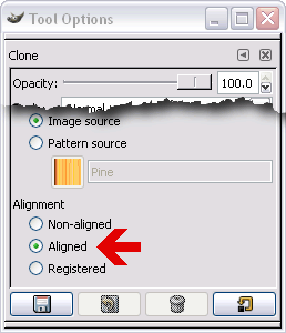 If you
double click on the tool icon, you will get the Tool
Options dialogue box - the important bits being that: If you
double click on the tool icon, you will get the Tool
Options dialogue box - the important bits being that:
The aligned option means that the vector (x,y offset) that you chose originally will be used again and again until you redefine it. If you chose non-aligned, it would use the original source point each time you started a 'draw' operation. |
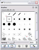 Like any
'draw' tool, the size and other qualities are taken from
the current brush. Like any
'draw' tool, the size and other qualities are taken from
the current brush.Access this by clicking on the brush area in the main toolbox. Note that there is an option to generate your own brush shape and hardness. |
 So, to use
the clone tool once you have configured it the way you
want it (or just used the defaults), this is what you
do... So, to use
the clone tool once you have configured it the way you
want it (or just used the defaults), this is what you
do...
If you have selected 'aligned', the next time you click the mouse to clone, the vector will be the same. If you have selected 'non-aligned', the next time you click the mouse to clone, the starting point will be the same and a new vector will be stored and used. So, how good is the clone tool? |
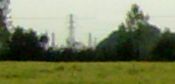
 This is the
original image with the 440,000 Volt pylon and the odd
car factory chimney. This is the
original image with the 440,000 Volt pylon and the odd
car factory chimney. |
 If you do an
'edge detect' on it, you can see the detail in the sky. If you do an
'edge detect' on it, you can see the detail in the sky. |
 First of
all, let's try just copying a gradient over the sky that
is effected. First of
all, let's try just copying a gradient over the sky that
is effected.This is the mask we will use... |
 And this is
the end effect. I took the colours (using the dropper
tool) of the sky at the top and bottom of the gradient
and used the gradient fill tool in the above mask. It
does look rather flat and featureless - rather false. And this is
the end effect. I took the colours (using the dropper
tool) of the sky at the top and bottom of the gradient
and used the gradient fill tool in the above mask. It
does look rather flat and featureless - rather false. |
 This is what
it is like with the edge detect used in the same way as
above. You can see that the natural grain/variations in
the sky are taken out, leaving us with a gradient that is
uniform. We need to be able to copy the natural gradient
from the sky itself to make it more convincing. This is what
it is like with the edge detect used in the same way as
above. You can see that the natural grain/variations in
the sky are taken out, leaving us with a gradient that is
uniform. We need to be able to copy the natural gradient
from the sky itself to make it more convincing. |
 This is the
result of using the clone tool. I took a source area that
was close to where the clone tool drew so that the
density was fairly similar. It does look a lot better. This is the
result of using the clone tool. I took a source area that
was close to where the clone tool drew so that the
density was fairly similar. It does look a lot better. |
 And this is
the edge effect used in the same way as above. You can
see that the texture of the sky has remained. And this is
the edge effect used in the same way as above. You can
see that the texture of the sky has remained. |
| If used carefully, the clone tool can be used to remove imperfections in images such as skin blemishes on models' faces, birds in the sky, power lines and so on. |
 The best
way of doing this is to use the clone tool. The clone
tool is like magic paint where your paint is your
picture.
The best
way of doing this is to use the clone tool. The clone
tool is like magic paint where your paint is your
picture.Internationalisation (i18n) and Localisation (l10n)Internationalisation and Localisation (or if you are not a fluent typist; 'i18n' and 'l10n' because there are 18 characters between the 'i' and the 'n' of 'internationalisation' and 10 characters between the 'l' and the 'n' of 'localisation') are two separate but related processes. Internationalisation ('i18n') takes a program and separates the words and phrases used in the user interface, from the programming itself. These can be stored in an external database and accessed by the program when it needs to. So, if your program previously displayed the word 'File' in a menu, it now looks up the word that it needs to use in that place and displays it -- thus 'File' appears again.
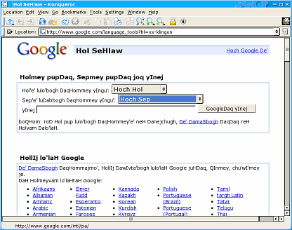
However, this needs to be done properly and there are two processes to test. The first is i18n and this can be tested by using a language to check that everything has been caught (no menus or dialogue boxes have escaped the process). The second is l10n which a local translator can do once the i18n has been completed. There are a number of test languages that are used for i18n and if you look at the language section of Google, you can see some of them - on the right, you can see the Google interface in Klingon. They include:
Just click on 'Language Tools' from the main search page to see them and try them out for yourself. |
 Whilst
that might see totally pointless, the process of
Localisation ('l10n') can replace the default database
with one in another language. This makes it comparatively
easy to make a version of a program that works in any
language because you don't need to go through many
thousands of lines of code, looking for bits of text and
then translating them - instead, you just work through a
database.
Whilst
that might see totally pointless, the process of
Localisation ('l10n') can replace the default database
with one in another language. This makes it comparatively
easy to make a version of a program that works in any
language because you don't need to go through many
thousands of lines of code, looking for bits of text and
then translating them - instead, you just work through a
database.xkillLittle is more annoying than something that has just stopped working for some reason and looks as though the only way to get rid of it is to have to kill it (with the exception of having to reinstall Windows). If all else fails, you will need to kill its window although I would recommend finding out why it appears to have stopped (it might be waiting for a resource to become available or in the middle of a long procedure) and solving that first.
There is a little utility called xkill that you can either:
|
When xkill is running, it will display the skull and crossbones that you can see in the screenshot and the next thing that you click on will be killed. Note that if you have a multi-window application open - for example, the GIMP - then all of that application will be closed down. If you click on something by accident (such as KDE), you will need to know how to restart it. If you are going to put its icon on a panel, then as a precaution, we would suggest that you don't have an icon for xkill anywhere you are likely to click on it by accident. Also, any icon you choose should look distinctly different. If you do, then make sure that you can start up a throw-away application (one that can be killed without any consequences such as a dummy xterm session) to kill that instead. One solution is to configure the KDE shortcuts so that the Windows/Tux key will start the KDE menu from which you can use the arrow keys and enter to start a program of your choice. Like all powerful tools, this can be a double edged sword because you can make mistakes with it so be careful. |
 This is, in
effect, a last resort.
This is, in
effect, a last resort.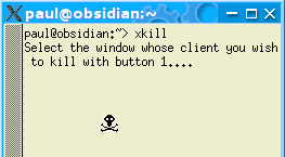 if
you have a console open, just enter xkill.
if
you have a console open, just enter xkill.Stop the screensaver
However, on KDE (and on Mac OS X, I am told), you can configure the system so that when the screen trips into screen saver mode, you have a configurable amount of time to get to the computer to rescue the situation. If you right-click on the screen and then select properties, you get the screen on the right. |
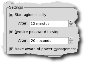 In the
settings frame, you can configure the amount of time you
have to get to your machine - here, 20 seconds. In the
settings frame, you can configure the amount of time you
have to get to your machine - here, 20 seconds.Don't make this time too long though because if you are waiting for it to become safe to leave, you will have to guess this last time. On a personal note, I have been using Windows (which does not feature this) and KDE (which does) for years and it is a lot better to know that you have a bit of time to got back to your machine. |
 Seeing the
screensaver start is particularly annoying if you are in
the middle of doing something and only left the machine
for a few minutes and you know that from that point on,
you will have to use your password to get to your account
again.
Seeing the
screensaver start is particularly annoying if you are in
the middle of doing something and only left the machine
for a few minutes and you know that from that point on,
you will have to use your password to get to your account
again.Processor demandIf you want to find out how much processor time and other resources a program uses - effectively finding the minimum system resources required to run a program - you can always use 'top' but if the program you are interested in uses all of the screen - such as a game like Tux Racer for instance - you will have to think of this from another angle. 'top' provides a useful, real-time display of processes and how much resources they use. However, it does require a console to work in so if you have a second machine, use the first method otherwise, you will have to look at the second way of doing this. 1. One way of hacking this is to use your slower machine to ssh into the faster one and run top. This way, you will be able to see how much power is being used in real time although this needs both machines in the same place or, you need to borrow someone to play the game while you watch top on the other machine. 2 a. The other way of doing this is to use top from the command line in batch mode. With this method, you can look at other processes that were running at the same time. Open up a shell and when you are ready to start Tux Racer, enter... top -b -d 3.0 -n 30 > tempfile.txt ... then run Tux racer.
Once you have created your file (and finished playing Tux Racer), you want to see the lines with your process on it. In batch mode, top outputs information on all of the processes which is why it is such a large file. The lines you are interested in will be dispersed amongst these other lines so, to sift these out, we use grep (get regular expression) to search through the file and print out each time tuxracer is found. To do this, enter... grep tuxracer tempfile.txt You can do this for any of the processes that were running at the time. 2 b. However, if you are pushed for disc space or you are only interested in the one process, type the following two lines instead... top -b -d 3.0 -n 30 | grep tuxracer > tempfile.txt less tempfile.txt This pipes the output of top, through grep which filters it and then that output is redirected to the file. This makes the file much smaller as we are only interested in looking at one process this time. Being a file that has already been filtered by grep, you then look at using 'less' once top has finished. This way of doing it generates a file of only around 2kB for the same situation. So, you know the processor speed (in this case 1.8GHz) and you know what proportion of the processor time is needed during normal playing (around 60 per cent) so you can work out roughly what speed processor is needed (in this case, around 1GHz plus a bit for other things going on that are needed). |
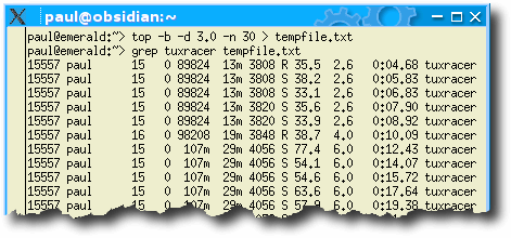 The '-b'
switch makes top run in batch mode, the '-d'
switch specifies the duration in seconds between each
sample and the '-n' switch tells it the
number of iterations to make. The '>'
tells the system to direct the output to a file called 'tempfile.txt'
which is in the current directory. I found that with
around 80 processes running, 30 iterations gave a file
size of around 250kB.
The '-b'
switch makes top run in batch mode, the '-d'
switch specifies the duration in seconds between each
sample and the '-n' switch tells it the
number of iterations to make. The '>'
tells the system to direct the output to a file called 'tempfile.txt'
which is in the current directory. I found that with
around 80 processes running, 30 iterations gave a file
size of around 250kB.